Hello Fellow ChartWatchers!
Long-time members know that I am always thrilled whenever I can start my article with the phrase "Today I am thrilled to announce...". And that phrase has been used so much in 2014 that it is starting to lose all meaning. As I mentioned in recent newsletters, we have added so many important new things to the website this year, but this week I do have something really special for you...
Relative Rotation Graph (RRG) Charts Now Available!
Today I am thrilled to announce that Relative Rotation Graph (RRG) charts are now available on StockCharts.com. These innovative charts give you an immediate, concrete sense of how well or how poorly each stock in a related group of stocks has been doing by plotting each stock's Relative Strength versus its Momentum. Here is an example of an RRG chart:
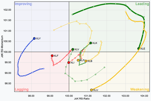
First things first: stocks generally follow a natural clockwise rotation on an RRG chart as time passes. For instance, if a stock starts out in the green "Leading" quadrant because it has good relative strength and good momentum, it typically will start to lose momentum and rotate into the yellow "Weakening" quadrant. Next its relative strength will probably falter and it will move into the red "Lagging" quadrant. After awhile, things may start to improve (relative to the other stocks on the chart) and momentum will pick up moving the stock into the blue "Improving" quadrant. Finally, relative strength will return causing the stock to move back into the green "Leading" quadrant. Make sense?
RRG charts have large dots on then showing you where each stock is currently on the chart. Extending backwards from each dot is a long "tail" that gives you a sense of the stock's recent travels through the chart. On the live RRG Chart page, you can interactively control the start and end date of the chart and watch the stocks spin around over time. Click here to try it out. Go ahead. I'll wait.
Did you have fun? These things are very addictive!
The example chart above shows the RRG chart for the nine S&P Sectore ETFs. It is only available to StockCharts members so I wanted to take a moment and talk everyone through it so you can see how useful it can be.
Did you notice that the color of each line is controlled by the color of the quadrant that the final dot is in? That makes it easy to see which stocks (Sector ETFs in this case) are in which quadrant. As of right now, Energy, Technology and Health Care are in the green "Leading" quadrant with Cyclicals in the blue "Improving" quadrant. Note that Energy is losing momentum however and should enter the yellow "Weakening" quadrant very soon. Also note that Finance (XLF) has improving momentum and may enter the blue "Improving" quadrant soon as well.
Now let's take a moment and look at our Sector Rotation model graph and see if that helps us interpret these results:
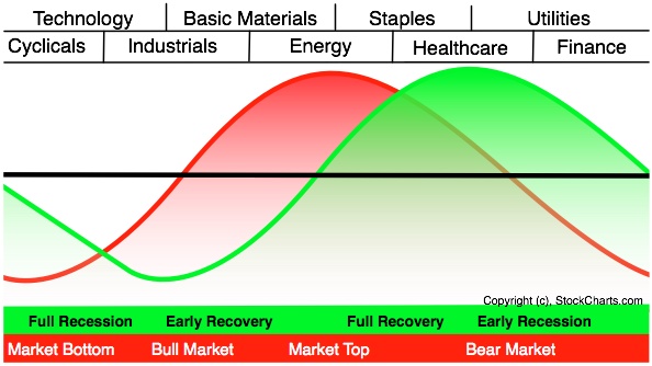
The fact that Technology is strong and Finance and Cyclicals are starting to perk up is evidence that we are still on the left side of this chart in the "bullish part of the red curve where the market picks up strength. However, the fact that Energy and Health Care are also strong brings a note of caution to this analysis. In a perfect world, we should see strong leadership from Cyclicals, Technology and Industrials with relative weakeness in Staples, Health Care, and Utilities. (Of course, there are outside factors that may be causing Health Care to ignore the general business cycle at this time.) So we have a bit of a mixed picture at the moment in terms of the Sector Rotation model. It will be interesting to watch this chart in the coming weeks to see how things resolve themselves.
Please do take some time to play with these new RRG charts and see how they can help you gain deeper insight into the market. I hope you find them useful.
- Chip
P.S. Also keep an eye out for the debut of a new "RRG Chart" blog written by Julius de Kempenaer, the inventor of RRG charts! Julius will be writing lots of articles explaining how he developed and uses these innovative charts himself to make money.
P.P.S. News Flash: Julius has been added to the speaker list for our upcoming ChartCon conference in Seattle in August. That means that ChartCon is now the perfect place to see these charts in action and learn how they work! Are you going? If not, click here and reserve one of the few seats that are still available.


