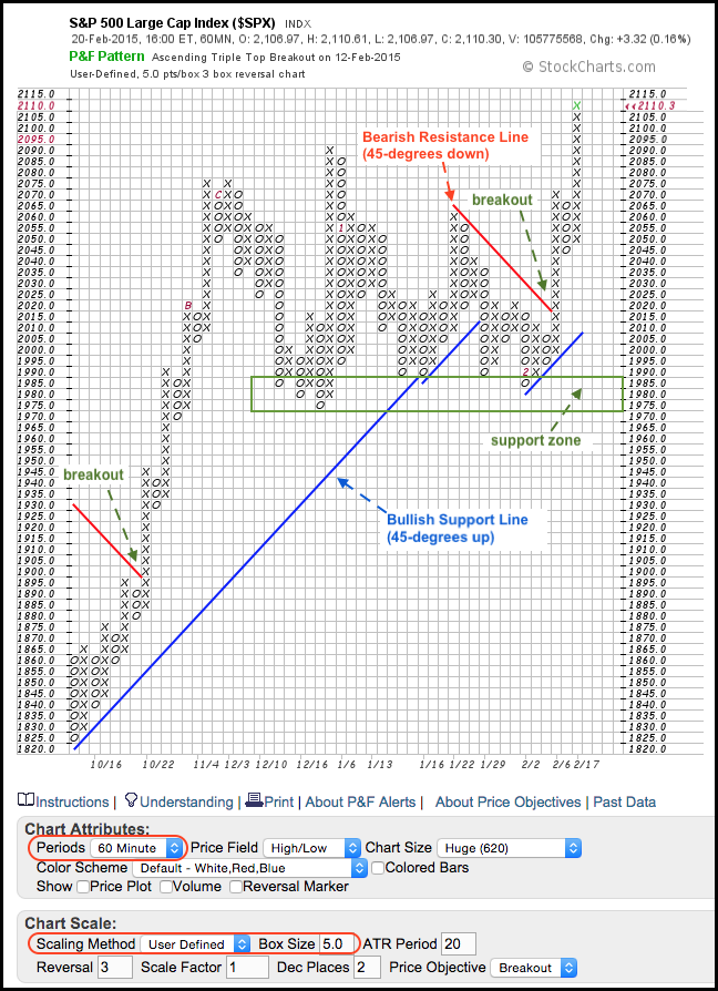
Chartists looking to filter small price movements and add a systematic touch to their analysis can turn to Point & Figure charts. Chart 1 shows a 60-minute P&F chart for the **S&P 500** and each box is five points. With a traditional 3-box reversal setting, this means a move greater than 15 points is needed to reverse a column. Note that the X-Columns represent rising prices and the O-Columns represent falling prices. Even though this P&F chart is based on intraday prices (60 minute), it **extends back to mid October and captures the medium-term trend quite well**. Before looking at the analysis, note that the red lines are bearish resistance lines drawn down at 45-degree angles. When prices break above a bearish resistance line, a blue bullish support line is drawn up at a 45-degree angle. This means prices are always above or below one of these lines.
The trend line signals provide a systematic element to chart analysis. A break above the bearish resistance line is bullish, while a break below the bullish support line is bearish. We have seen three signals since mid October and the current signal is bullish. Notice how the index broke above the bearish resistance line with the surge above 2025 in early February. A new bullish support line was then drawn from the low of the move and it extends up at a 45-degree angle. These systematic signals can also be used to establish a trading bias for a shorter timeframe. And finally, note that P&F charts are excellent for marking support and resistance zones. The lows extending back to December mark a support zone in the 1975-1990 area. A break below this zone would call for a reassessment of the long-term uptrend.


