Hello Fellow ChartWatchers!
Last time I reviewed our PE Ratio symbols for several major indexes (!PEDOW,!PESPX, !PEOEX, and !PENDX) and promised that this time around I'd show you the PE Ratio symbols we have for the nine S&P Sectors. Promise fulfilled!
(click for live version)
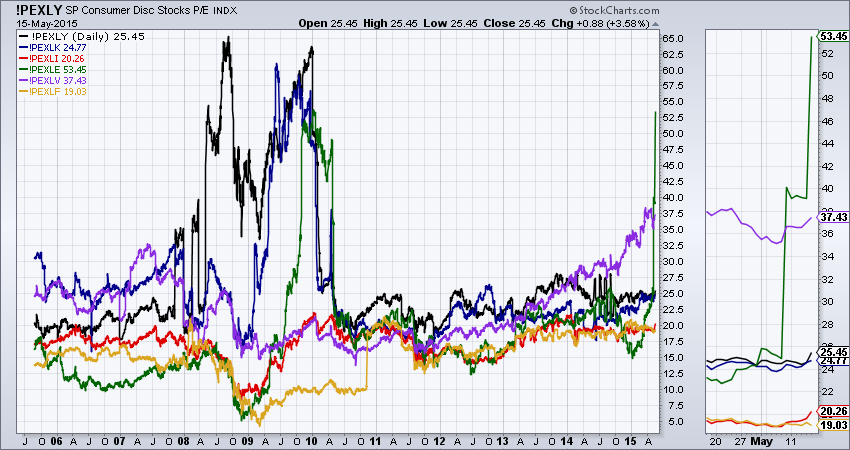
This chart contains P/E lines for 6 of the 9 S&P sectors. You can see their symbols in the legend of the chart. Note that I added these indexes to this chart using the "Price (Same Scale)" _overlay_ instead of the "Price" indicator. That ensures that they are all plotted using an identical vertical scale and can be correctly compared visually.
Just like in the index-based PE charts, you can also see that the Financial Crisis in 2008 and 2009 has played havoc with several of these indexes - first the black Discretionary (Cyclical) sector, then the blue Technology sector, and finally the green Energy sector. Even though each of those sectors "exploded" at different times, it is interesting to see how they all "calmed down" around the same time - May of 2010.
On the right half of the chart, we see that the purple Healthcare sector has been gradually increasing since 2012 and, since around October of last year, it's increases seem to have accelerated. Finally, on the right edge of the chart (and in the Zoom Thumbnail area on the right side of the chart) we see that Energy P/Es have doubled in less than a month(!).
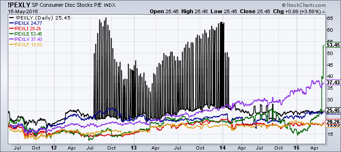
Something else that is very important to understand is less noticeable on the chart above but much more noticeable on the chart below:
Yikes! What is that? That is what happens when our various vendors can't agree about which stocks belong to which sectors. We are actually working on cleaning up that data and trying to prevent this kind of anomaly from happening again but it will take some time. In the mean time, it is important for everyone to understand that our PE indicators can contain unexpected surprises and should be used with both caution and common sense.
- Chip


