Most of you are familiar with the Price Momentum Oscillator (PMO) and its use on my individual stock, ETF, index charts. However, by analyzing the health of the PMOs within an index, we are able to get a reliable market indicator.
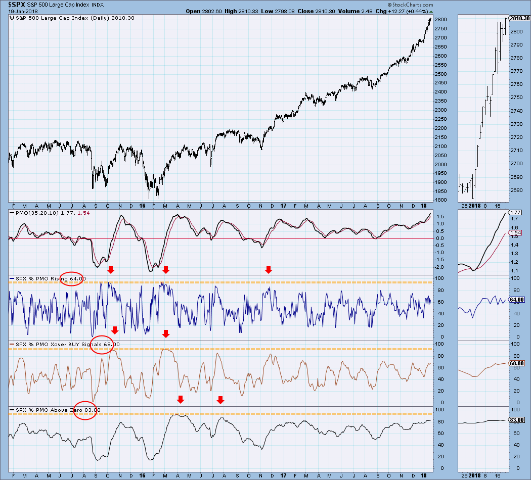
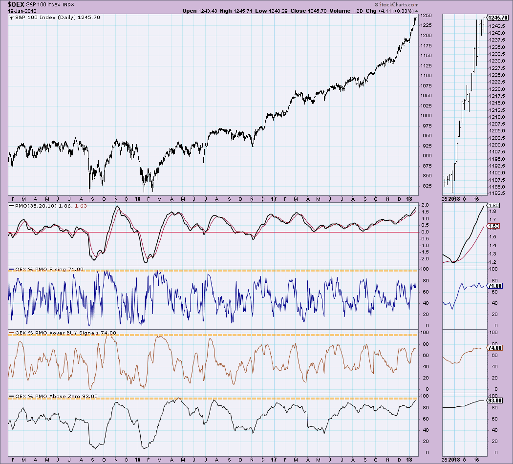
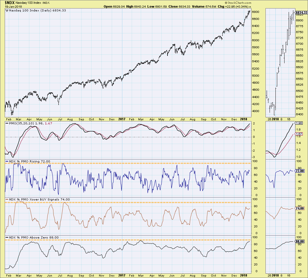
The PMO Analysis charts that are in the DecisionPoint Market Indicator ChartPack tally up whether the PMOs on each component of the index are rising, on buy signals or have PMO readings that are above the zero line. Each pane gives us a short-, intermediate- and long-term picture of the health of an index. Using the first pane (the PMO), you can understand what we are looking at as far as PMO direction, signal and location above the zero line. We have PMO Analysis charts for each of the DecisionPoint Scoreboard indexes, SPX, OEX, NDX and Dow. You'll find these in the DecisionPoint Market Indicator ChartPack in ChartList "DPMI - 1120".
Now for the analysis! Based on the percentages I'm seeing on these major index PMO Analysis charts, we are not in overbought territory. There is room for expansion. Note on the SPX that only 64% have rising PMOs and only 68% are on PMO crossover BUY signals. Additionally, 83% for the amount of PMOs above the zero line is far from overbought as well. Note we've seen much higher readings previously.
Below are the OEX and NDX PMO Analysis charts. You'll see a very similar set-up on these charts as well with the main difference being higher percentages of PMOs above zero. This does suggest long-term overbought conditions. However, you'll also notice that high percentage readings in the long term can persist for some time. I'm most interested in the shorter-term %rising and %Buy signals.
One thing we will want to watch closely as we proceed are possible negative divergences. Below I've highlighted negative divergences and how they typically play out with a decline or correction. It makes sense, right? If the index is flying higher but fewer and fewer stocks show PMOs rising or on BUY signals, that means participation isn't universal and suggests only a few are moving price higher in the index. For bull markets to rage and continue, you need as many participating as possible.
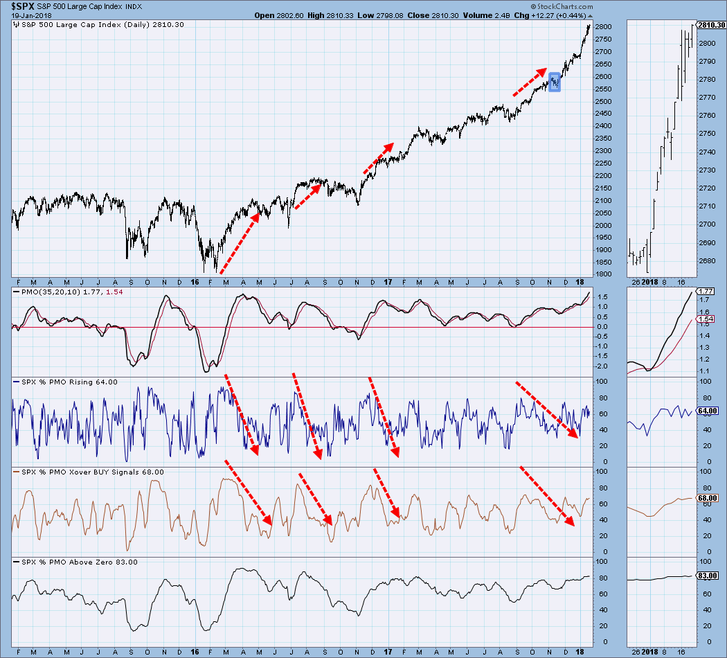
Conclusion: We are in a parabolic rally on the SPX and parabolic formations always worry me. However, I'm not seeing extreme bullishness as far as price momentum. These indicators have more room to grow and that suggests to me that the market isn't as overbought as we think. We've seen much higher readings. We aren't seeing any negative divergences either which tells me we aren't ready for a serious decline.
Helpful DecisionPoint Links:
DecisionPoint Shared ChartList and DecisionPoint Chart Gallery
Price Momentum Oscillator (PMO)
Swenlin Trading Oscillators (STO-B and STO-V)
Technical Analysis is a windsock, not a crystal ball.
Happy Charting!
- Erin
**Don't miss DecisionPoint Commentary! Add your email below to be notified of new updates"**