THE Question
Is this a correction within a bull market or is it the beginning of a bear market? That is THE question that everyone is debating and hoping to answer correctly. There's no crystal ball to know for sure the correct answer. However, the market does provide us clues if we're willing to look for them.
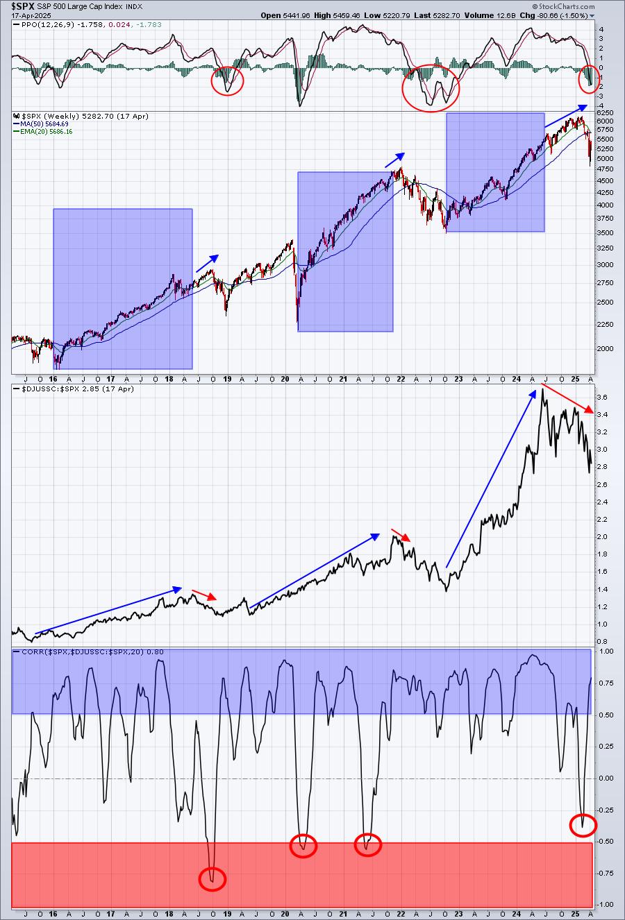
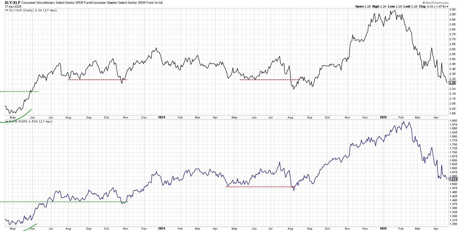
Let's begin with the knowledge that roughly two-thirds of GDP is comprised of consumer spending. So it makes common sense to analyze consumer stocks for clues about the direction of our economy and, hence, the stock market. The aggressive component of consumer stocks is discretionary (XLY), while the more defensive area of consumer stocks is staples (XLP). The ratio of discretionary to staples (XLY:XLP) is a very solid indicator of stock market health because it not only reviews the consumer stocks, but it also shows relative strength of aggressive consumer stocks vs. defensive consumer stocks. During bull markets, this ratio should rise to indicate traders' appetite for riskier consumer stocks. When the ratio turns considerably lower, we need to worry as the market is turning much more defensive. If this occurs as the stock market is setting fresh all-time highs, it's an outright bearish development.
Besides the price action on the S&P 500, the XLY:XLP is my favorite "below the surface" indicator to determine the sustainability of a bull market advance. Before we look at the current state of the XLY:XLP ratio, let's take a trip down memory lane and look at this ratio just before and during the past two bear markets.
2000-2002 Bear Market
On the following chart, I've overlaid the XLY:XLP ratio (pink line) onto the S&P 500 chart. Take a look:
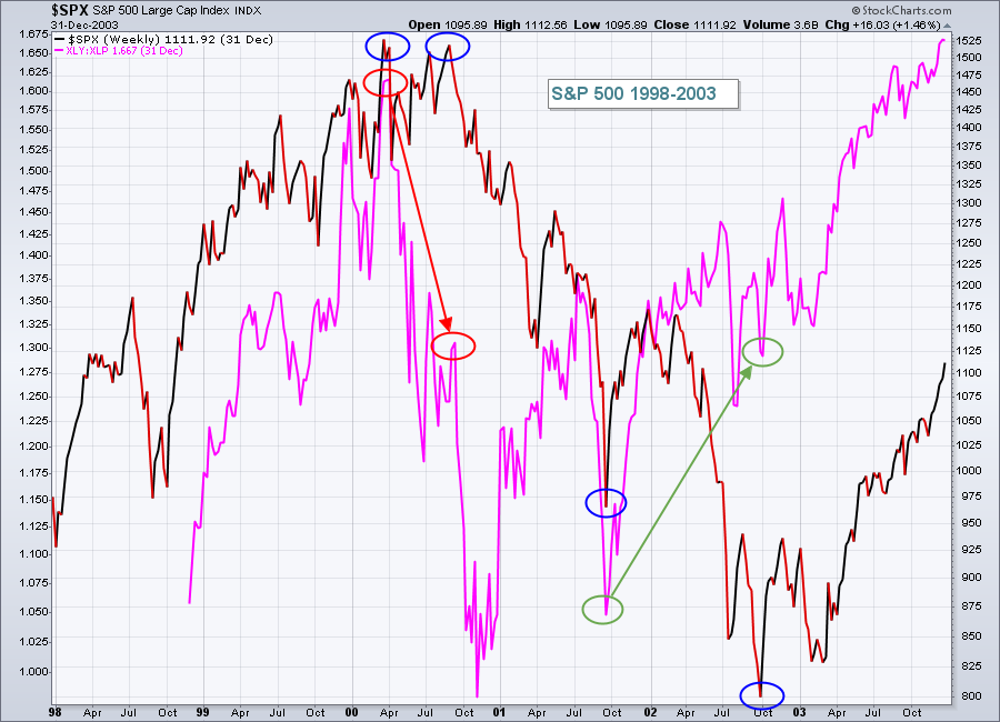 Moving from bull markets to bear markets is a process. It just doesn't happen one day. Yet that's exactly what many are trying to argue here in 2018. To illustrate this point about a "process", let's first look at the S&P 500 chart as we moved into the 21st century. In the chart above, take a look at the two S&P 500 tops in year 2000 (blue circles). Looking only at the S&P 500, you probably would have no idea that changes were taking place "under the surface" and that we were in the "process" of shifting from bull market to bear market. But check out the tops in the XLY:XLP ratio (red circles) at those two S&P 500 tops. This ratio had declined significantly as money rotated from offense (discretionary - XLY) to defense (staples - XLP).
Fast forward to the end of the bear market. Check out the lower lows on the S&P 500 (again blue circles highlight these lows) and compare that to the XLY:XLP ratio (green circles). There were much higher lows, indicating that traders were becoming much more aggressive in consumer stocks as the S&P 500 made its final bottom. These "under the surface" signals are powerful and let us know when we need to be cautious as market conditions change ahead of the market tornado.
2007-2009 Bear Market
So let's use this same approach to help spot the next bear market. Here's a similar chart, this time from just before the start of our last bear market:
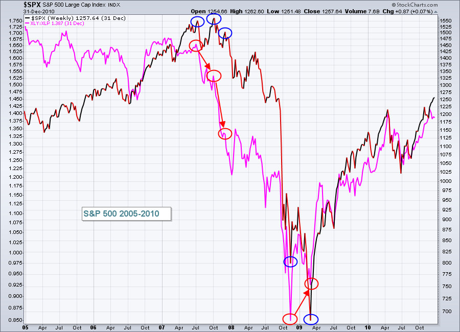 It was a very similar setup, correct? The only difference I see is that the bull market really wasn't on great footing during 2005 and 2006 as the XLY:XLP ratio was struggling to move higher. That was a warning sign in itself, perpetuated by the rapid decline in this ratio in 2007 as the final top printed.
Also note that the end of the bear market saw the XLY:XLP ratio turn higher before the final bottom occurred in the S&P 500. Again consumer stocks, and their relative performance vs. each other, provided a very important "below the surface" signal.
Don't fall into the CNBC trap. A falling market isn't the sign of a bear market. It's the "confirmation" of a bear market after smart money has moved to defensive stocks.
2018
After examining the make up of the last two bear markets, let's get back to that earlier question. Was February's sharp decline and increased volatility the start of a new bear market? Well.....here's the current version of same chart and how it's looked throughout the last several years of this bull market:
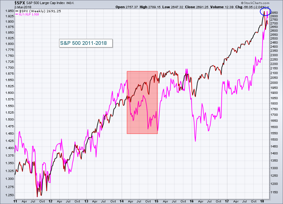 2014 caused a lot of heartache because of the declining XLY:XLP ratio and it led to a two year period of consolidation on the S&P 500. The ultimate low in 2016 tested the 2014 low, but didn't break below it. Of course, hindsight is 20/20 and it looks much easier now to have stayed long back then. At the time, I wrote many cautious articles because of the XLY:XLP behavior. But outside of that red shaded area, the XLY:XLP ratio has climbed with the S&P 500. The blue circle highlights the fact that the S&P 500 and the XLY:XLP ratio are hitting all-time highs in 2018 simultaneously.
If this is a bear market, someone might want to send a text message to market participants. They are not moving into defense to prepare for a bear market decline. Therefore, neither am I. Am I cautious in the very near-term with the VIX remaining quite elevated? Absolutely! We certainly could see a double bottom, possibly even one more low. But I firmly believe we'll be setting new all-time highs on our major indices in the not-too-distant future.
Do you have any comments on this article? I'd love to hear your thoughts on my rationale, whether you agree or disagree and any reasons you'd like to share. Feel free to send them to me at tomb@stockcharts.com.
Happy trading!
Tom