After a massive run in 2017, the market has paused to absorb all the news of the tax package. I am reminded of other instances where the market sold off on good news, surprising retail investors.
Stock markets usually lead the economy, but that does not mean that a little rock and roll won't happen along the way. When the $SPX was flying above a long term moving average by such an extreme (13%), who wouldn't expect some correction of sorts?
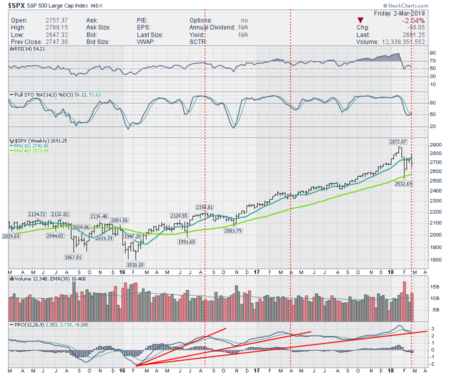
A crack in the momentum trend shown by the PPO can be a clue to more weakness. In this particular case, the momentum is still at a high level. We don't have a lower high in momentum (PPO) so there is no divergence showing on the big picture. While this break of the momentum trend adds caution to my analysis, it doesn't mean sell yet.
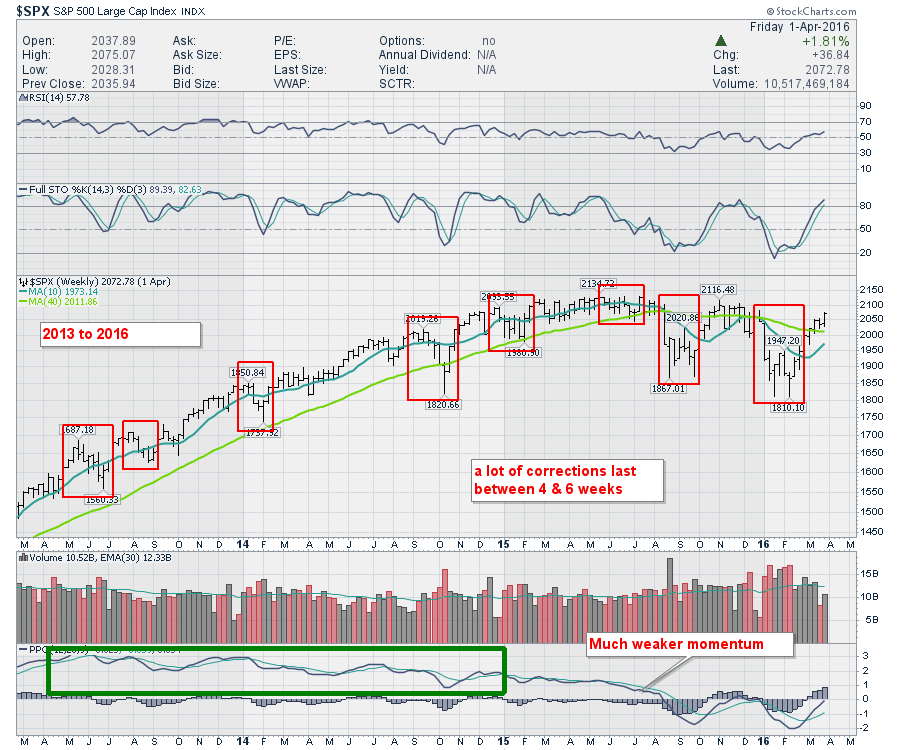
I would suggest a couple of things to look at. Looking through the period of 2013 to 2016, almost every correction was over in 4-6 weeks. Keeping in mind, the period of 2013-2014 had unlimited QE (no exit date set), the market still had corrections. Looking closely, the market had a few 4-6 week corrections with a couple lasting longer. One could are December 1st 2015 to February 9 2016 was 9 weeks, but we also had a down sloping 40 WMA in green.
 With the current correction, we are already 5 weeks into it from the highs. Perhaps we get a big shake out low in the next week to challenge our convictions, but more than likely it will be a better buying opportunity than selling opportunity. Looking back, the current abrupt market selloff is setting up similarly to selloffs we have seen before.
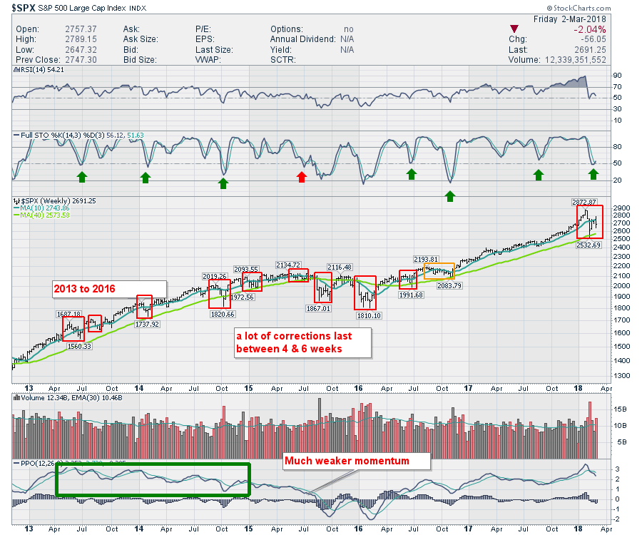 To wrap this up, I would be a buyer on this dip (with stops of course) rather than focusing on significant new lows. Stocks that refuse to break down are probably going higher. I will say that the $RUT indicators are a lot weaker, so this may be more of a move out of small cap and into large cap. While we might experience some rally in small caps on a bounce, the chart is significantly weaker on the big picture.
Foreign markets look weaker, which suggests that we might be working our way into a topping structure globally. The USA does not usually break down first. If the rest of the world weakens, it would give me more caution on the large cap USA heading into April and May.
Links to other articles and videos:
- Angst In Commodities Spills Over
- Momentum Trends Are Breaking Down - Video
- Canada Bounces Into Resistance Article
- Canada Bounces Into Resistance- Video
- One Commodity ETF Is Trying To Go Higher
- Using Hedged and Unhedged ETF's
- Palo Alto Networks Closes On A New High
- VeriSign Breaks Out To New Highs
Good trading,
Greg Schnell, CMT, MFTA.