 Various breadth indicators are used to analyze the underlying strength or weakness of a broad market index like the S&P 500 index or NYSE. Over the years a number of different breadth indicators have been developed and/or used in their work by well known technical analysts.
A few names that spring to mind here in the Stockcharts community are Tom McLellan, Carl Swenlin and Greg Morris.
"Market breadth" groups a number of indicators that derive data from the underlying market that they cover. Things like the A/D Line, the advance-decline line where the number of advancing issues are compared to the number of declining issues. Or New Highs versus New Lows. Or Up/Down volume where the total volume of advancing stocks is compared to the total volume of declining stocks. And many more.
Such breadth numbers can be studied in isolation or cumulative or you can calculate moving averages of them etc. etc. market breadth is a serious chapter in Technical Analysis and there are many people who are much better qualified than me to elaborate on it.
A good starting point would be Greg Morris' "The complete guide to market breadth indicators" and the accompanying chartpack for Stockcharts members.
Over the years I have studied various forms of market breadth on and off but never really managed to put it into my workflow as an embedded component. It's one of those things that I look at irregularly when I feel like it. When you just have that feeling that "things are going on" but your normal tools don't show you anything...
Particularly when markets are reaching high grounds as they have been doing recently.
Triggered
This time it was this article by Arthur Hill that made me have another look at breadth again. in this article he uses a breadth indicator that looks at the "percentage of stocks above n-day EMA".
The ticker symbol in the Stockcharts database is !GT200SPX which looks at the number of stocks in the S&P 500 index that are trading above their 200-day exponential moving average. Other versions look at the number of stocks above their 20- and 50-day EMA. These indicators are originally coming from the DecisionPoint database and used by Carl and Erin Swenlin.
Stockcharts has a similar set of breadth indicators starting with $... like $SPXA200 etc.
What really triggered my interest and made me investigate a bit more is when I noticed these numbers were also available for the sectors and not just only for the broader market.
Using breadth on RRG
My thought was: If these numbers are available for all sectors as well as for the S&P 500 and they are all comparable.... then what would happen if I would put them on a Relative Rotation Graph?
I had already played around in the past with the "Bullish percent" indexes per sector against the BP for the S&P 500 on an RRG but put it aside for some reason and went on with other things. After reading Arthur's article I started experimenting again with these data-sets on RRGs and showed some of it in last Thursday's Market Watchers Live.
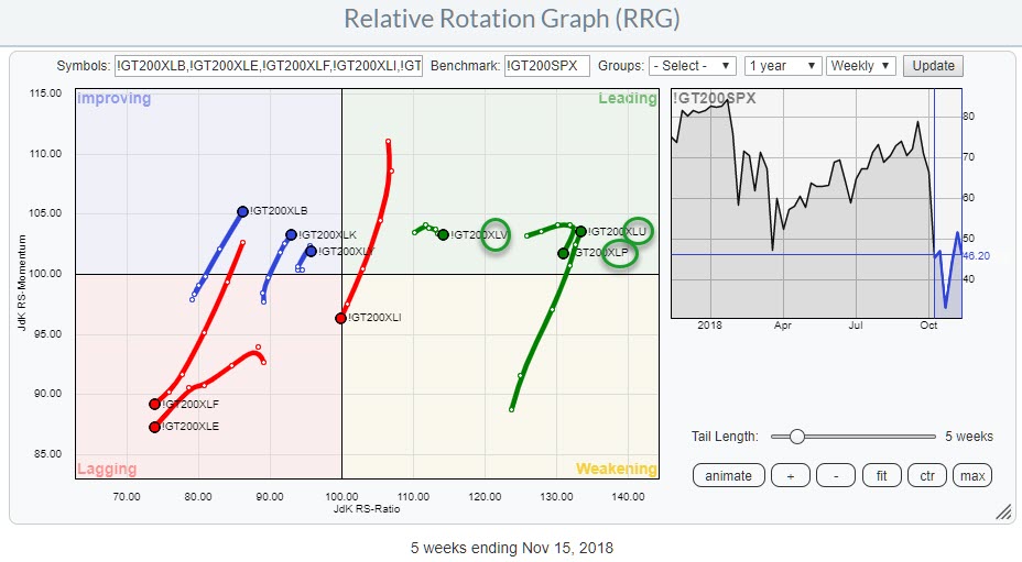
Here's an example of a Relative Rotation Graph showing the interaction of the number of stocks above their 200 day EMA.
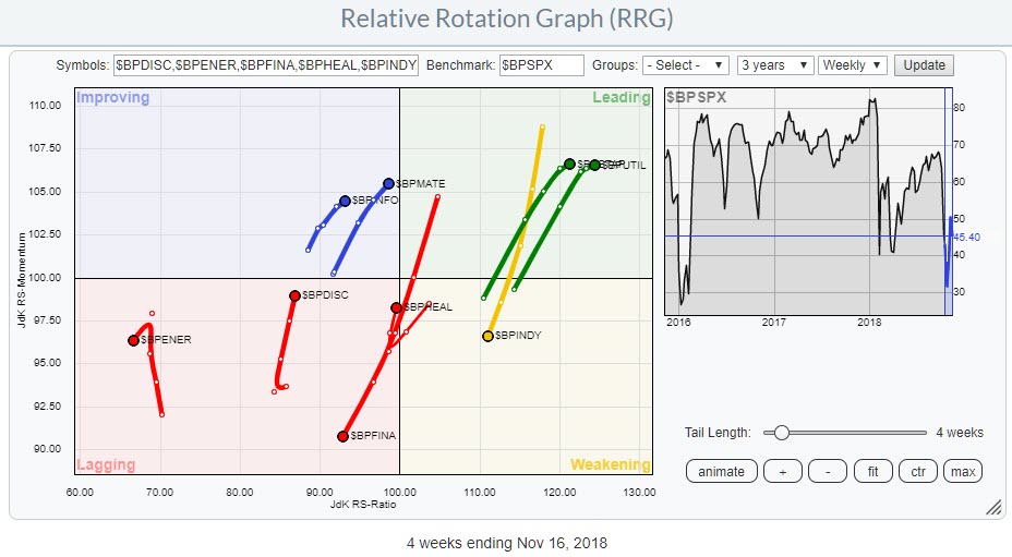
 And here's a version that shows the relationships between the various sectors based on Bullish percent data.
 It is interesting to see that the positions of the various sectors seem to match, more or less, with the sectors on a regular, price-based, RRG.
As Breadth is assumed to give early warning signals I am going to investigate these RRGs a bit more in one of my upcoming RRG blogs to see if I can find a leading tendency for the breadth indicators over the price based indicators.
For now, I hope I have been able to trigger your curiosity to set up your own RRGs with less obvious data sets and see if you can find a way for them to help you get an edge in your investment process. Or just take a look at these breadth indicators as such and see if it makes sense for you to use them.
My regular blog is the RRG blog If you would like to receive a notification when a new article is published there, simply "Subscribe" with your email address using the form below.
Julius de Kempenaer | RRG Research
RRG, Relative Rotation Graphs, JdK RS-Ratio, and JdK RS-Momentum are registered TradeMarks ®; of RRG Research
Follow RRG Research on social media:
Feedback, comments or questions are welcome at Juliusdk@stockcharts.com. I cannot promise to respond to each and every message but I will certainly read them and where reasonably possible use the feedback and comments or answer questions.
If you want to discuss RRG with me on SCAN, please use my handle Julius_RRG so that I will get a notification.
