Relative Rotation Graphs are a great tool to use to visualize sector rotation, along with other asset rotations in various universes.
If you have used RRGs regularly and have monitored multiple rotational patterns, you may have noticed that the rotations do not always travel through all four quadrants in sequential order. Understanding what happens in these situations will help you to read and better understand Relative Rotation Graphs.
Typical Rotational Pattern
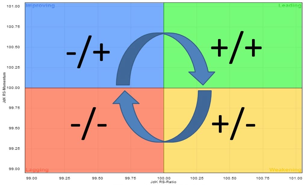 The usual rotation on a Relative Rotation Graph tracks a clockwise pattern starting in the LEADING quadrant. Here, you will find sectors that are in a relative uptrend against the benchmark (i.e., SPY) as the JdK RS-Ratio is above 100. Since the JdK RS-Momentum reading is also above 100, this relative uptrend is still pushed higher (accelerating) due to strong momentum.
The first thing that will happen is that that relative momentum will decrease, flatten and eventually drop below 100, indicating that relative momentum is now negative. At that time, the sector will move from the leading quadrant into the WEAKENING quadrant. This quadrant contains the sectors that are still in a relative uptrend, but decelerating. RS-Ratio is still above 100, but the JdK RS-Momentum indicator being below 100 indicates that this uptrend is now losing strength. When this happens, you will be able see on a regular price graph (in combination with the RRG-Lines) that the RS-Ratio line has peaked and started to move lower, though still above 100.
As this deterioration continues, the sector will move into the LAGGING quadrant. Here, you will find the sectors that are in a relative downtrend. In this section, said relative downtrend is getting pushed further down by weak, accelerating downward momentum.
The first thing that will happen is that relative momentum will level off and turn upward, before then moving into the IMPROVING quadrant. This quadrant contains the sectors that are still in a relative downtrend, with a JdK RS-Ratio below 100, but where that trend is turning around (decelerating).
On a regular price graph, in combination with the RRG-Lines, you will see the RS-Momentum line above 100 and moving higher, while the RS-Ratio line, though still below 100, has put in a low and has started to move higher from that low.
Eventually, a further improvement of relative strength, in combination with relative momentum, will lead to a rotation back into the LEADING quadrant, which completes a full rotation.
This was the theory, anyway. Unfortunately, reality does not always match theory - ahummm ;) - and markets will, more often than not, keep throwing us curve balls.
One-Sided Rotations
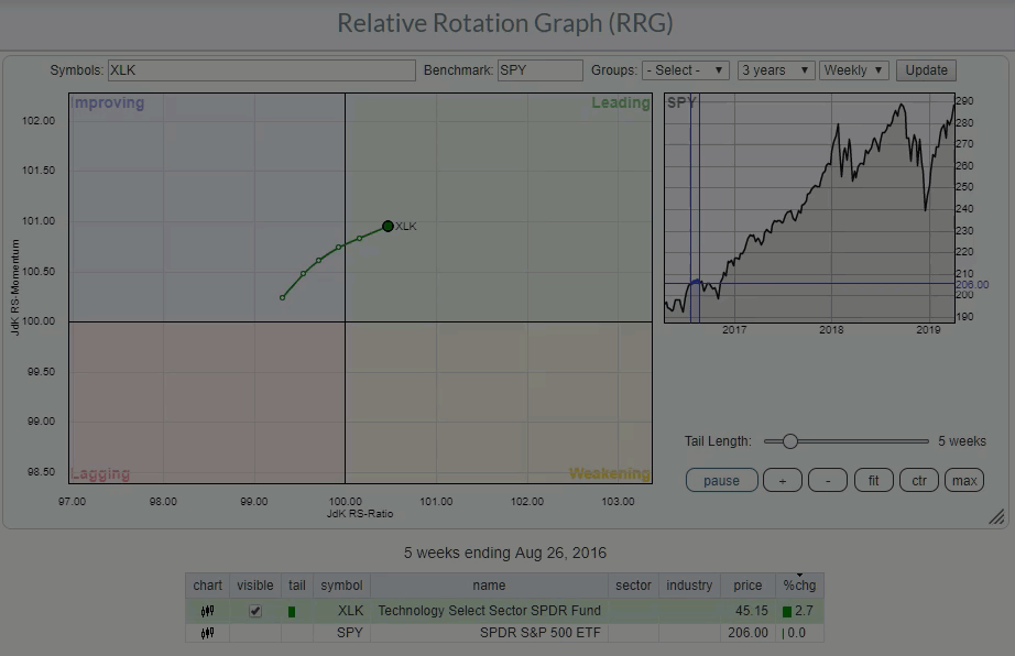
One of these curve balls is a situation wherein the rotation does not travel through all four quadrants as described above, but remains on one side, left or right, of the Relative Rotation Graph. The RRG at the top of this article shows the animated rotation of the Technology sector (XLK) against SPY. (If you click the animated image and open the live version, you will be able to control the speed of the animation by either dragging the slider in the benchmark graph or by using the left and right arrow keys.)
The animation starts in August 2016, where XLK crosses over from improving into the leading quadrant. XLK then moves through the leading quadrant until late November, where it crosses into the weakening quadrant. During the week of January 13, XLK passes into lagging, but almost immediately starts heading back up, returning directly to the leading quadrant without hitting improving. From 17 February 2017 onward up to the week of November 9, 2018, XLK remains at the right-hand side of the Relative Rotation Graph.
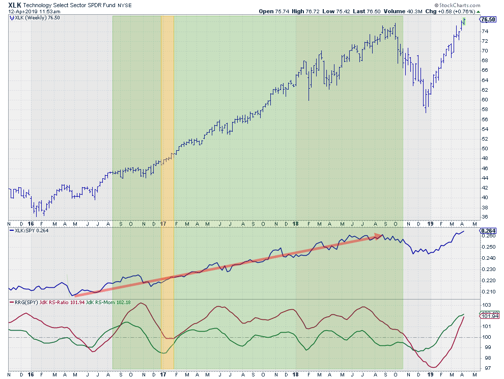
These periods are highlighted in the price graph above, combined with relative strength and RRG-Lines. The shaded area matches the uptrend in relative strength, indicated with the red arrow and perfect hindsight, with a small delay.
As you can see, the uptrend in relative strength is powerful, but still does not form a straight line. Just like every other trend, this one also has occasional dips to deal with. These dips result in higher lows after higher highs, causing the JdK RS-Momentum line to drop below 100 even as the RS-Ratio line remains comfortably above 100. This indicates that the uptrend is still intact.
The uptrend ends in November 2018 when the JdK RS-Momentum line fails to come back above 100, peaking lower 100 and subsequently dragging the JdK RS-Ratio line below 100 as well. That's the moment when XLK crosses over into the lagging quadrant, starting a 20-week journey through lagging and improving before returning to the leading quadrant just three weeks ago.
The ability to relate the rotational patterns on the RRG back to the price and to relative movement on a regular chart will help you better understand the interaction between the various sectors and their benchmarks.
I hope this article will help give you a better understanding of these relationships.
My regular blog is the RRG Charts blog. If you would like to receive a notification when a new article is published, simply Subscribe using your email address.
Julius de Kempenaer
Senior Technical Analyst, StockCharts.com
Creator, Relative Rotation Graphs
Founder, RRG Research
Want to stay up to date with the latest market insights from Julius?
– Follow @RRGResearch on Twitter
– Like RRG Research on Facebook
– Follow RRG Research on LinkedIn
– Subscribe to the RRG Charts blog on StockCharts
Feedback, comments or questions are welcome at Juliusdk@stockcharts.com. I cannot promise to respond to each and every message, but I will certainly read them and, where reasonably possible, use the feedback and comments or answer questions.
To discuss RRG with me on S.C.A.N., tag me using the handle Julius_RRG.
RRG, Relative Rotation Graphs, JdK RS-Ratio, and JdK RS-Momentum are registered trademarks of RRG Research.


