I've written before about RSI and the difference between "good" overbought and "bad" overbought. In the future, we may see the bond prices of these past few weeks used as examples of how to interpret extreme overbought conditions. A review of the stock-to-bond ratio shows how investors may have rotated too quickly from bonds back to stocks.
As interest rates dropped in recent months, the charts of bond ETFs appeared to be trending up and to the right with no end in sight. Frequent overbought conditions (RSI > 70) usually continued on to become extremely overbought (RSI > 80). This often leads to a brief correction preceding a resumption of the uptrend.
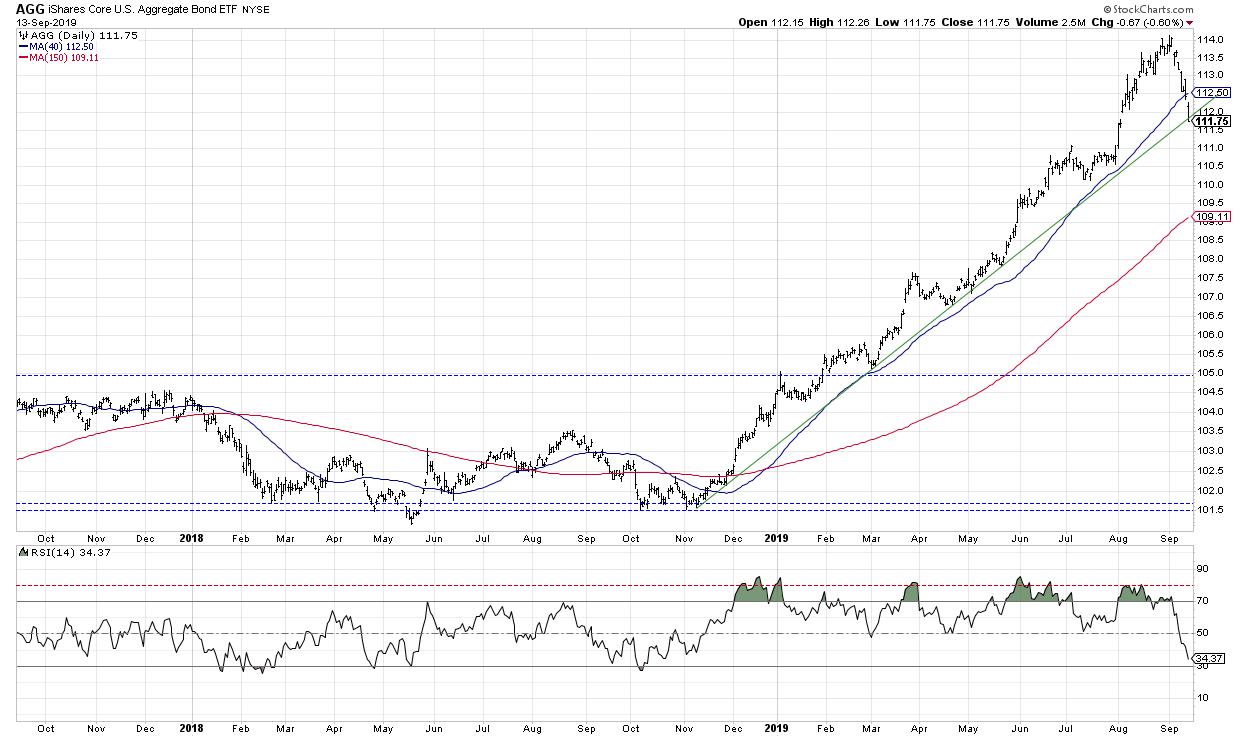
Something different happened in early September, when the push higher from a couple weeks ago was met with an RSI just above 70. Not extremely overbought, just regular overbought. That means probable downside corrective movement. This also resulted in a bearish divergence between price and RSI for most of the major bond ETFs, another confirmation of downside potential.
One of the charts I review regularly on The Mindful Investor ChartList is the ratio of stock-to-bond prices in the form of the SPY vs. the TLT.
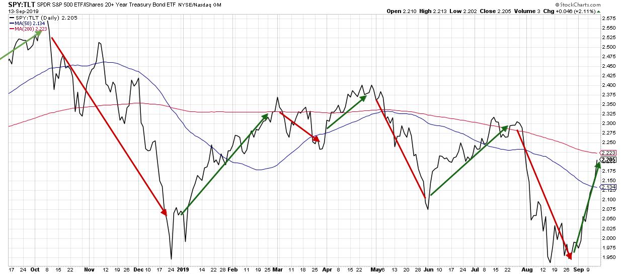
I've tracked the cyclical nature of this ratio by manually placing red and green arrows to signify downtrends and uptrends, respectively. What's funny is that the ratio has to move significantly in the opposite direction before I can bring myself to place the new arrow and acknowledge the recent trend reversal.
Just this week, I finally had to place the green arrow, representing the rotation away from bonds and into stocks. The question now is, "Is that sustainable?"
As a trend-follower, I have to assume that trends in motion will remain in motion. But a quick review of the RSI suggests that the ratio has moved just about enough in the current direction.
The AGG chart shown earlier indicates an RSI just above the oversold level, currently around 34. If the RSI dips below 30, the chart will jump on my radar for potential upside reversal.
The daily chart of the S&P 500 shows an RSI right around 60. While this is not near the overbought region just yet, it's right at the point where I'd expect a downside reversal if the broader market trend is down.
That is, in a bear market phase (which I would argue we're still in), market rallies often end with an RSI around 60. A failure around the RSI 60 level tends to confirm a corrective market phase, as bulls are unable to push the market any higher.
What's really interesting is we can apply RSI to the ratio itself.
Here we see an RSI around 66, similar to where the ratio topped out in April and July. The ratio and the RSI can certainly go higher, but it's telling that we're now in the range where this ratio has topped out earlier in the cycle.
Overall, trends can last way longer than investors often expect. But a quick read of momentum on stock prices, bond prices, and the stock-to-bond ratio tell me that a reversal from stocks back to bonds is possible and worthy of consideration.
RR#6,
Dave
David Keller, CMT
Chief Market Strategist, StockCharts.com


