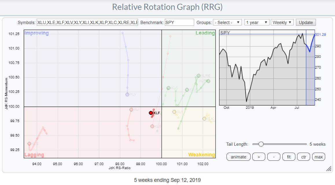
On the weekly Relative Rotation Graph for US sectors, the Financial sector is positioned just inside the lagging quadrant, very close to the benchmark (center of the chart). It arrived here after a nearly vertical drop from the improving quadrant after failing to rotate into leading.
During the last five weeks, the tail on XLF shrank to being one of the shortest on the plot, which means that the move (downward in this case) has stabilized and is in a position to turn around more easily.
From Weekly to Daily
To get a better grip on the rotational picture for Financials, we need to switch to the daily version of the RRG.
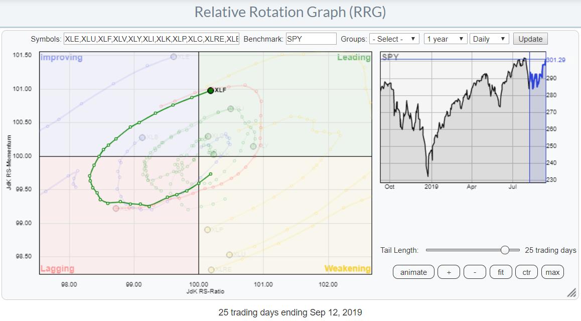
As you can see, the 25-day tail on the daily RRG above matches the 5-week tail on the weekly chart.
What we see here is a solid rotation for the Financials sector from weakening, through lagging and improving, into leading at a strong RRG-Heading. With the strong rotation on the daily RRG and the stable position on the weekly, I am inclined to look at the Financials sector from a (mildly) positive angle.
And Then To the Price Chart
As usual, the proof is in the pudding, which in our case is the price chart of XLF.
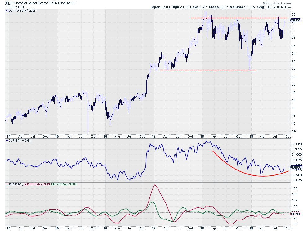
People who bought XLF at the start of 2018 and are still holding these positions are just about to break even. Since that time, the area between $28-29 has become a serious resistance level. As it represents a pretty major level, that area should be monitored closely in the coming weeks, as a breakthrough will very likely trigger an acceleration of the recent rally.
And Finally, Single Stocks
With improvements visible for the sector, it's always interesting to zoom in on the rotations of the individual stocks within said sector. The RRG below shows the rotations for the eight biggest stocks inside XLF.
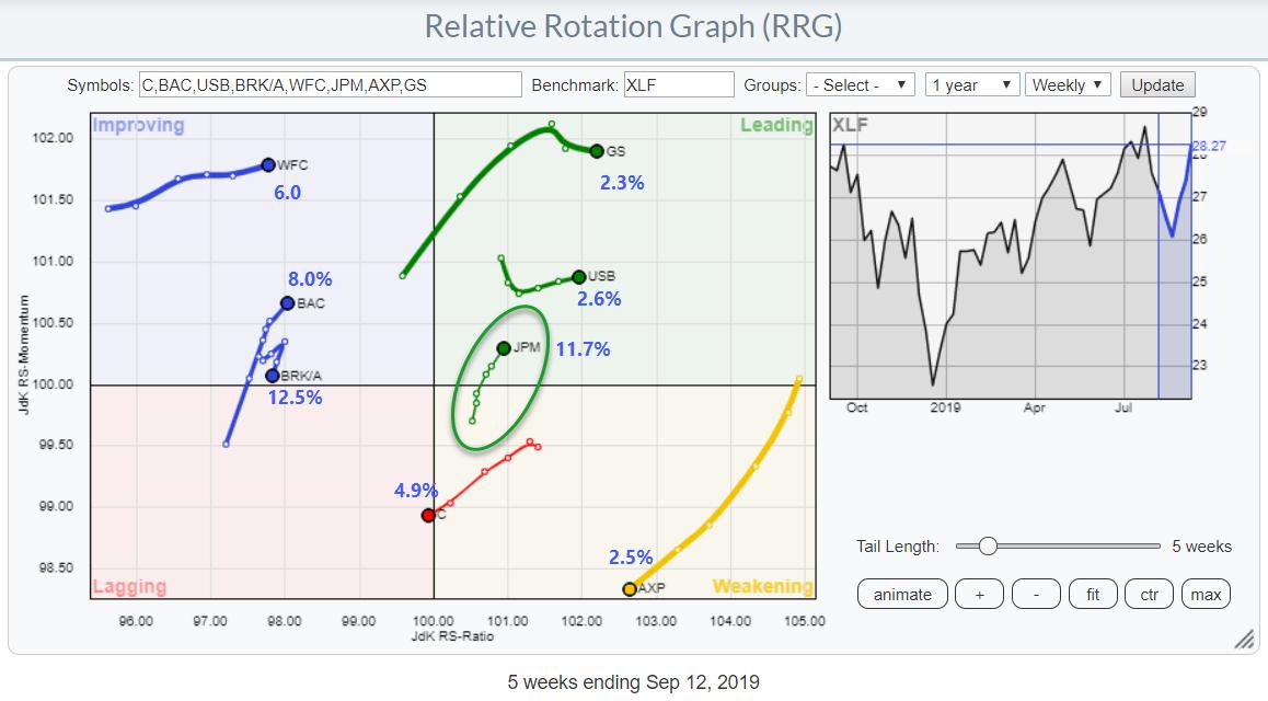
From this picture, we can immediately see that there are three stocks that should probably be avoided. These are BRK/A, which is inside the improving quadrant but rotating down and back into lagging; C, which is just entering the lagging quadrant; and finally AXP, which is inside weakening but rapidly deteriorating and rotating towards lagging at a negative RRG-Heading.
All other stocks on the plot are showing better tails and rotations. The one that interests me most at the moment is JPM.
JPM entered the leading quadrant in May, then continued to rotate positively for a few weeks before rolling over and dropping into the weakening quadrant in the middle of July. Following this corrective rotation, JPM recovered and curled up again, entering the leading quadrant while picking up pace on both axes.
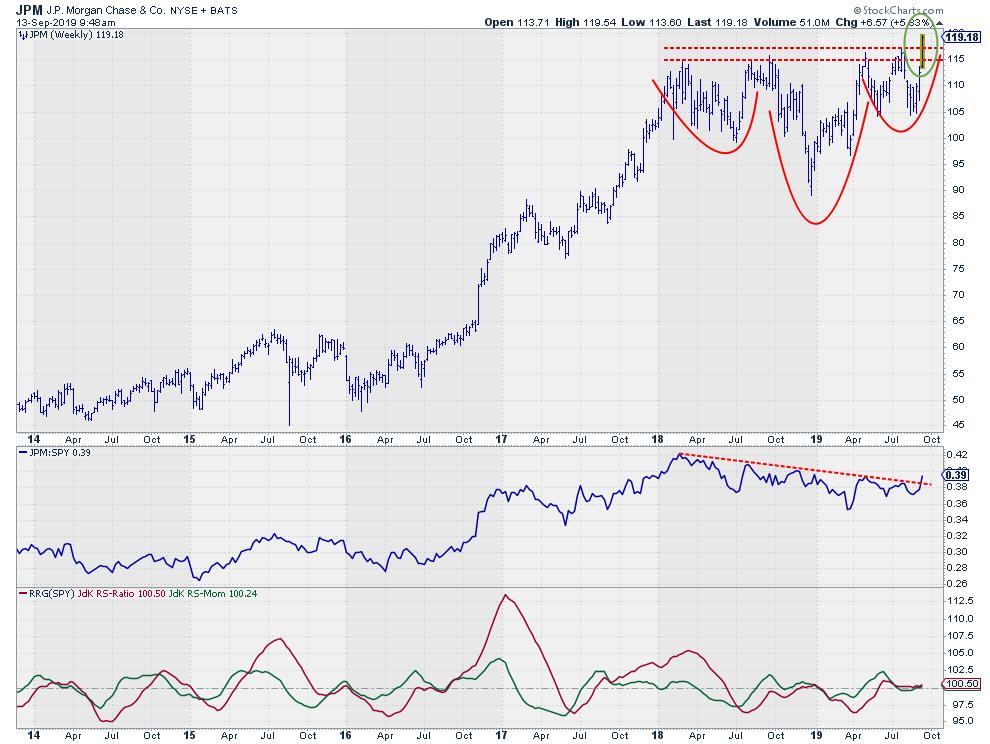
The weekly price chart only confirms the positive outlook for JPM. With only a couple of hours left before it completes the weekly bar currently in progress, JPM is now comfortable above its resistance area and breaking to new highs.
In combination with the strong relative (rotation) picture, it looks as if JPM is picking up a leadership role inside the financial sector.
My regular blog is the RRG Charts blog. If you would like to receive a notification when a new article is published there, simply "Subscribe" with your email address.
Julius de Kempenaer
Senior Technical Analyst, StockCharts.com
Creator, Relative Rotation Graphs
Founder, RRG Research
Want to stay up to date with the latest market insights from Julius?
– Follow @RRGResearch on Twitter
– Like RRG Research on Facebook
– Follow RRG Research on LinkedIn
– Subscribe to the RRG Charts blog on StockCharts
Feedback, comments or questions are welcome at Juliusdk@stockcharts.com. I cannot promise to respond to each and every message, but I will certainly read them and, where reasonably possible, use the feedback and comments or answer questions.
To discuss RRG with me on S.C.A.N., tag me using the handle Julius_RRG.
RRG, Relative Rotation Graphs, JdK RS-Ratio, and JdK RS-Momentum are registered trademarks of RRG Research.
Julius de Kempenaer
Senior Technical Analyst, StockCharts.com
Creator, Relative Rotation Graphs
Founder, RRG Research
Host of: Sector Spotlight
Please find my handles for social media channels under the Bio below.
Feedback, comments or questions are welcome at Juliusdk@stockcharts.com. I cannot promise to respond to each and every message, but I will certainly read them and, where reasonably possible, use the feedback and comments or answer questions.
To discuss RRG with me on S.C.A.N., tag me using the handle Julius_RRG.
RRG, Relative Rotation Graphs, JdK RS-Ratio, and JdK RS-Momentum are registered trademarks of RRG Research.


