Last Wednesday, I published an article in the RRG blog titled "Stocks Remain The Only Asset Class Inside The Leading Quadrant Going into December". As the title suggests, that article is primarily looking at the rotation for asset classes, with an in-depth look into the long-term chart of SPY.
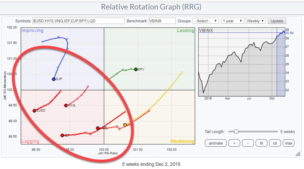
The Relative Rotation Graph above again shows the rotation (weekly) for asset classes. With SPY as the only one inside the Leading quadrant, what does that mean for other asset classes? Where do you go when you don't want to be 100% invested in stocks and would like to have some diversification in your portfolio?
In this graph, the benchmark is the 60/40 balanced portfolio (VBINX), which clearly shows that stocks are the best asset class from a relative perspective.
When we change the benchmark to $ONE, which shows us the trend in absolute terms ($ONE is a benchmark that never goes down), we see that all asset classes are at the right hand side of the RRG plot.
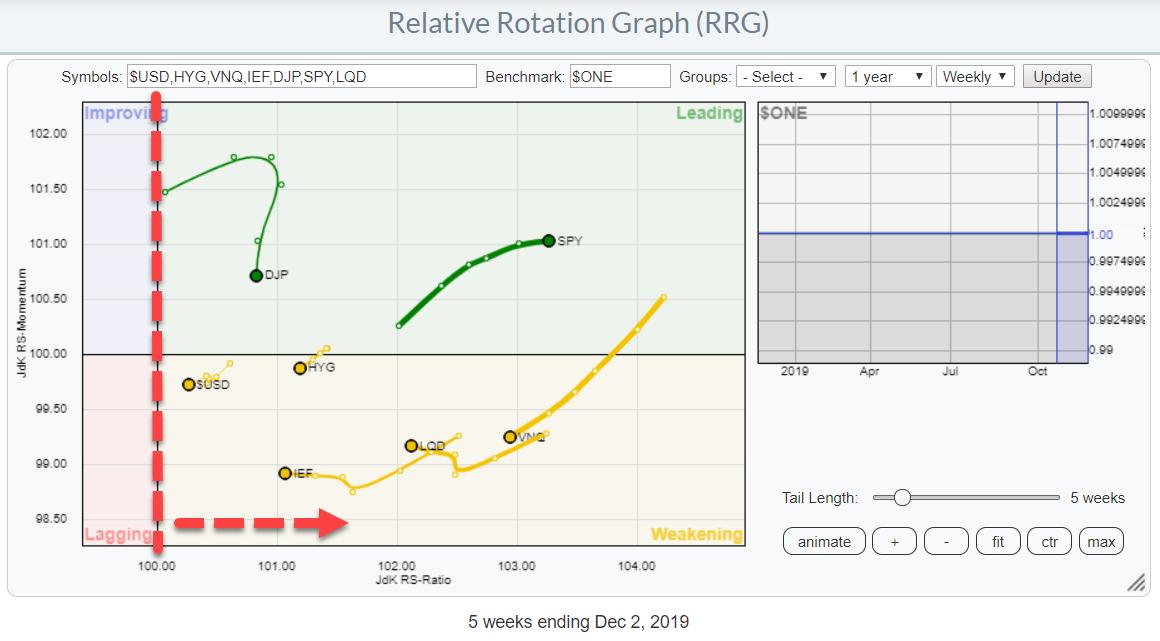
This means that the other asset classes, even though they are underperforming stocks, are still showing mildly positive trends. So they aren't as bad as it may seem at first sight.
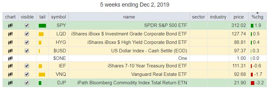
Over the past five weeks, LQD and HYG are also showing a positive return. The worst returns have come from Real Estate and Commodities. In particular, LQD is showing an interesting chart at the moment IMHO.
Adjusted Chart Shows Returns including Accrued Interest (dividends)
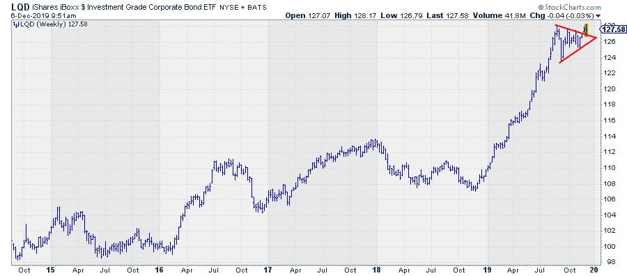
Above is the adjusted weekly chart for LQD, which shows the strong uptrend since the start of 2019 and the recent consolidation (pennant, triangle, etc.) which we are now leaving to the upside. That is good news, as it suggests a continuation of the uptrend.
As this is an asset class where a substantial portion of the return is coming from coupons (or dividends in the case of this ETF), I always, also, like to study the UNadjusted chart, as it shows the prices where people have actually traded this market.
That chart shows a very different, but also positive, picture.
Unadjusted Chart Shows Actually-Traded Levels
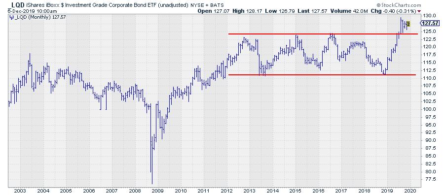
This the monthly chart. As you can see, LQD has been trading in a range since 2012 and broke out of that range to the upside four months ago, where it has been consolidating since. This is the consolidation pattern that is also visible on the weekly chart using adjusted data.
The unadjusted chart illustrates the levels where people have actually been trading this market. In bond terms, these are the clean prices, as opposed to the dirty pricing where accrued interest is included (the adjusted price series).
For support and resistance levels, these are the levels I like to watch, as they represent what is in peoples' minds.
The break that is visible is significant, as it is a breakout from a long sideways range, meaning that a lot of tension had been built up at the edges of that range and this situation is now broken. Usually, that means an acceleration in the direction of the break, in this case upward.
The width of the range is around $12.50; to achieve a price target, we may project that figure at the top of the breakout level. This exercise leads to a price target somewhere between $135.00 - $137.50.
So despite the fact that LQD is lagging behind SPY (stocks), for the time being it can still serve as a diversifier in your portfolio if you do not want to have 100% exposure to stocks.
--Julius
My regular blog is the RRG Charts blog. If you would like to receive a notification when a new article is published there, simply "Subscribe" with your email address.
Julius de Kempenaer
Senior Technical Analyst, StockCharts.com
Creator, Relative Rotation Graphs
Founder, RRG Research
Want to stay up to date with the latest market insights from Julius?
– Follow @RRGResearch on Twitter
– Like RRG Research on Facebook
– Follow RRG Research on LinkedIn
– Subscribe to the RRG Charts blog on StockCharts
Feedback, comments or questions are welcome at Juliusdk@stockcharts.com. I cannot promise to respond to each and every message, but I will certainly read them and, where reasonably possible, use the feedback and comments or answer questions.
To discuss RRG with me on S.C.A.N., tag me using the handle Julius_RRG.
RRG, Relative Rotation Graphs, JdK RS-Ratio, and JdK RS-Momentum are registered trademarks of RRG Research.
Julius de Kempenaer
Senior Technical Analyst, StockCharts.com
Creator, Relative Rotation Graphs
Founder, RRG Research
Host of: Sector Spotlight
Please find my handles for social media channels under the Bio below.
Feedback, comments or questions are welcome at Juliusdk@stockcharts.com. I cannot promise to respond to each and every message, but I will certainly read them and, where reasonably possible, use the feedback and comments or answer questions.
To discuss RRG with me on S.C.A.N., tag me using the handle Julius_RRG.
RRG, Relative Rotation Graphs, JdK RS-Ratio, and JdK RS-Momentum are registered trademarks of RRG Research.


