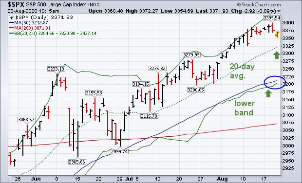
Last Friday's message applied Bollinger bands to the S&P 500 and cautioned that the market looked a bit stretched over the short-run. Prices have since backed off slightly from the upper band, but remain well above the dashed 20-day average (green arrow) which means that the uptrend is still intact. The upper band is plotted two standard deviations above the 20-day average. During uptrends, prices will fluctuate between the two upper lines. Pullbacks from the upper band sometimes lead to a retest of the 20-day line which happened in late July. More serious pullbacks often drop all the way to the lower band which happened during June. It's also worth noting that the lower band coincides closely with the blue 50-day average (blue circle) which should provide additional support during any market pullback. So far, the pullback from the February peak is relatively minor and doesn't imply that the market uptrend is in danger. Bollinger bands, however, offer some perspective on the market's short-term trend and show where potential support levels lie if a pullback were to occur.
 Chart 2
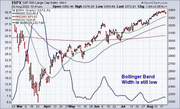
Last Friday's message explained that Bollinger band width measures the difference between the two outer Bollinger bands. And helps measure the level of market volatility. As a rule, lower volatility (narrower band width) supports higher prices, while rising volatility (wider band width) is a warning of lower stock prices. The blue line in Chart 3 shows Bollinger band width still at a relatively lower level which is supportive to stock prices. Any spike in that line, however, would signal the need for more caution.
 Chart 3
Editor's Note: This is an article that was originally published in John Murphy's Market Message on Thursday, August 20th at 10:46am ET.
