Some Indicators Have Moved to Levels Consistent with a Low
Most corrections in a bull market fall in the 5-10% range. On Thursday, the NASDAQ is down 10% intraday and the S&P Composite 7%, so it's not unrealistic to conclude that the correction might be over. Let's take a look at some indicators and find out.
The 10-day ROC for the NASDAQ VIX (Chart 1) and that of the NYSE (Chart 2), for example, both look as if they have peaked from a level that has consistently flagged a short-term buying opportunity. Valid signals have been flagged with the solid green vertical lines, whereas the failed ones are represented by a dashed red variety. This approach is clearly not perfect, but these charts do suggest that a good case can be made for the end of the correction.
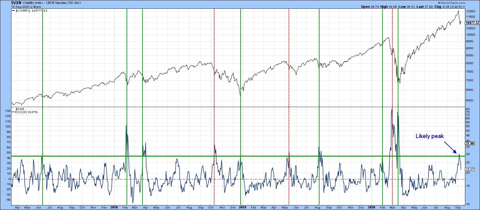 Chart 1
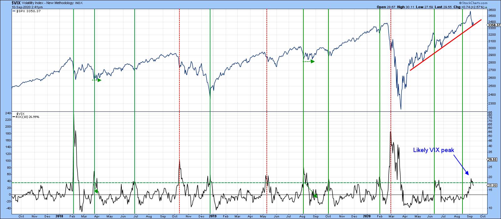 Chart 2
Others Suggest the Likelihood of More Corrective Activity
On the other hand, Chart 3 tells us that the percentage of NASDAQ stocks above their 200-day MA has just triggered a sell signal by dropping below its 30-Day MA. Some of these signals, such as last January's and that of July 2018, have been pretty timely. Others have not, but even the less consequential ones have usually been followed by a month or more of weakness. Remember, "weakness" does not necessarily mean a lower Index, but it does imply a more challenging trading environment if the trend of fewer stocks trading above their 200-day MA's extends.
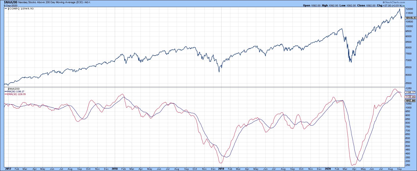 Chart 3
My Dow Diffusion Indicator (Chart 4), which monitors Dow stocks in a positive trend, has been indecisive for the last few months. However, it has just crossed below its 15-day MA for the third time since the rally began in March. Moreover, recent action has been quite indecisive, even as the DJIA itself took out its June peak. The indicator remains at an elevated level compared to the low-level reversals that have usually signaled the end of a correction. It's not mandatory for it to drop below the dashed green oversold line, but most rallies have been signaled when it has been trading at a lower level than it is currently. My basic conclusion is that this indicator is hinting at further weakness going into the fall.
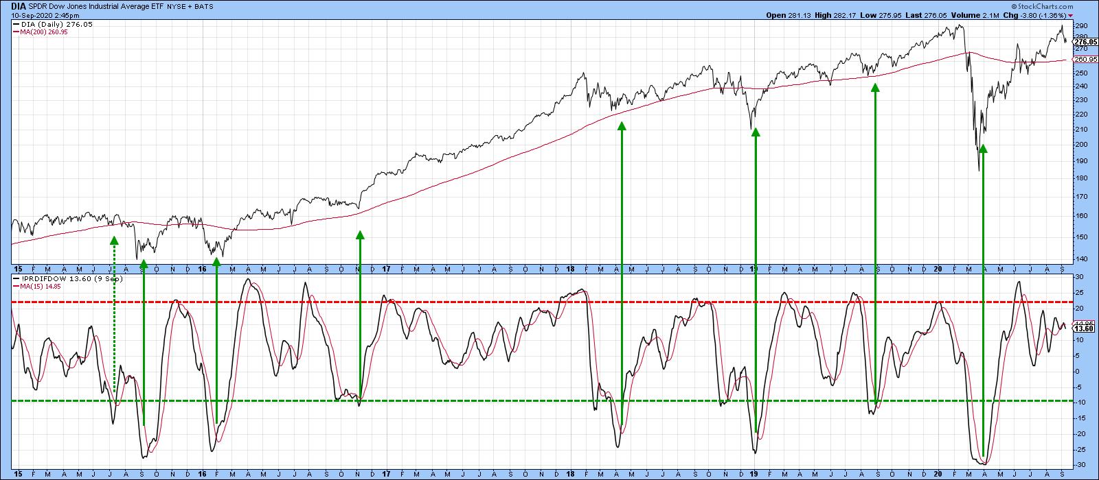 Chart 4
The idea of further corrective activity is suggested by Chart 5, which shows that the NASDAQ experienced an outside bar for the first week in September. An outside week totally encompasses the trading range of its predecessor and indicates a change in the buyer/seller relationship in favor of sellers. The power of outside patterns can be seen from the bullish price action in late March. This was an unusually strong after-effect, which I am not expecting in the case of last week's bearish pattern. However, since the outside week was observed for the World and most US aggregate indexes, it is likely to act as a damper over the next few weeks.
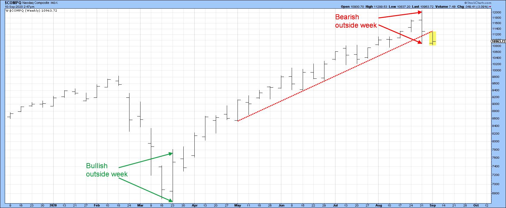 Chart 5
In summary, Charts 1 and 2 show some promise. However, the bulk of the evidence suggests further corrective activity lies ahead. That could either take the form of downside or range-bound activity. For those focusing on the long-term, this should not be a problem, as the vast majority of primary trend indicators remain positive. Indeed, some of them are deeply oversold. When they turn, likely after the correction has run its course, this should be really positive for US equities.
Editor's Note: This is an excerpt of an article originally published in Martin Pring's Market Roundup on Thursday, September 10th at 5:19pm ET. Click here to read the full article, which includes charts 6-8 and a discussion of what indicators should be monitored for a possible upside reversal.
Good luck and good charting,
Martin J. Pring
The views expressed in this article are those of the author and do not necessarily reflect the position or opinion of Pring Turner Capital Group of Walnut Creek or its affiliates.
