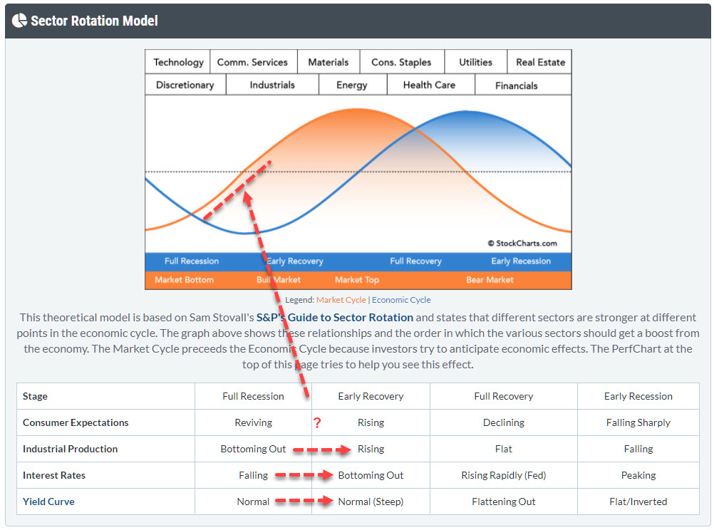
 With markets flying everywhere from day to day, I want to take a step back in this article and look at the bigger economic cycle picture, in order to see if we can fit things into the "Sector Rotation Model" as it can bee seen under the PerfCharts.
This time, I will not be focusing on the performance of the various sectors in different parts of the economic cycle, but will try to paint a possible scenario from looking at the movement in the macroeconomic variables that are listed in the table below the cyclical graph.
There are various angles from which you can look at this model. One way I often use is to look at the actual rotations of the various sectors on a Relative Rotation Graph and see if I can find/match the economic condition that would be expected in that situation. For example, if Materials, Staples, Energy and Health Care are the strongest (out)performers and the other sectors are lagging, that suggests the market is at or approaching a top.
The angle I'd like to take here is to (also) look at the macroeconomic variables that dictate the phase of the cycle.
One of the things that I use a lot in terms of intermarket analysis and examining at the big picture is the yield curve. And StockCharts has a great "dynamic yield curve" tool which is, I think, underestimated and undervalued.
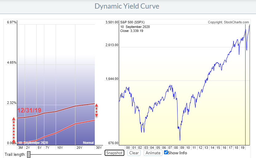
This Yield Curve chart above shows the YC as it was shaped at the end of last year (dark red) and how it is shaped now (light red).
What you can see is that yields in general have come down. The whole curve is lower, on all maturities, than it was 9 months ago. But the curve has also steepened. The decline at the shorter end of the curve is much bigger than the decline. If you would like to learn more about the dynamics of the yield curve you can find a ChartSchool article on the subject here.
Going back to the table, in the Sector Rotation Model we find that a steepening curve (moving from Normal to Normal (Steep)) is a characteristic that occurs during phase where the economy moves from Full Recession to Early Recovery.
Then there is the behavior of Interest Rates.
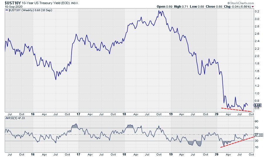
The chart above shows the yield on 10-year US Treasuries. And where it has come off hard since the end of 2018, it now looks as if markets are trying to find a floor around levels we have seen earlier in the year, and the positive divergence between RSI and yield is clearly visible.
I prefer to look at "tradable" instruments and so, for the interest rates, that means a bond chart.
The chart below shows the price of the GOVT ETF, which is an ETF that covers all maturities on the curve.
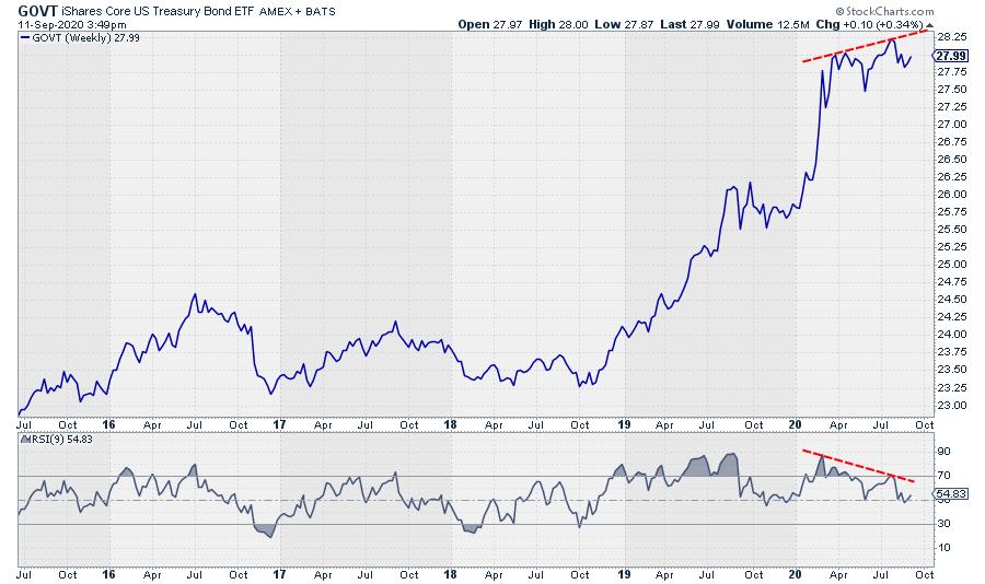
Obviously, this chart is inverted from the yield chart, but certainly confirms the toppish characteristics of bonds at the moment. The divergence, in this case negative, is even more pronounced than on the yield chart. So it certainly looks as if yields are trying to put in a bottom and start moving higher - which is also a characteristic of an economy that is shifting from Full Recession towards Early Recovery.
The third one is Industrial production. This is a metric that is a bit harder to analyze as it only has monthly data points, meaning it takes longer before trends become visible.
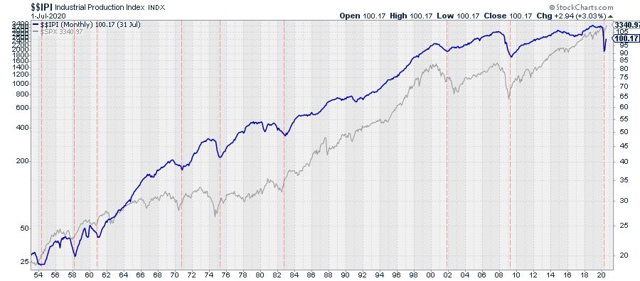
This chart shows $$IPI with the S&P 500 plotted behind it since 1954. I have eyeballed in a few vertical red dotted lines at the significant lows in the Industrial Production Index. These lows certainly do not match with lows in the market 100% of the time, but I think we can agree that it certainly is not a negative for the market.
As I said, this index is only updated only once a month, so we will have to see how this comes out on the next update and if it will still be rising, but, from a historical perspective, such a quick up-down swing does not seem to happen very often here.
Hence, this metric also suggests that the economy is moving from Full Recession to Early Recovery.
I'll be following these developments closely in coming weeks / months and see how things develop. But, for now, I am going to keep an open mind to the possibility of an extension of the rally that has been underway since March!
My regular blog is the RRG Charts blog. If you would like to receive a notification when a new article is published there, simply "Subscribe" with your email address.
Julius de Kempenaer
Senior Technical Analyst, StockCharts.com
Creator, Relative Rotation Graphs
Founder, RRG Research
Host of: Sector Spotlight
Please find my handles for social media channels under the Bio below.
Feedback, comments or questions are welcome at Juliusdk@stockcharts.com. I cannot promise to respond to each and every message, but I will certainly read them and, where reasonably possible, use the feedback and comments or answer questions.
To discuss RRG with me on S.C.A.N., tag me using the handle Julius_RRG.
RRG, Relative Rotation Graphs, JdK RS-Ratio, and JdK RS-Momentum are registered trademarks of RRG Research.
