Every first Tuesday of the month in Sector Spotlight, I go over the completed monthly charts for the prior month.
Sometime mid-2019, when there was a lot of discussion on the yield curve being inverted, I started to include a long-term chart of the yield-curve in my monthly overviews. And, prior to that, I had already written a few articles on it as well.
Just to be clear when I talk about the "yield curve" when plotting "regular" charts, I refer to the difference between 10- and 2-year yields. The Yield Curve, as such, naturally includes all bond maturities at the same point in time, plotted on one graph. You can learn more about the yield curve and what it means in this ChartSchool article.
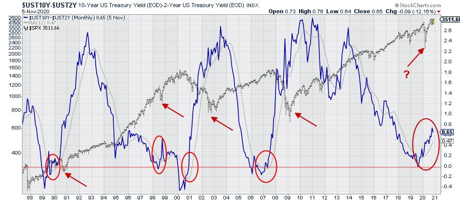
The chart above shows the 10-2 yield curve (difference) as the thick blue line, with a grey 12-month moving average. The horizontal red-line is plotted at zero. Below zero, the yield curve is "inverted."
Behind the yield curve chart, I have plotted the monthly bar-chart of the S&P 500 on a log-scale. The red oval annotations mark the times when the yield curve crossed back above zero after an inversion, while also moving above its twelve-month moving average and starting to accelerate.
Here's what I thought/think to note every time this sequence of events plays out:
- YC inversion
- YC back to normal
- YC crosses above its 12-month SMA
- YC starts to accelerate
The S&P goes into or is in a correction initially, then rallies when the pace of the steepening slows down, turns around and starts to flatten again.
As it is very long term and very rough analysis, it is hard, if not impossible, to accurately pinpoint a specific moment or signal, but I do feel it is something that we as analysts/investors at least should be aware of.
In the charts below, I have zoomed in on the individual occasions when this sequence of events played out.
1989-1990
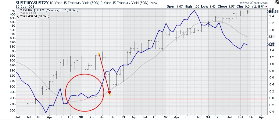
After the inversion in the first half of 1989, the yield curve turned back to flat/normal and, when the steepening started to accelerate, the market went through a decline. This was around the time of the first Gulf War.
1998-2000/2001
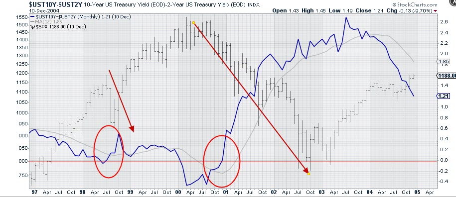
In 1998, we saw a short inversion and, when the acceleration of the steepening started, the decline was already underway and it ended rapidly. This was the first serious correction in what we know as the "tech-bubble."
A more serious inversion occurred in 2000. At the end of the year, the curve went back to flat/normal and started to accelerate higher after breaking above its 12-month SMA. The S&P already had started to decline off the peak a few months prior, but seriously accelerated lower from early 2001 onwards.
2007
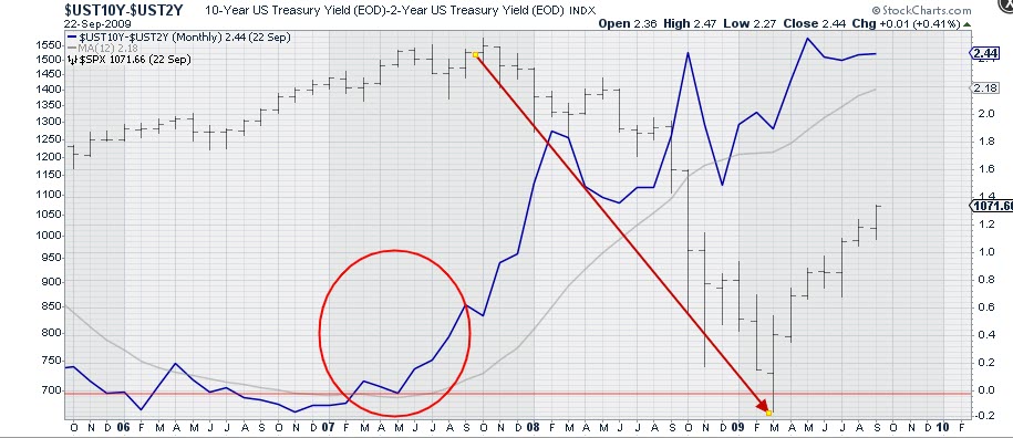
The sequence played out again in the first half of 2007. Coming out of inversion and breaking above its 12-month SMA, the 10-2 curve started to accelerate in the summer of 2007. The decline, as we know, started in the first half of 2008 and really accelerated in the second half of the year when the financial crisis hit hard.
2019-2020
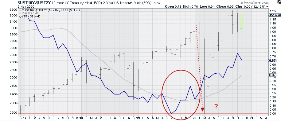
And now we are here. We saw an inversion of 10-2 year yield in the middle of 2019, albeit only minimal. In November, the 12-month SMA was broken upward and the curve started to steepen/accelerate just before the Feb/March decline occurred.
Since then, the S&P has rallied nicely, but the steepening of the curve also started to accelerate.
So what I am wondering now is -- was that Feb/March move "the decline"? Or do we have another (potentially more serious) dip ahead of us?
As I said, it's a very rough analysis and it's difficult to mark or pinpoint specific points based on this. From a high-level perspective, however, I do think it is something that we at least should be aware of, in order to be able to keep an open mind when this very strong market, because that is what it still is, starts sending us subtle messages that can easily be overlooked when assuming everything is looking good....
RRG
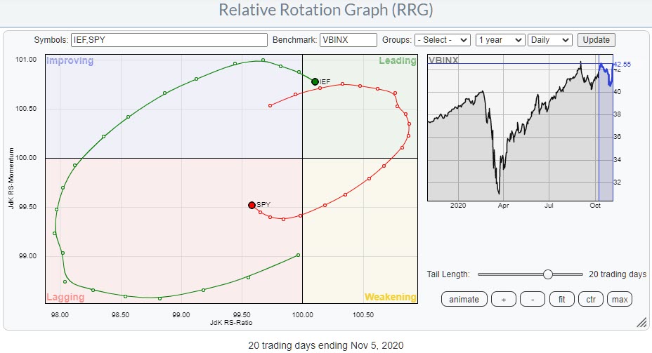
On the weekly RRG, stocks are still in a rotation through weakening at the right side of the graph, while bonds are in an opposite move within improving. The shorter daily RRG shows the last four weeks of rotation for both asset classes and the (temporary) relative weakness for stocks vs. bonds during that period.
But, as you can see, momentum has already started to pick up for stocks and (vice versa) drop off for bonds. Assuming a continuation of this rotation, the odds are in favor for stocks to complete a rotation at the right hand side of the RRG and rotate back to leading without hitting lagging.
So the bullish outlook for stocks and the stock/bond ratio in favor of stocks remains intact. Just be aware of the steepening yield curve that may throw a spanner in the works.
#StaySafe, --Julius
My regular blog is the RRG Charts blog. If you would like to receive a notification when a new article is published there, simply "Subscribe" with your email address.
Julius de Kempenaer
Senior Technical Analyst, StockCharts.com
Creator, Relative Rotation Graphs
Founder, RRG Research
Host of: Sector Spotlight
Please find my handles for social media channels under the Bio below.
Feedback, comments or questions are welcome at Juliusdk@stockcharts.com. I cannot promise to respond to each and every message, but I will certainly read them and, where reasonably possible, use the feedback and comments or answer questions.
To discuss RRG with me on S.C.A.N., tag me using the handle Julius_RRG.
RRG, Relative Rotation Graphs, JdK RS-Ratio, and JdK RS-Momentum are registered trademarks of RRG Research.


