Since its intraday high (set in August), the price of the SPDR Gold Trust, the GLD, has fallen close to 15%. That's not enough to qualify for a bear market under the media's arbitrary and totally useless 20% standard. However, it is enough for bulls like me to get concerned. From a contrary point of view, that's probably a really bullish factor, but what are the charts saying?
The Long-Term Picture
To add some perspective, Chart 1 shows the inflation-adjusted price back to the 1970s. It recently rallied back to the extended line, joining the 1980 and 2011 peaks, then backed off. That's a perfectly normal phenomenon for an overstretched market running into resistance. No surprises there!
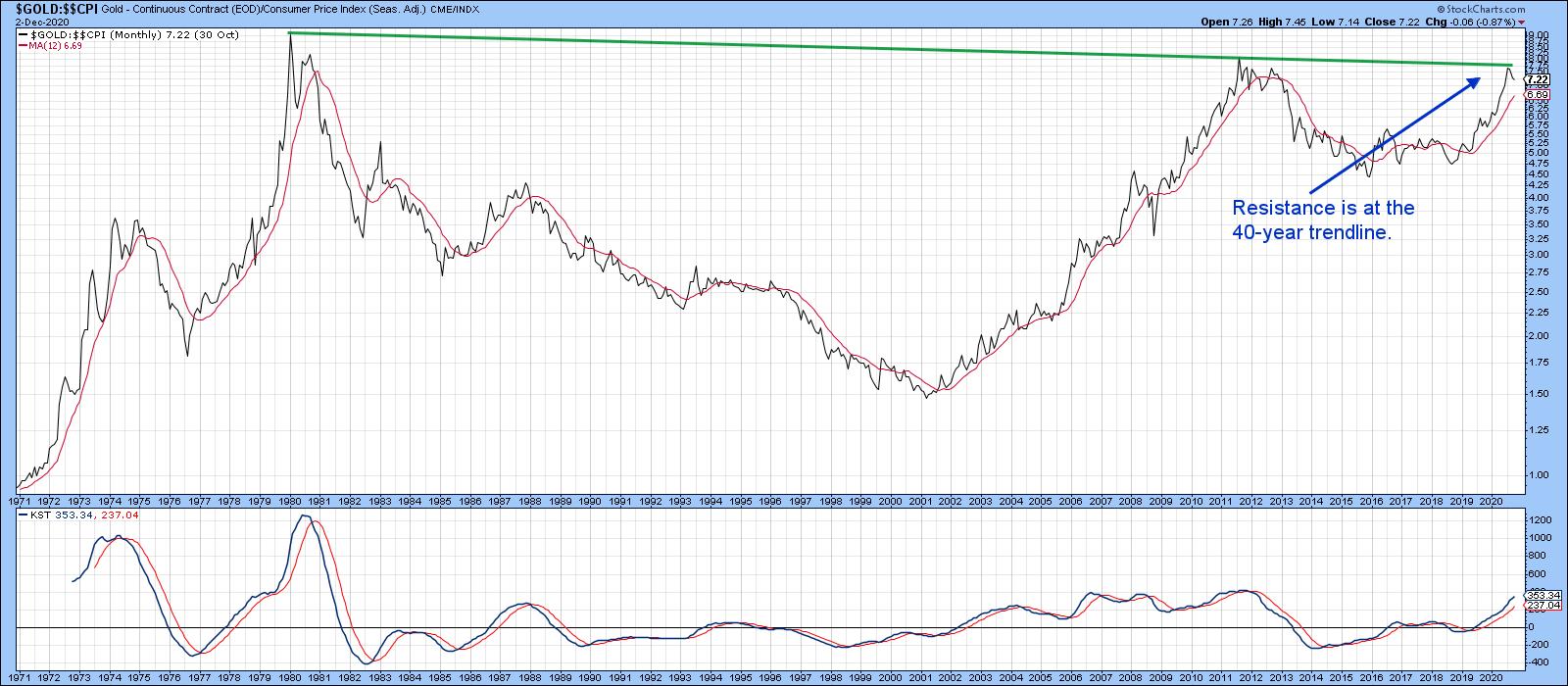 Chart 1
Chart 2 also monitors the trend from a longer-term perspective by tracking the quarterly price. A comparison of the two charts demonstrates the devastating nature of inflation, as the nominal price in Chart 2 is way above its 1980 and 2011 highs. Compare that to the inflation-adjusted series which, at its recent peak, was slightly below them. Over the very long haul, gold does represent a hedge against inflation, but there can be long periods, such as that between 1980-2011 and 2011-2020, where that hedge is barely working. Timing is everything!
But I digress. The green-shaded areas in Chart 2 tells us that, when the Coppock Indicator is experiencing a rising slope, it's a good time to own the yellow metal. Equally as important, downside reversals in the indicator tend to occur near primary trend peaks in the price. Right now, the Coppock is still accelerating to the upside, arguing in favor of the integrity of the bull trend.
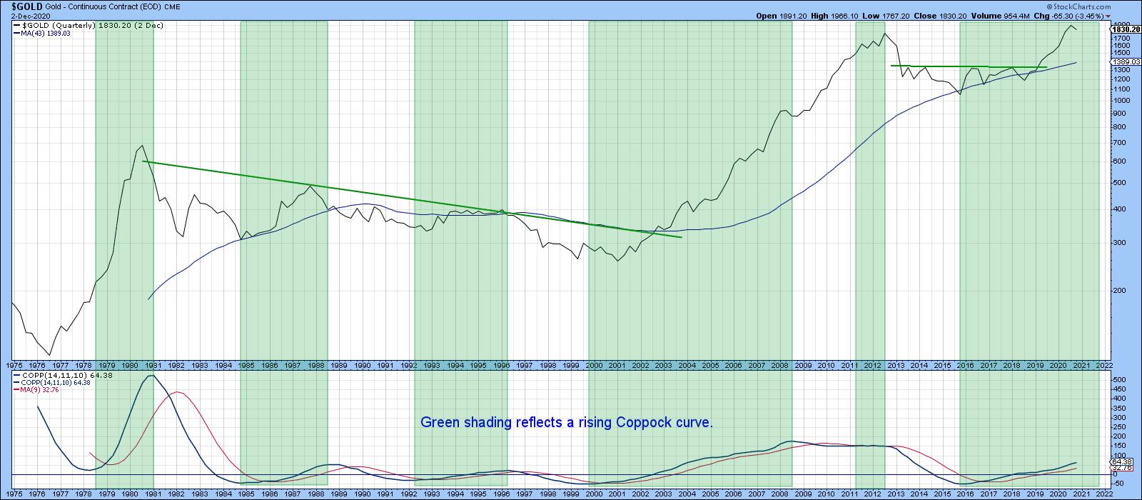 Chart 2
Chart 3 features the monthly price, along with a PPO, using the 6/15 parameters. Once again, the green shadings indicate bullish periods. That's when the 6-month EMA is above its 15-month counterpart. There are two things I like about this approach: there are very few whipsaws (they have been flagged with the red and green arrows), and sell signals have usually occurred near the final peak, thereby protecting most of the profits. The last couple of months have seen the oscillator top out. However, it is still a long way from a negative zero crossover that would suggest a primary bear market.
There is one other point before we leave this chart, which lies in the fact that the price is very close to its 12-month MA. No timespan is perfect, but this one works reasonably consistently over a wide swath of markets. That makes it a key benchmark and is a prime reason why it's too early to give up on the bull market.
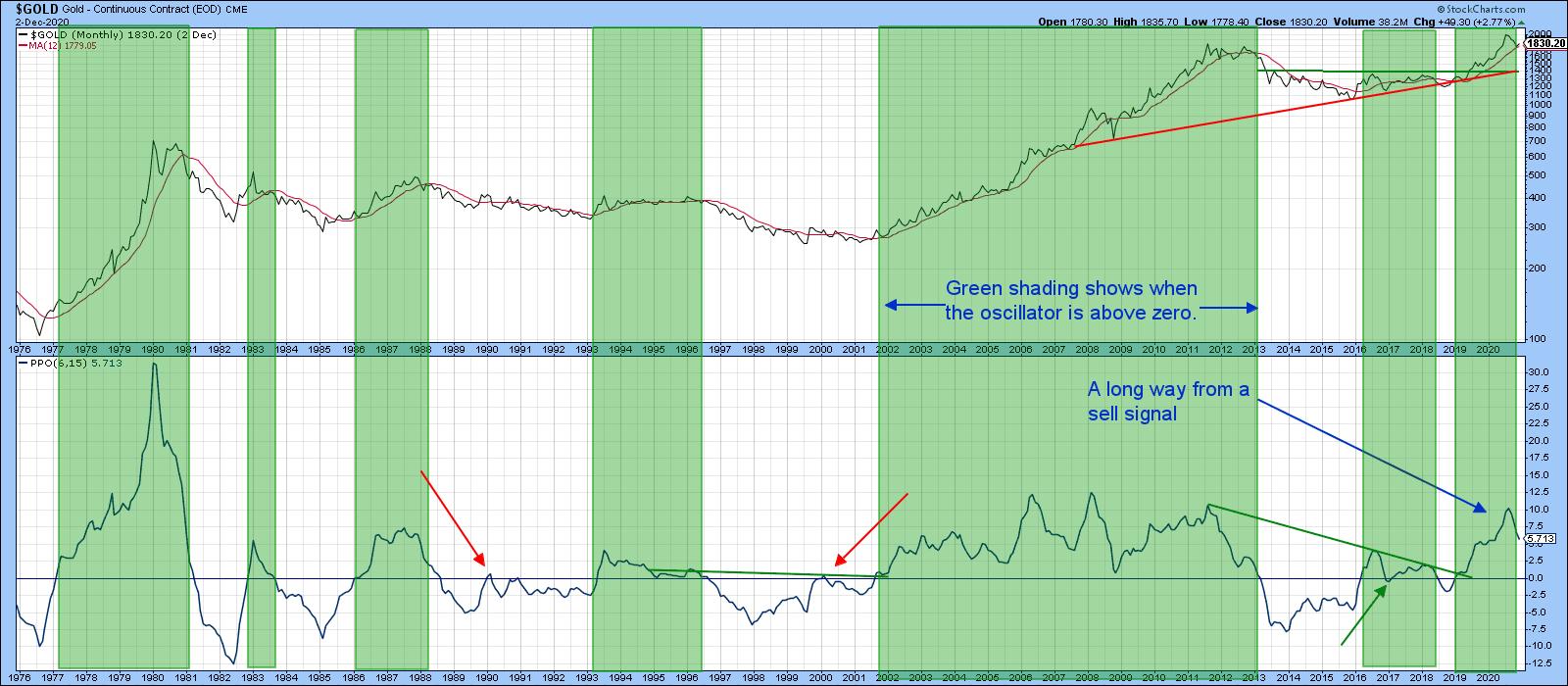 Chart 3
The Intermediate and Short-Term Trends
Chart 4 compares the price of the SPDR Gold Trust (GLD) to its short- and intermediate-term KSTs. The first thing to note is that the price remains above its 65-week EMA. Second, the correction has taken the form of a downside zig-zag, which to me has more of the characteristics of a counter-cyclical move than a pro-trend one. If gold is topping out, I would expect to see some range-bound action involving a test of the 2020 high followed by a move to new lows. That obviously hasn't happened yet. What does concern me is the fact that the intermediate KST has violated an up trendline and is still moderately overbought. If this is still a bull market, where downside corrective action is usually limited, that won't be a problem. Examples of a contained intermediate correction in an ongoing bull market occurred in the summer of 2019 and in the early part of this year.
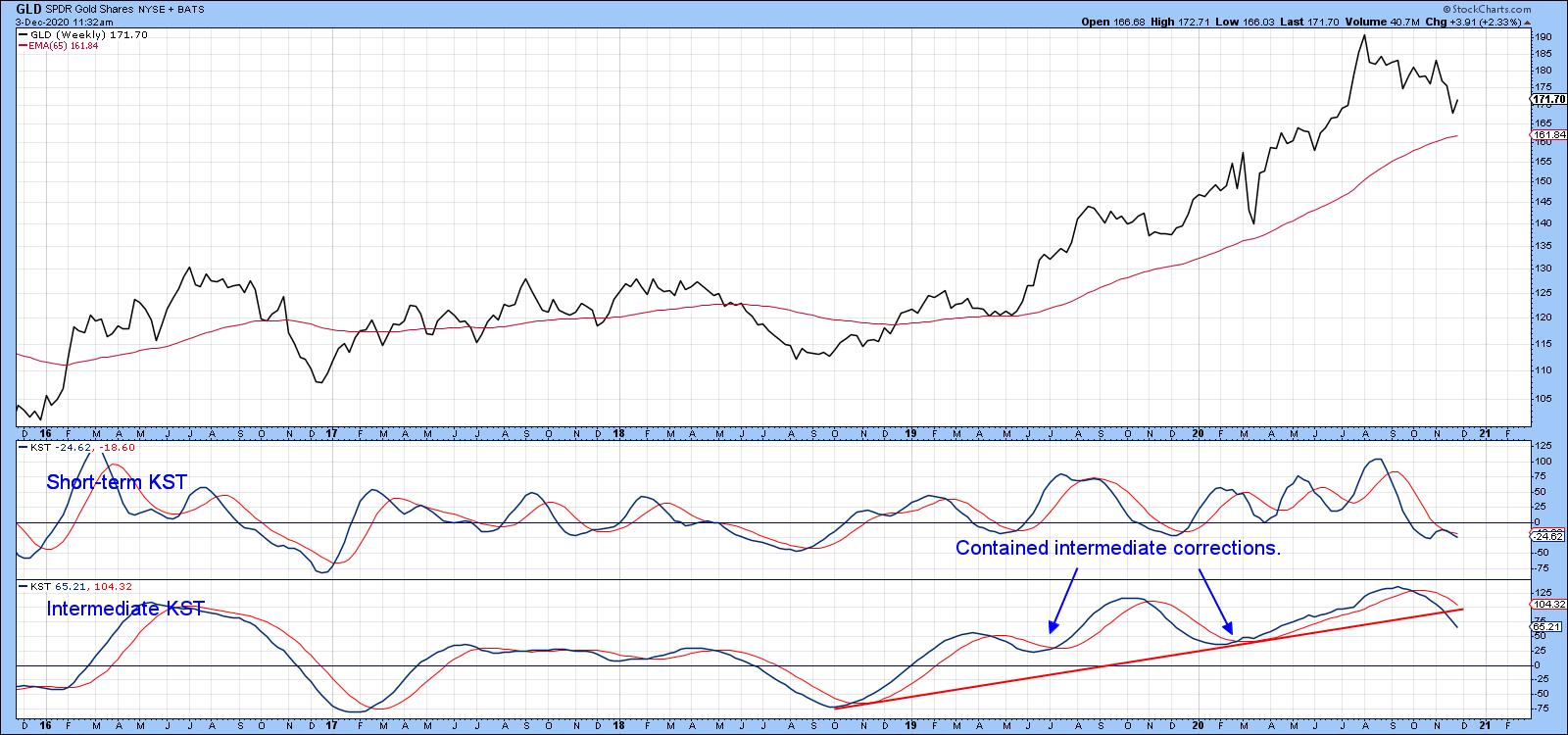 Chart 4
Chart 5 suggests that correction, at least in terms of magnitude, may be over. Here is my reasoning. First, the RSI is bouncing from an oversold condition, which is a bull market characteristic. Second, the price violated its red support trendline and the 200-day MA. However, those breaks did not hold, as the price has now moved back above the line and MA. This cancels out the false upside move that developed at the red-dashed arrow in November. What's now required is a rally that surpasses the green down trendline and 50-day MA, which are reinforcing each other as a resistance zone around the $177 area. Only when that happens can we be more confident that the correction is over and the bull market set to resume.
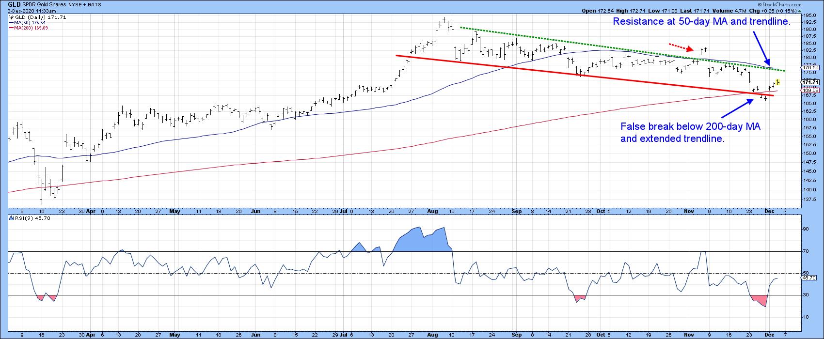 Chart 5
Editor's Note: This is an excerpt of an article originally published in Martin Pring's Market Roundup on Thursday, December 3rd at 1:02pm ET. Click here to read the full article, which includes charts 6-7 and a discussion of $GOLD in relation to Silver (SLV) and Platinum (PPLT).
Good luck and good charting,
Martin J. Pring
The views expressed in this article are those of the author and do not necessarily reflect the position or opinion of Pring Turner Capital Group of Walnut Creek or its affiliates.