This article is about using charts in different time spans to gain a better perspective on an individual stock or any other market. I'm using copper producer Freeport McMoran (FCX) to make that point. I'm picking that stock because it's Wednesday's biggest percentage gainer in the S&P 500 and has already had a strong run. Previous messages have shown the price of copper rising to the highest level in seven years which has been the main driver behind FCX and other copper producers. So this isn't new story. The question here is whether the stock is too high to buy; or whether there's more upside to come. The daily bars in Chart 1 show the stock rising to a new 52-week high which makes it look pretty expensive. Its weekly chart offers a better perspective.
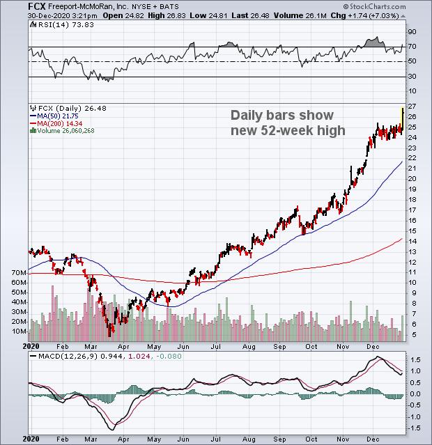 Chart 1
The weekly bars in Chart 2 paint a more bullish picture for Freeport McMoran. It shows the stock rising above its early 2018 peak near 19.00 to complete a major bottom. And suggests that the stock has more upside to come. Measuring the height of the bottoming pattern from peak to trough (19 - 3) and adding that to the breakout point near 19 suggests that FCX has the potential of eventually reaching its 2014 high near 36. Its weekly RSI line is in overbought territory which may slow the advance temporarily. But the chart suggests that FCX is in the early stages of a new bull run. Its monthly chart also appears to support higher prices.
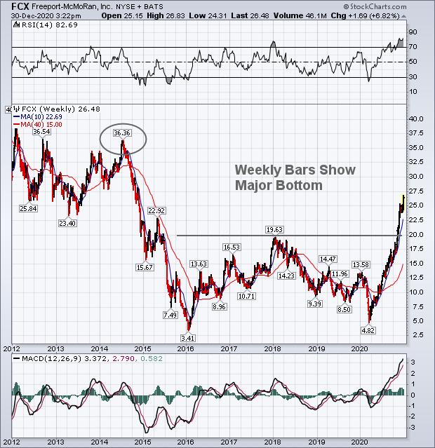 Chart 2
Monthly charts spanning a decade or more usually provide the best perspective on any chart. And that may be the case here. The monthly bars in Chart 3 show the bullish breakout in FCX in better perspective. Not only has the stock risen to a six-year high to complete a major bottom; a major down trendline extending back to 2011 has been exceeded. The chart shows the next potential upside target near 36 more clearly. It also shows the stock peaking twice near 48 during 2008 and 2011. This longer range perspective suggests that the copper producer is still in the early stages of a new bull trend, and probably has a lot further to run.
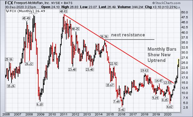 Chart 3
Editor's Note: This is an article that was originally published in John Murphy's Market Message on Wednesday, December 30th at 2:56pm ET.