Last week, I recorded a 40-minute presentation with my friend Bruce Fraser on the 2021 outlook. It's currently being featured on StockCharts TV and calls for a significant extension to the bull market. We present a number of long-term charts featuring several indicators whose bullish signals have consistently been followed by a year or so of rising equities. I have to add that none of them are perfect, so there are no guarantees.
A typical example is featured in Chart 1, which compares the KST for the ratio between the S&P and the 30-year bond price with the S&P itself. When this smoothed momentum indicator crosses above its MA, it signals that the odds favor stocks outperforming bonds for an extended period. It also indicates that stocks are likely to rise in their own right. The reason lies in the fact that a liquidity injection at the beginning of the cycle drives both stocks and bonds higher. However, when the ratio between them reverses, it means that stocks realize that the economy has the momentum to grow on its own, with little or no help from the central bank. This rotational concept is explained here. In most business cycles, the transition in relative performance develops early on, hence the tendency for a year or more of rising equities following such signals.
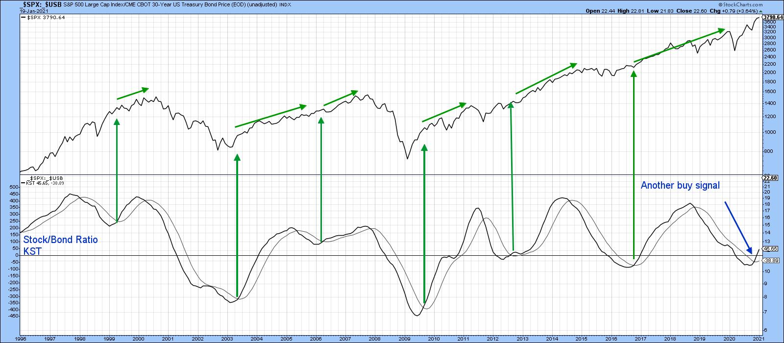 Chart 1Chart 2 just compares the ratio to its Special K (SPK). The thick green and red arrows indicate that both consistently reverse at more or less the same time. Those reversals are an easy thing to spot with the benefit of hindsight. Consequently, trendlines have been inserted to demonstrate how they might be identified in real time. Note that the 2019-2020 down trendline was recently breached. That action has now been confirmed by the ratio itself. The green resistance trendline marks the upper end of a right-angled broadening formation, a particularly bullish pattern. It's really a reverse head-and-shoulders that does not have enough time to complete a right shoulder. To see how powerful these patterns can be, look no further than the breakout that took place in 2009.
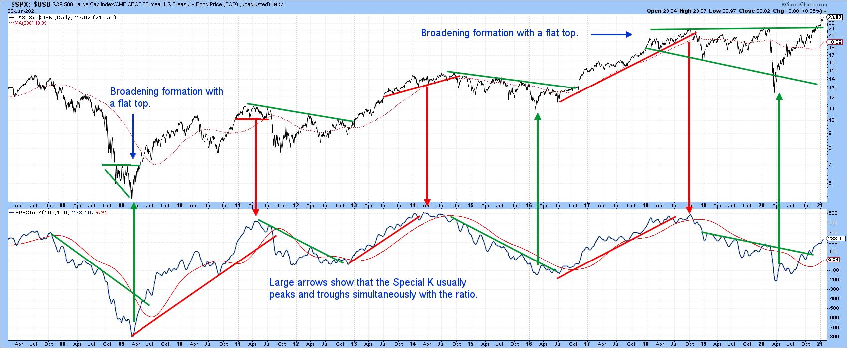 Chart 2Before we talk about a possible correction, Chart 3 tells us that the market continues to climb a wall of worry. That wall is represented by the declining trend in the VIX since last spring. However, it's still at a fairly high level. The red arrows flag all the major peaks since 2000. Note that, in every case, the VIX was reflecting complacency, with readings below the blue line at 18.5. The latest reading is 23. The long period spent below the blue line from 2004 to 2007 tells us that a complacent reading on its own is not a reliable indication of vulnerability. By the same token, experience since 2000 tells us that a major top is unlikely to develop until a sub-18.5 reading has been registered.
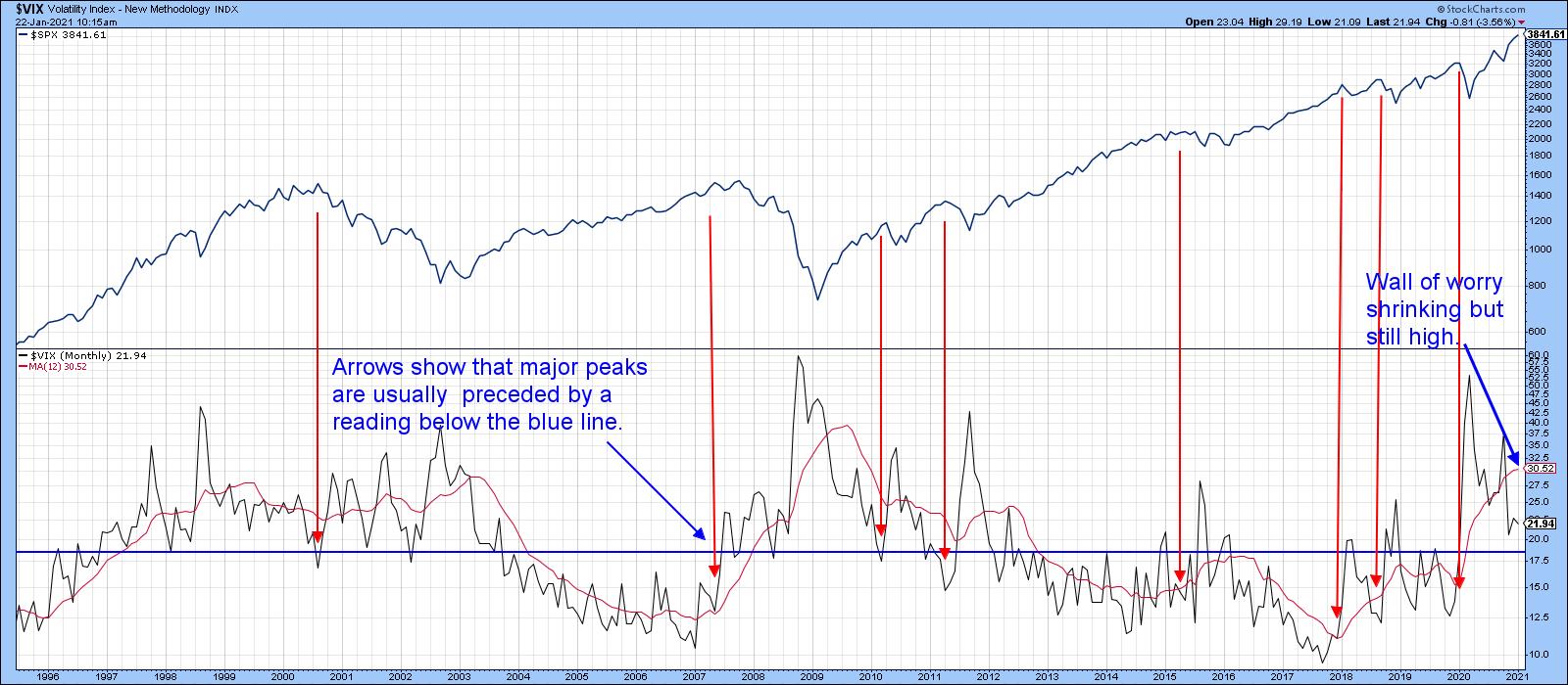 Chart 3
The Correction?
I have often argued that trying to call a correction in a bull market is a mugs game. That said, there are some things that worry me about the near-term outlook, not from a bear market point of view, but more in the way of a sideways correction. I guess what I am saying is that all bull markets are temporarily interrupted by corrective action, and now might be as good time as any to expect digestion of recent gains.
Chart 4 features the NYSE Bullish Percent indicator. On the one hand, it's very overextended, as it was in 2004 and 2009. Both situations were followed by sideways consolidations. On the other hand, such strong readings also represent a form of breadth thrust. A breadth thrust is an exceptionally overbought oscillator that occurs in the early stages of a bull market. You can see that because these corrections were part of the overall bullish trend, as flagged by the green arrows. Bottom line, while the current high reading suggests that the market may be risky for traders, it's a positive sign for long-term investors.
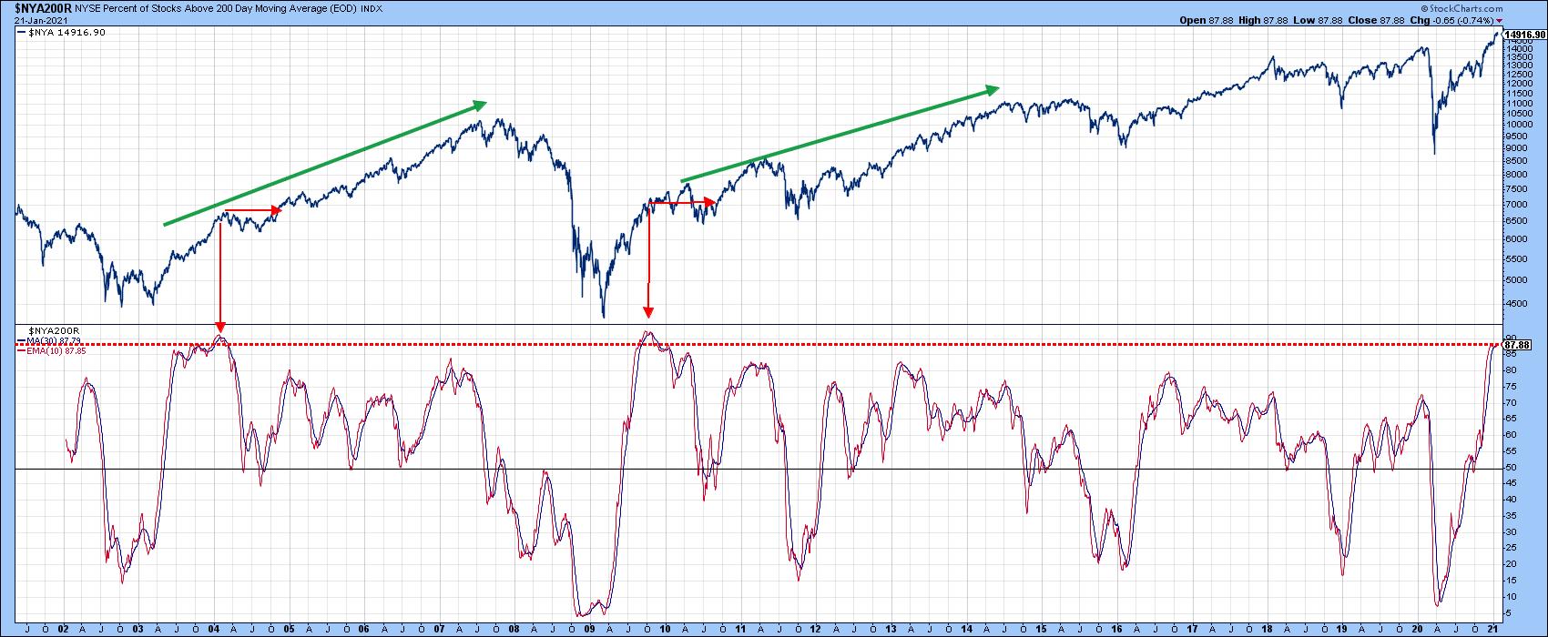 Chart 4
My Dow Diffusion indicator (Chart 5) triggers sell signals when it reverses to the downside from a reading above its red overbought line. Since 2015, such signals have consistently been followed by a downward or sideways correction. So far, the Dow's reaction has been to rise. However, the failure of the indicator to rally back above its MA is not a positive sign.
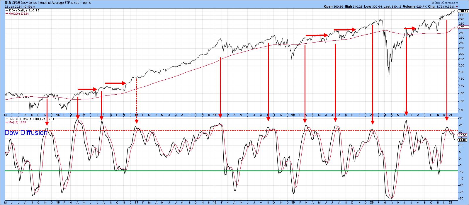 Chart 5
US equities are closely tied into the global technical picture. In that respect, Chart 6 compares the MSCI World ETF (AWCI) to my Global Net New High indicator. This oscillator is calculated from a universe of country ETFs registering net new highs over a 40-day time span. It triggers sell signals when it drops below its MA from an elevated level. Solid arrows represent valid signals; dashed ones, false negatives. A sell signal has been triggered in the last few days, which further points us in the direction of a correction.
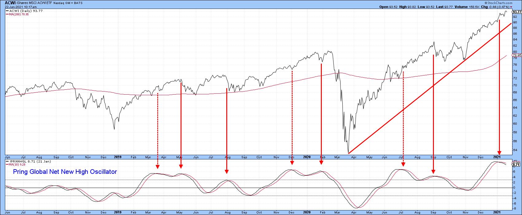 Chart 6
Finally, we return to our old friend the VIX. This time, it is being featured in the form of its daily KST. The pink shadings approximate periods when it is above zero; in other words, when fear and concern are on the rise. Typically, if a sell-off or correction is going to develop, it does so during one of these plus zero periods. The unshaded areas, when the KST is below zero, are mostly associated with rallies. Unfortunately, this VIX momentum indicator is edging through zero again, but not yet in a decisive manner. If it does, that will represent a strong signal that a correction is underway. Remember, you can update this chart going forward by simply clicking on it.
 Chart 7
This is an updated version of an article previously published on Tuesday, January 19th at 11:56am ET in the member-exclusive blog Martin Pring's Market Roundup.
Good luck and good charting,
Martin J. Pring
The views expressed in this article are those of the author and do not necessarily reflect the position or opinion of Pring Turner Capital Group of Walnut Creek or its affiliates.