This past Thursday, I was one of the guest hosts to fill in for David Keller on The Final Bar, as Dave was enjoying a week off. Of course I brought RRG to the show, but I also wanted to add a bit of educational content on how to use RRG in a way that was somewhat outside the box.
Breadth Indexes on RRG
As Dave likes to track breadth through various metrics, I decided to brush off some work that I did in the past on using breadth data on a Relative Rotation Graph.
I wrote on this subject for the first time in November 2018 in an article titled "Plotting Breadth Indicators on Relative Rotation Graphs - Part I" and this search command gives you some more articles on the subject. The approached I used in those articles is to plot breadth metrics on a Relative Rotation Graph. The ones that seem most useful are the indicators that measure the percentage of stocks trading above their moving n-period EMA.
There are three sets of this indicator family on the site. Their symbols look like this:
!GT + #days + symbol
So !GT50XLI holds the percentage of stocks in the Industrials sector trading above their 50-day moving average.
The three sets hold data for the 20-, 50- and 200-day periods for all sectors, as well as the S&P 500. Obviously, they show long-, mid- and short-term trends, at least to some degree.
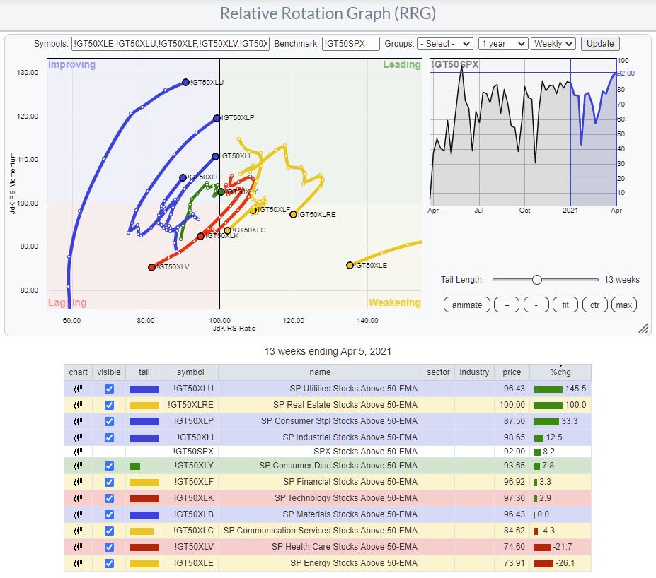
The RRG above shows the weekly rotation for the medium-term breadth per sector. The long tails, moving in a NW heading for more defensive sectors like Utilities, Staples and Industrials, are immediately visible -- as is the weak rotation for Health Care.
In order to get a better view of the other sector, I have to zoom in a bit more. Shortening the tails and hiding the less interesting rotations gives you the RRG below.
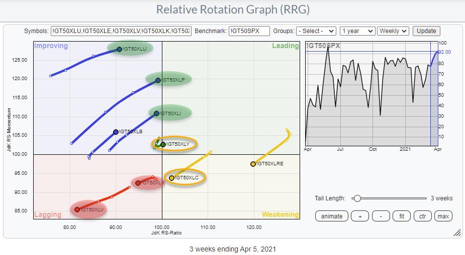
Health Care and Technology are now clearly visible inside the lagging quadrant and moving further into it. These rotations fit the rotation for these sectors on the regular RRG.
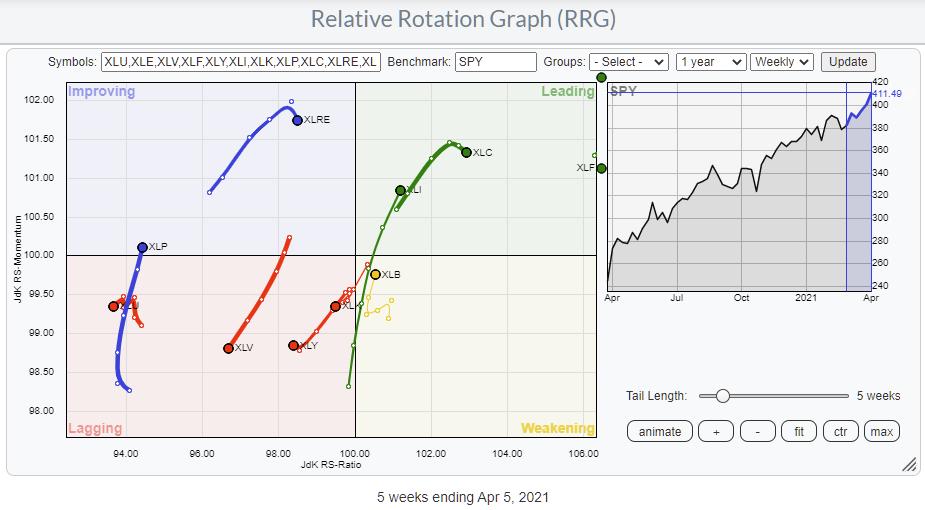
The discrepancies I see are for Consumer Discretionary and for Communication Services. The breadth for XLY has just turned right and back into the leading quadrant, albeit with a very short tail and very close to the benchmark.
For XLC, the breadth is heading towards lagging while the price tail is inside leading but rolling over. A prelude??
RRG Rotation as a Measure of Breadth
Another way of using RRG for breadth that I found useful is to load the members of a sector and, instead of using the sector index as the benchmark, switch to $ONE. I have introduced this benchmark in the past as a way to see absolute rotations instead of relative, which is an interesting way of looking at things for people who are more gearing towards absolute returns.
What you will see when you run an RRG against $ONE is that most members will move/rotate in a similar fashion. In strong sectors/markets, all members will gyrate to the right side of the RRG and v.v. in weak sectors/markets. But, recently, it dawned on me that we can use this setup also to eyeball and get a handle on breadth for sectors or markets.
For example, when a trend in price is still UP, but, on the RRG you see the majority of constituents roll over and/or rotate at a negative heading, I think that shows an underlying change of trend underway, which is exactly what breadth metrics help us find -- underlying movements that have not (or not completely) surfaced yet.
A good example can be seen in the Health Care sector.
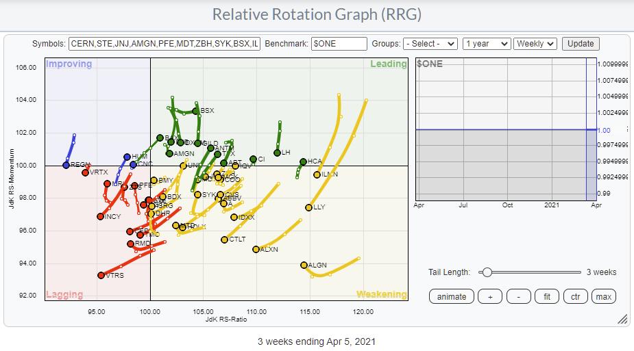
The individual stocks are mostly located at the right side of the graph, but the majority of the tails are pointing in a 180-270 degree heading, which signals a loss of momentum and (relative against a flat line) strength.
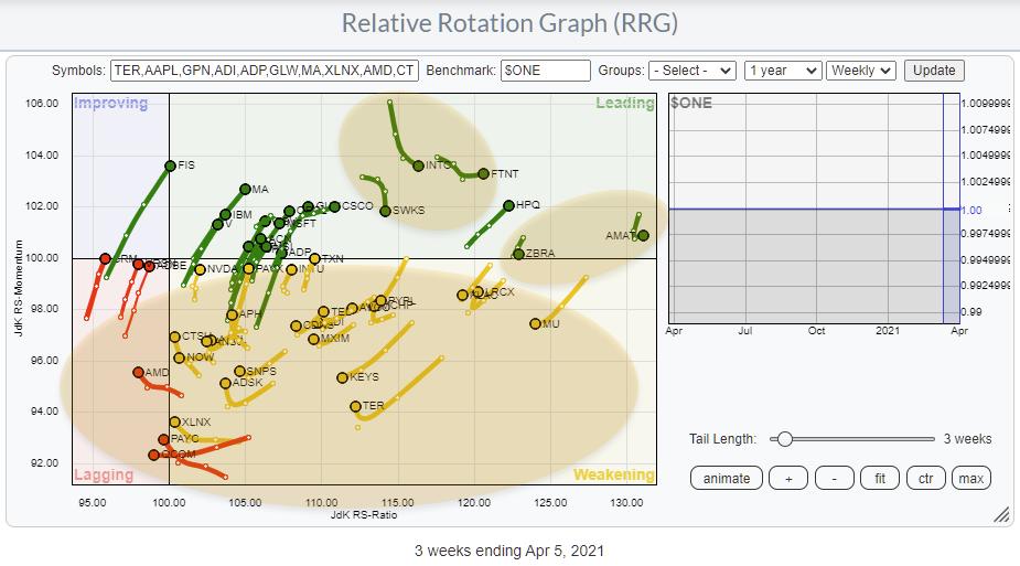
In Tech, it is a little less pronounced, but still visible. The majority are at the right, but a lot are rotating at a negative heading.
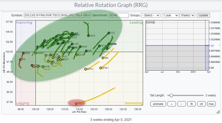
And finally, in Consumer Discretionary, this approach clearly shows how the negative rotation of one mega-cap stock can drag a sector down in price while the majority of constituents are still doing pretty well.
I hope this slightly different use of RRG will help you gain other insights somewhat off the beaten path and also hopefully give you a better understanding of what RRG is capable of doing/visualizing.
#StaySafe and have a great weekend! --Julius
My regular blog is the RRG Charts blog. If you would like to receive a notification when a new article is published there, simply "Subscribe" with your email address.
Julius de Kempenaer
Senior Technical Analyst, StockCharts.com
Creator, Relative Rotation Graphs
Founder, RRG Research
Host of: Sector Spotlight
Please find my handles for social media channels under the Bio below.
Feedback, comments or questions are welcome at Juliusdk@stockcharts.com. I cannot promise to respond to each and every message, but I will certainly read them and, where reasonably possible, use the feedback and comments or answer questions.
To discuss RRG with me on S.C.A.N., tag me using the handle Julius_RRG.
RRG, Relative Rotation Graphs, JdK RS-Ratio, and JdK RS-Momentum are registered trademarks of RRG Research.