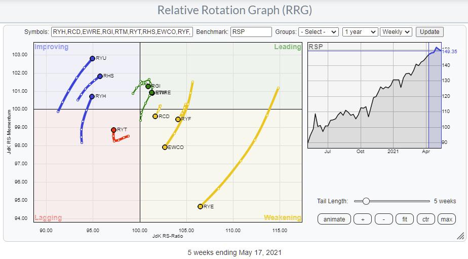
The Relative Rotation Graph shows the rotation of the Invesco family of equal-weight ETFs. These sector ETFs are often used to eliminate the dominating weight of some individual stocks in specific sectors. Think AAPL and MSFT in Technology, AMZN and (to a lesser extent) TSLA in Consumer Discretionary and FB and GOOG(L) in Communication Services.
But what does "Equal-Weight" actually mean? At first sight, you'd think that's easy; it means that all components in the index are weighted equally. And that is true for every individual (sector-)index. This information can be found on the website of the manager of these ETFs, in this case Invesco.
If you want to see the composition of the Technology index (ticker symbol RYT) in this family of ETFs, you can simply search for RYT on their website. That will lead you to the product page for that instrument.
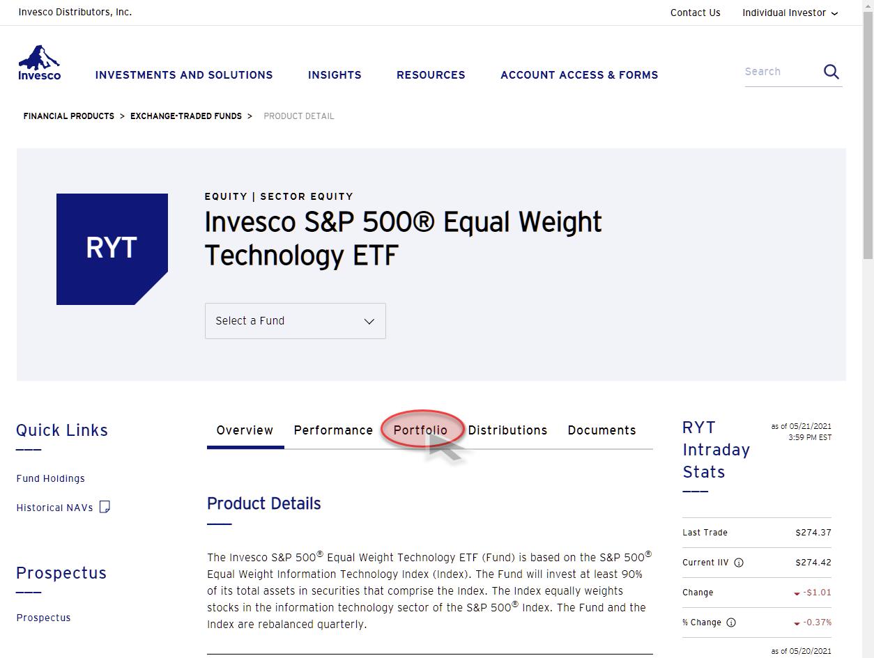
When you click on the Portfolio tab on that page, it will take you to the composition of that ETF.
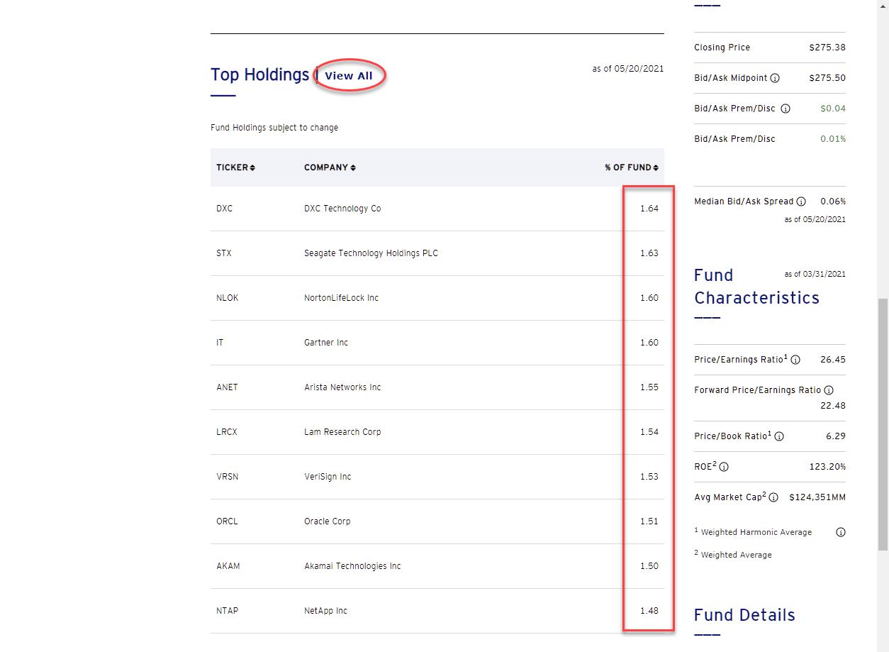
Scrolling down on that page brings you to the Top Holdings of the portfolio, and you can even go a little further and show all holdings, which you can even download in an Excel file, if you'd like.
The Technology sector holds 74 stocks. So, in an equal-weight portfolio, each stock will count for:
100% : 74 = 1.35%
When you look at the current weights, you will see that they are around 1.35%. That is because composing the equal-weight portfolio at 1.35% per symbol is only done at the rebalancing data, which is quarterly. After rebalancing, the weights will shift up or down depending on the movement of the stock price.
This goes for every sector ETF in this family. Each stock is equally weighted within the sector. So a smaller sector, in terms of the number of stocks in the sector, will have a higher weighting per stock. The utility sector, symbol RYU, for example, holds only 28 stocks. Therefore the weight per individual stock in that sector will be:
100% : 28 = 3.57%
So far, so good. Within the sectors, no individual stock will dominate because of its market cap.
What About the Benchmark?
The benchmark for the RRG showing the equal-weight sector ETFs is RSP, which is the equal weight S&P index. Again, the information about the portfolio composition can be found on the product page for RSP. And, not surprisingly, you will find that the weight per individual stock in that index comes in at:
100% : 506 = 0.197%
Because you all know that the S&P 500 holds 506 stocks (at the moment) and not 500, right? ;)
That also makes sense.
But hold on; what does that mean at the sector level?
Well, it means that all pigs are equal, but some pigs are more equal than others. As a result, the sectors that hold a high number of stocks, like Technology and Industrials, will have a higher weighting at the sector level than sectors that hold a low number of stocks, like Energy and Communication Services.
Here is the sector allocation of the Equal-Weight S&P index, RSP.
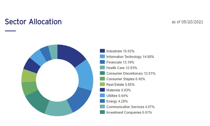
Wow!! All of a sudden, Equal weight is not so equal-weight anymore..
For sectors to be "Equal Weight" in an index, I would expect each sector to be at...
100 : 11 = 9.09%
Here is the comparison of sector weights in the cap-weighted S&P and the equal-weight S&P:
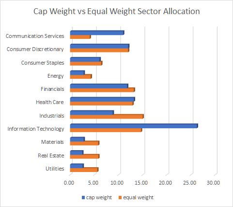
Some of my initial observations are that the impact of Information Technology is reduced significantly, as expected, but the sector remains above the "expected" average of 9.09%. The weight for Communication Services is also significantly reduced, but this sector goes from 11%, which is just above the EW average, to 4%, which is half of the average. For some of the smaller sectors like Materials, Real-Estate, and Utilities, the impact almost doubles.
Very interesting is the fact that the consumer discretionary sector, which, as you know, is heavily impacted by AMZN, is at exactly the same weight in both the cap-weight and equal-weight S&P. It's one of these subtleties that is easily overlooked, but can have a significant impact on your investment decisions and thus performance.
Let me know, did you know this? Did you realize it?
#StaySafe, and have a great weekend! --Julius
My regular blog is the RRG Charts blog. If you would like to receive a notification when a new article is published there, simply "Subscribe" with your email address.
Julius de Kempenaer
Senior Technical Analyst, StockCharts.com
Creator, Relative Rotation Graphs
Founder, RRG Research
Host of: Sector Spotlight
Please find my handles for social media channels under the Bio below.
Feedback, comments or questions are welcome at Juliusdk@stockcharts.com. I cannot promise to respond to each and every message, but I will certainly read them and, where reasonably possible, use the feedback and comments or answer questions.
To discuss RRG with me on S.C.A.N., tag me using the handle Julius_RRG.
RRG, Relative Rotation Graphs, JdK RS-Ratio, and JdK RS-Momentum are registered trademarks of RRG Research.


