A couple of weeks ago, I posted an article questioning whether the tech-dominated NASDAQ still had the mojo to lead the market higher. At the time, many sub-surface indicators, such as breadth, volume and relative action, looked weak. Several charts indicated that many of them had experienced multiple negative divergences, but none had yet broken the trend. When they did, that would be the time to anticipate some extended weakness. My conclusion was more oriented to relative as opposed to absolute performance.
In the intervening two weeks, the NASDAQ Composite has succeeded in edging out a marginal new high, but breadth, volume and especially relative action failed to confirm. This week's action has actually seen the violation of several important trendlines. We'll focus on some of those areas to start with, subsequently examining NASDAQ and tech relative action. Finally, I'll try and answer the question of, if tech has lost its relative mojo, which sector looks as though it may be taking over.
Questionable Internal NASDAQ Indicators
Chart 1 compares the NASDAQ Composite to its bullish percent indicator. I have plotted three sets of solid trendlines to show that joint breaks usually result in important changes in trend. The two dashed lines are now under threat, as the bullish percent has just begun to edge through its line and the Index is precariously balanced. Note that the late April high was accompanied by far fewer stocks in bullish trends than the February peak.
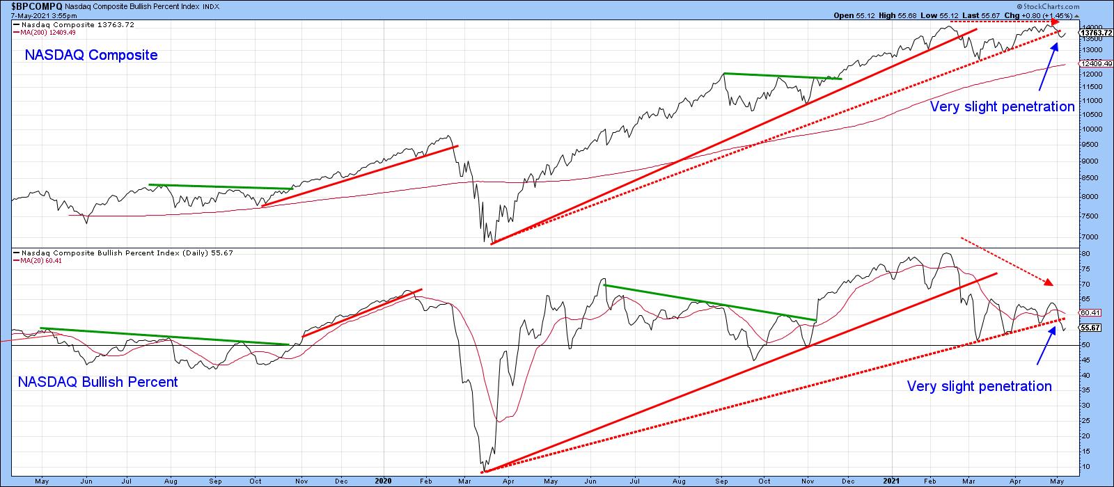 Chart 1
Chart 2 shows that three previous intermediate peaks were associated with a negative divergence between the Index and the number of NASDAQ stocks above their 150-day moving averages. Last week's high experienced the largest divergence of all. Now, the indicator has dropped below its 2020-2021 secondary up trendline and 200-day MA. The implication is that the number of stocks trading above their 150-day MA is likely to shrink, which should pull the Index down with it. Even if it does not and the NASDAQ moves higher, this deteriorating indicator points up the probability that it will be a progressively selective market.
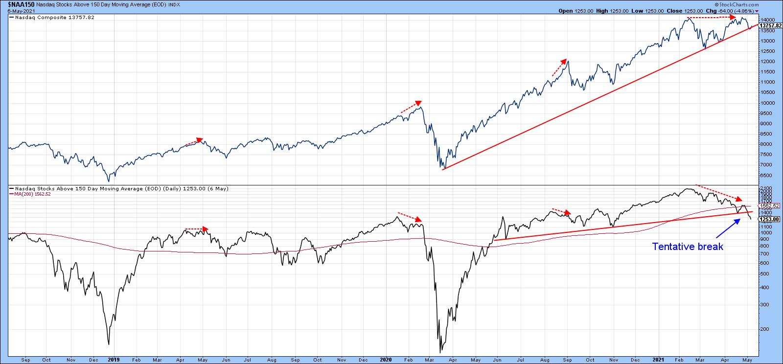 Chart 2
NASDAQ new high/low data is also sporting a negative divergence in a similar manner to the two 2020 peaks flagged in Chart 3.
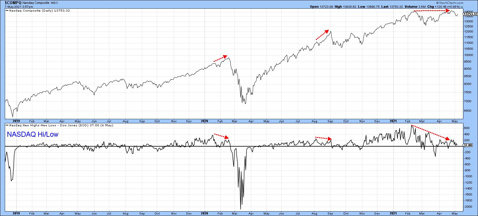 Chart 3
Tech Relative Strength is Weakening
Chart 4 shows that a major negative divergence between the Index and its RS line against the S&P Composite has been building up since February. This indicates that the latest high developed from a strong market pulling the NASDAQ higher, as opposed to its ability to rally based on its own momentum. Now, the RS line has completed a one-year complex head-and-shoulders top. That does not mean that the NASDAQ Composite will decline in its own right. However, it strongly hints that this tech-dominated sector no longer has the ability to maintain its previous upside leadership. Relative weakness is not just concentrated in one area but also shows up in many tech sub-sectors. This contrasts with the positive RS action that preceded the March 2020 low and the huge tech-dominated NASDAQ rally that followed.
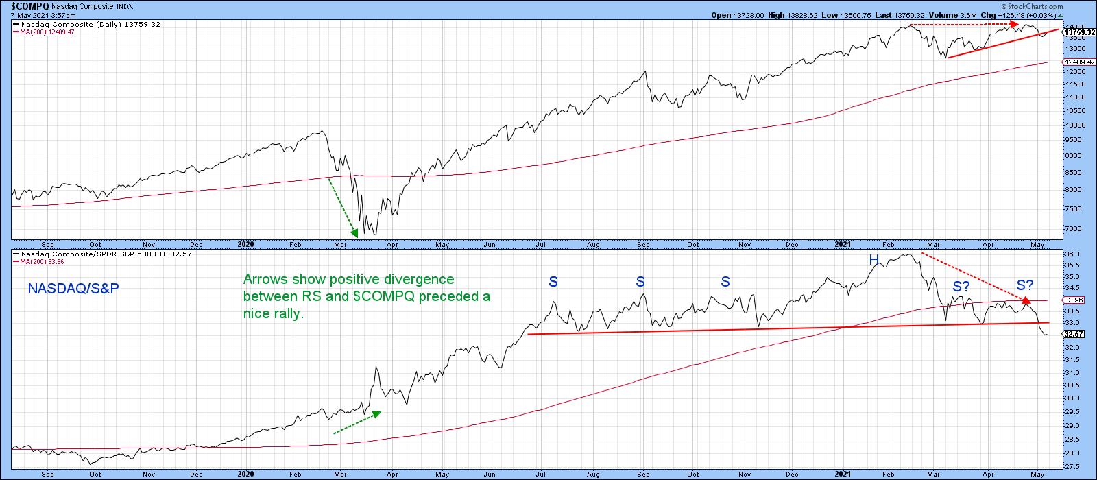 Chart 4
For example, the Dow Jones Internet Commerce Index (Chart 5) has been one of the stellar performers in the last decade or so. Its RS line has already penetrated the neckline of a head-and-shoulders top. The Index itself is right at the base of a smaller formation and has not yet broken down. It nonetheless looks potentially quite ominous.
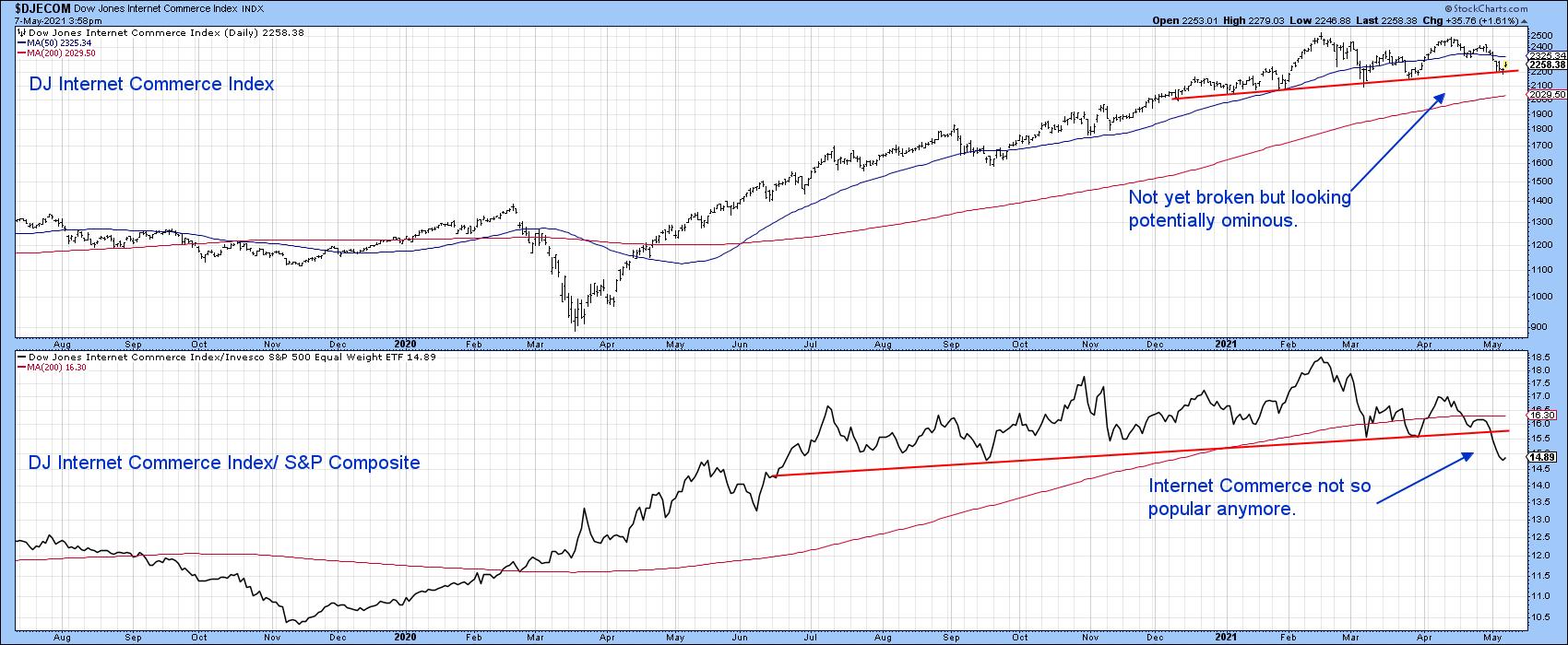 Chart 5
We hear a lot about chip shortages, which should be bullish for semiconductors. However, the SPDR Semiconductor ETF (XSD) has also completed a major RS top and dropped below its 200-day MA. For its part, the absolute price is still above its MA, but could easily violate that potential head-and-shoulders neckline.
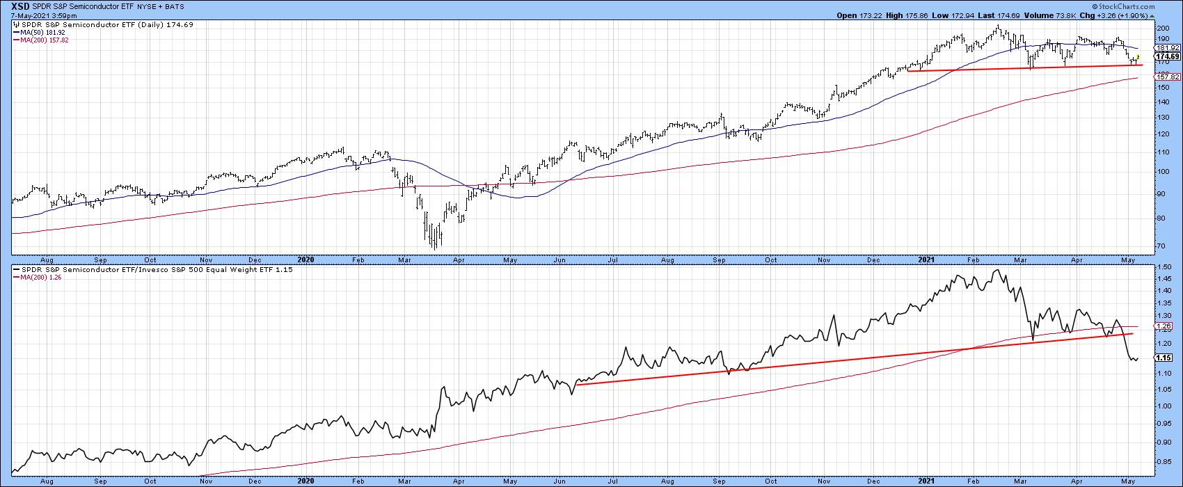 Chart 6
A similar picture is being painted in Chart 7 by the SPDR Software Services, as the RS line appears to be leading it lower.
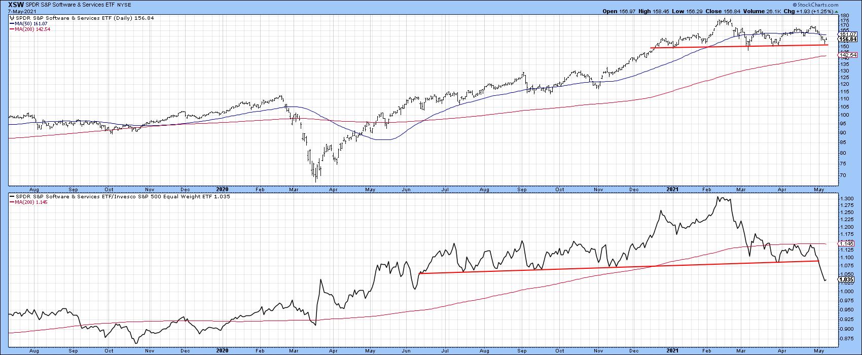 Chart 7
Finally, Chart 8 shows that the Global X Social Media ETF (SOCL) has joined the weakening relative strength party with a similar pattern to other tech areas.
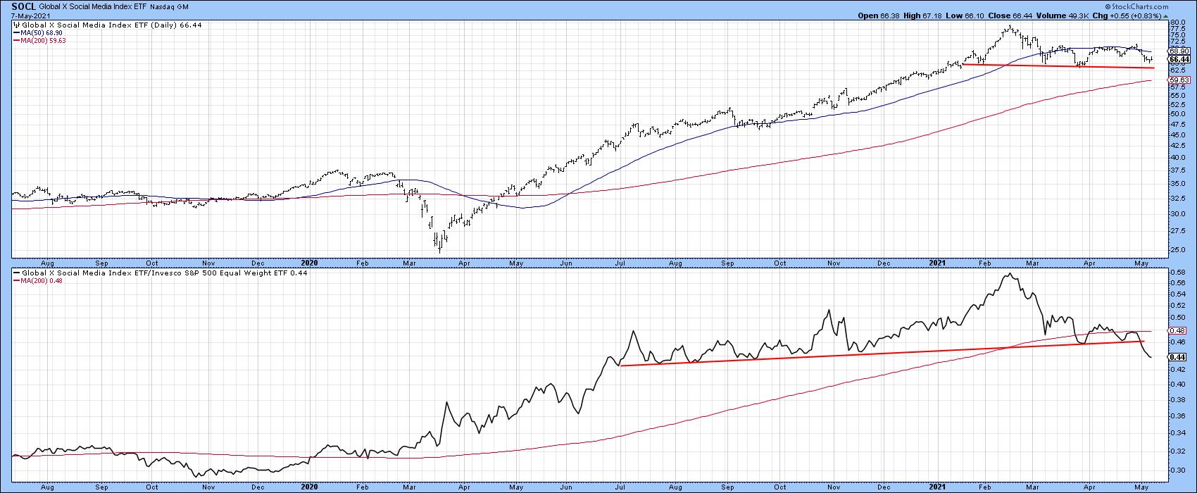 Chart 8
Where is the Next Leader?
There is always a bull market in relative strength because it rotates. If the tech-dominated NASDAQ has lost its mojo, it's worth answering the question, "What's likely to take over?"
Chart 9 shows the relative performance of several key sectors over the last five-years. The two outstanding performers were tech on the upside and energy on the downside. The tech RS looks toppy, whereas energy is likely forming a base.
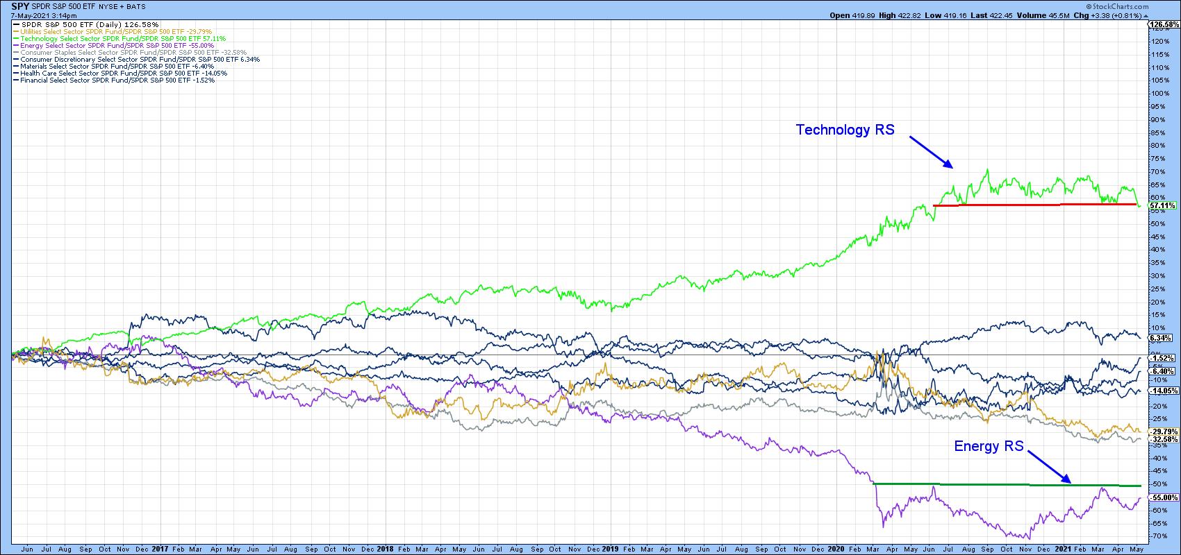 Chart 9
When we run a ratio between them two of them, as in Chart 10, you can see that technology recently experienced a record-level superior performance and has since reversed to the downside. Note that the 18-month ROC was recently trading at a reading slightly north of 200%. The last time it reversed from around that level, it took 20 years to recapture all the losses and move to a new high. That's exactly the same as the average of from 24 historic cases that I have been able to identify going back 50 years or so. Bottom line, if that 18-month ROC has peaked, history suggests that the ratio is unlikely to take out its 2021 high for many years to come.
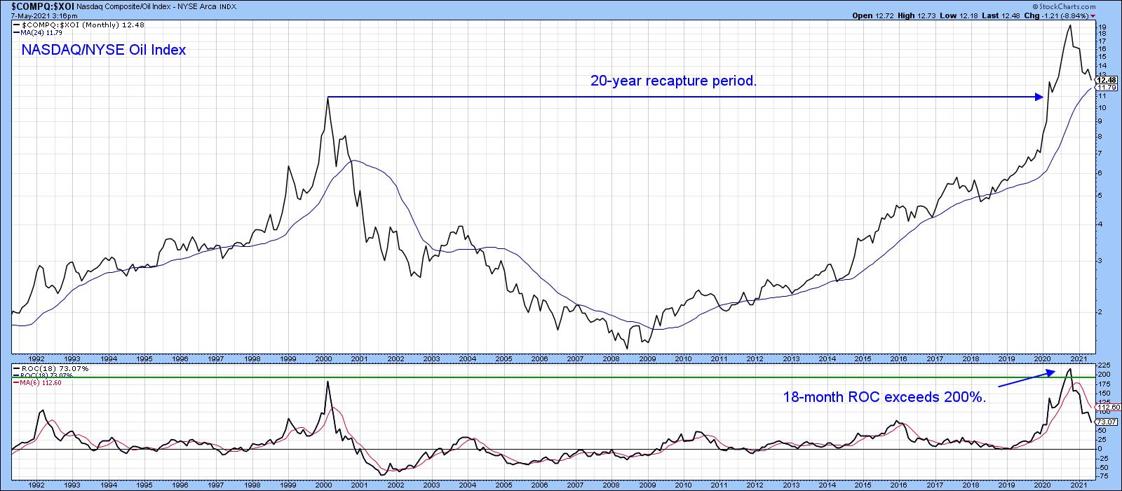 Chart 10
Finally, Chart 11 shows a similar ratio, substituting the SPDR Energy ETF for the $XOI. It throws open the possibility that this relationship is tracing out a large complex head-and-shoulders top. It's already completed a small distribution formation, dropped below its 200-day MA and triggered a long-term KST sell signal. We are likely to soon find out soon if that potential head-and-shoulders will be completed. That's because the short-term KST has just gone negative, therefore placing downside pressure on this key ratio.
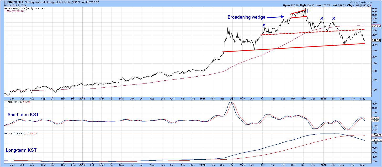 Chart 11
It's important to bear in mind that this is a relative relationship, so completion of the top would only point to the probability that energy will outperform the NASDAQ Composite. It does not speak to the direction of either of its components.
This is an updated version of an article previously published on Wednesday, May 5th at 11:34am ET in the member-exclusive blog Martin Pring's Market Roundup.
Good luck and good charting,
Martin J. Pring
The views expressed in this article are those of the author and do not necessarily reflect the position or opinion of Pring Turner Capital Group of Walnut Creek or its affiliates.Tech Leadership