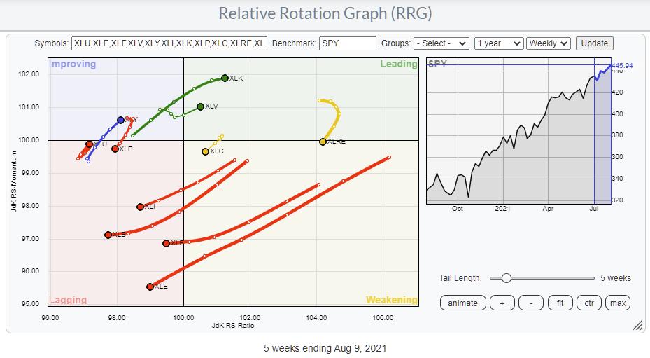
Relative Rotation Graphs are a great tool to use for a top-down approach. Lots of people look at sectors and trade the sector ETFs. The State Street sector SPDRs range (XLK, XLY, XLP, etc.) is probably the most popular family of ETFs for that purpose. The RRG above shows the rotation for these sectors over the last five weeks.
In one pass, you can easily see the strength and further improvement for the Technology (XLK) and Healthcare (XLV) sectors as they move into the leading quadrant. However, at the same time, you can see the rapid weakening for Industrials (XLI), Materials (XLB), Financials (XLF) and Energy (XLE) as they head further into the lagging quadrant.
Of course, one could stop here and build a portfolio just using these ETFs. The use of these ETFs that cover an entire index makes sure that risk is properly distributed across all the stocks that make up the index. Thus, there is very limited "single-stock risk" in such an approach.
Groups
However, all these sectors are sub-divided into industries or industry groups, which allow for more granular analysis of the sector. This breakdown is easily accessible from the StockCharts Sector Summary page:
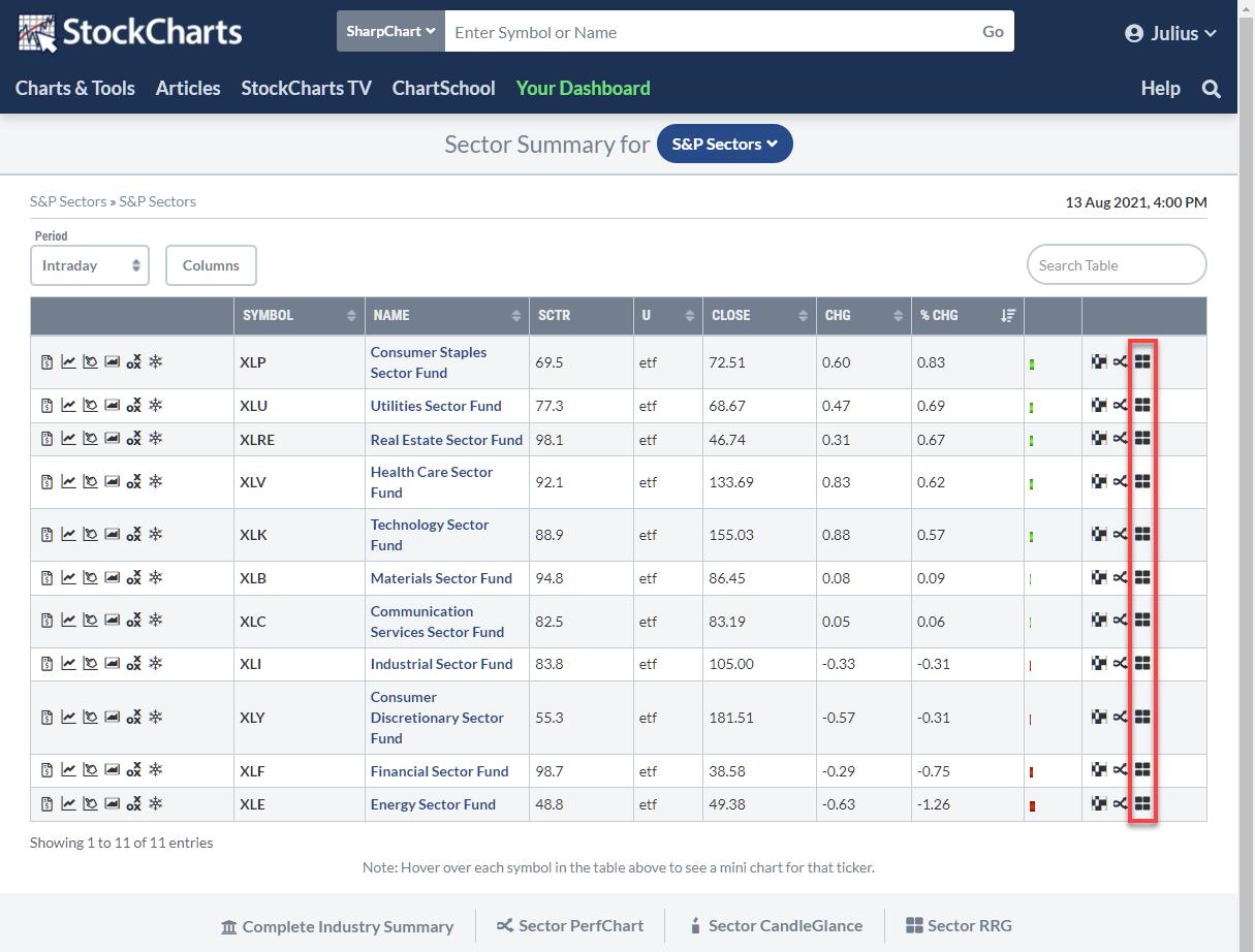
On this page, you find a lot of information for each sector ETF. The last icon on each line is the RRG icon. Clicking that icon opens up the Relative Rotation Graph, showing the breakdown for that group into industries. By default, the sector ETF is also included, and the benchmark defaults to $SPX.
You can leave it like that, which will give you an instant view of the sector and its industries against the S&P. Because the sector ETF is also included on the plot, you can also gauge the rotation for these groups vs. their sector.
Let's take the Technology sector as an example. It is one of the stronger sectors at the moment, and this approach allows us to see which group or groups we should focus on and maybe which group or groups we should preferably avoid.
Clicking the RRG icon on the XLK line gives this Relative Rotation Graph.
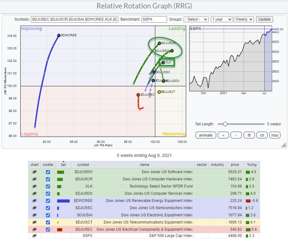
The position of XLK vs. the benchmark $SPX is the same as seen on the sector RRG at the top of this article. Only now are the groups added, and we can see their rotational behavior against the S&P as well as against the Technology sector index.
As the sector itself is strong and improving vs. the S&P 500, it is expected that the majority of the groups will show a similar rotation vs. $SPX as the benchmark.
To find the "best" group or groups inside the technology sector, I am going to change the benchmark to XLK.
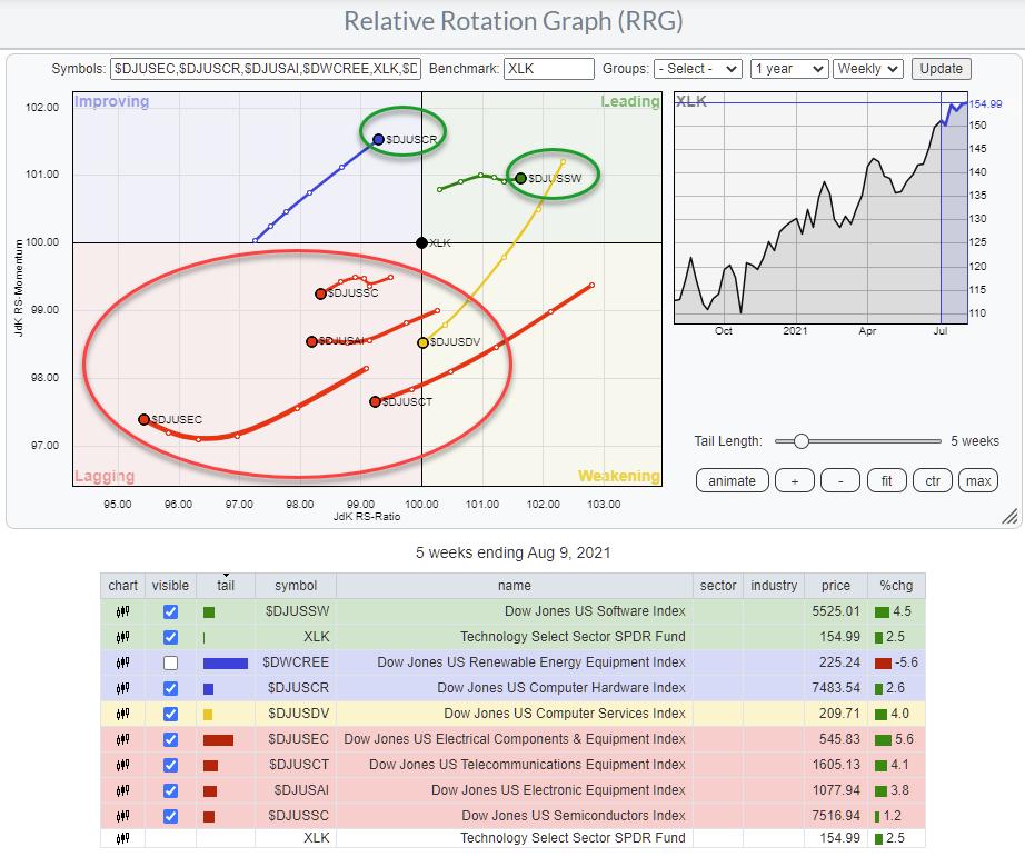
This changes the image quite a bit. Please note that I have un-ticked $DWCREE, as it is so far away from the benchmark and the rest of the groups that it distorts the image.
The RRG above clearly shows that there are actually only two groups inside the technology sector that are driving the sector -- Computer Hardware ($DJUSCR) and Software ($DJUSSW). That is very helpful information for investors, as it narrows down the search for interesting stocks to these two groups.
Stocks
To find the individual stocks inside a group, we need to use the StockCharts scanning functionality.
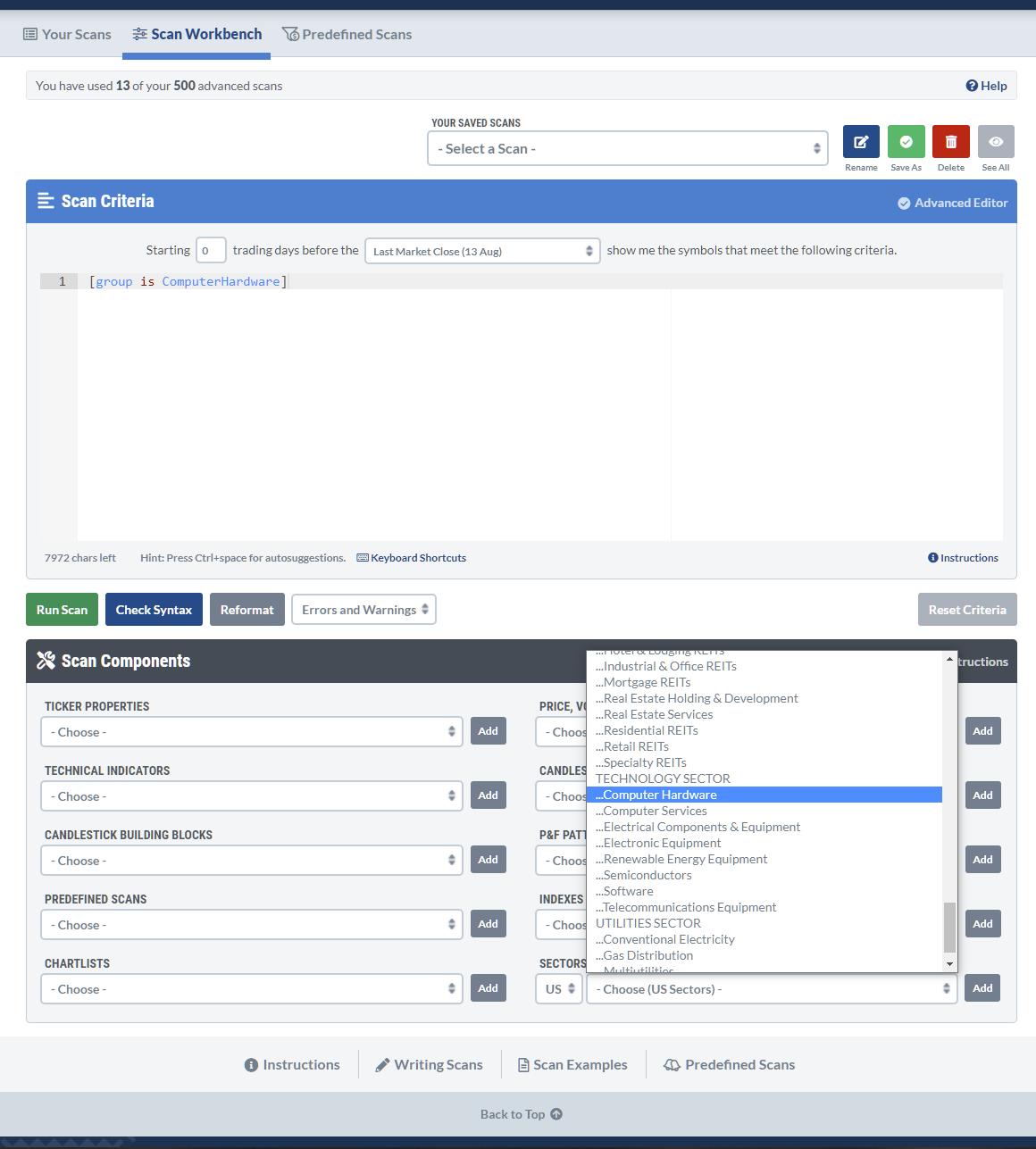
Open up a new scan and delete the default line so you have a blank canvas, then go to the scan components at the bottom and look for Computer hardware in the sectors and industries section. Simply click Add, and the rule will be added to your scan.
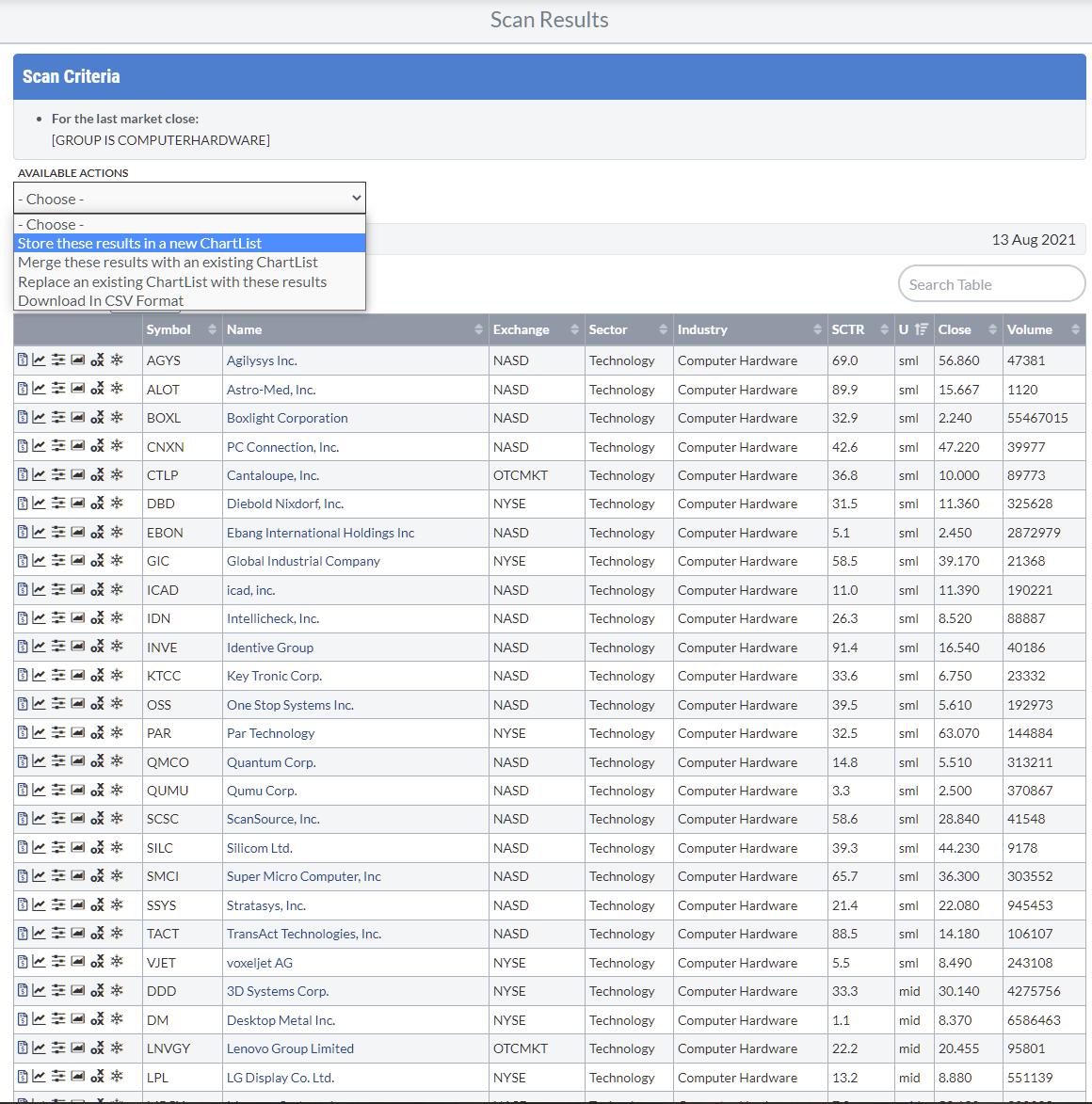
Running this scan will result in 49 matches. You can save these results as a ChartList for future reference using the Available Actions function, so you do not have to run this scan every time.
However, the keen observer may have noticed that this scan also includes small- and mid-caps, and unclassified (by size). If you are happy to include them, leave things as they are. When you would like to limit your analysis to just S&P 500 stocks, you can add another rule to make that happen. Go back to your scan and select S&P 500 from Indexes & ETFs, then click Add.
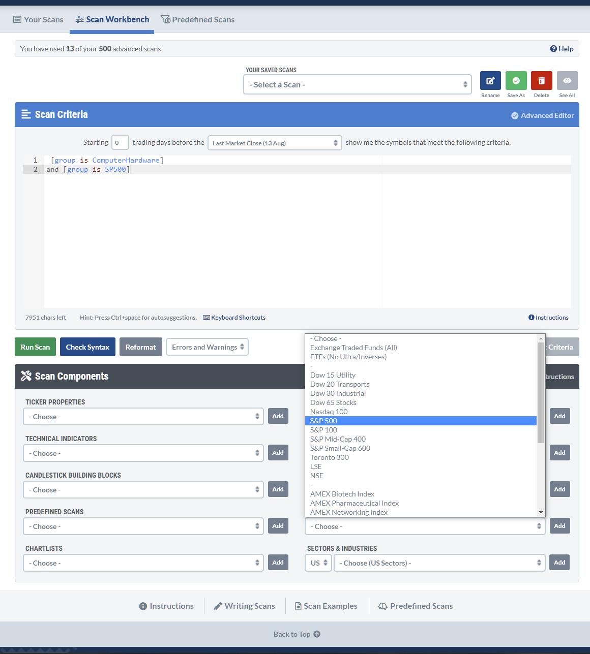
Then, rerun the scan.
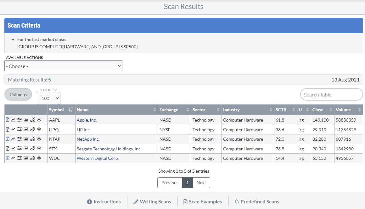
The list is now limited to the 5 stocks in the Computer Hardware industry group that are also a member of the S&P 500. I saved this result to a ChartList for later use.
When you go to your ChartLists, you will see the list you just created. In the "View List As" selection, you will find the option to show the list on a Relative Rotation Graph.
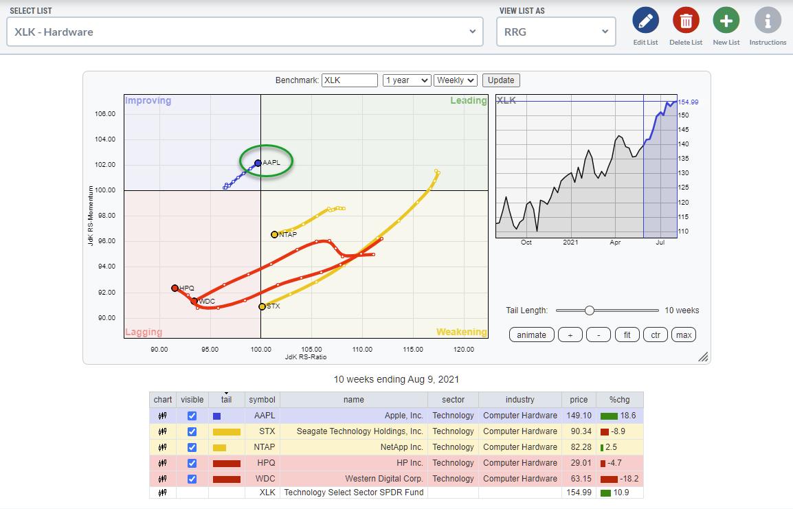
By default, the RRG will open with $SPX as the benchmark. I have changed that to XLK to see the rotations against the sector index in the image above.
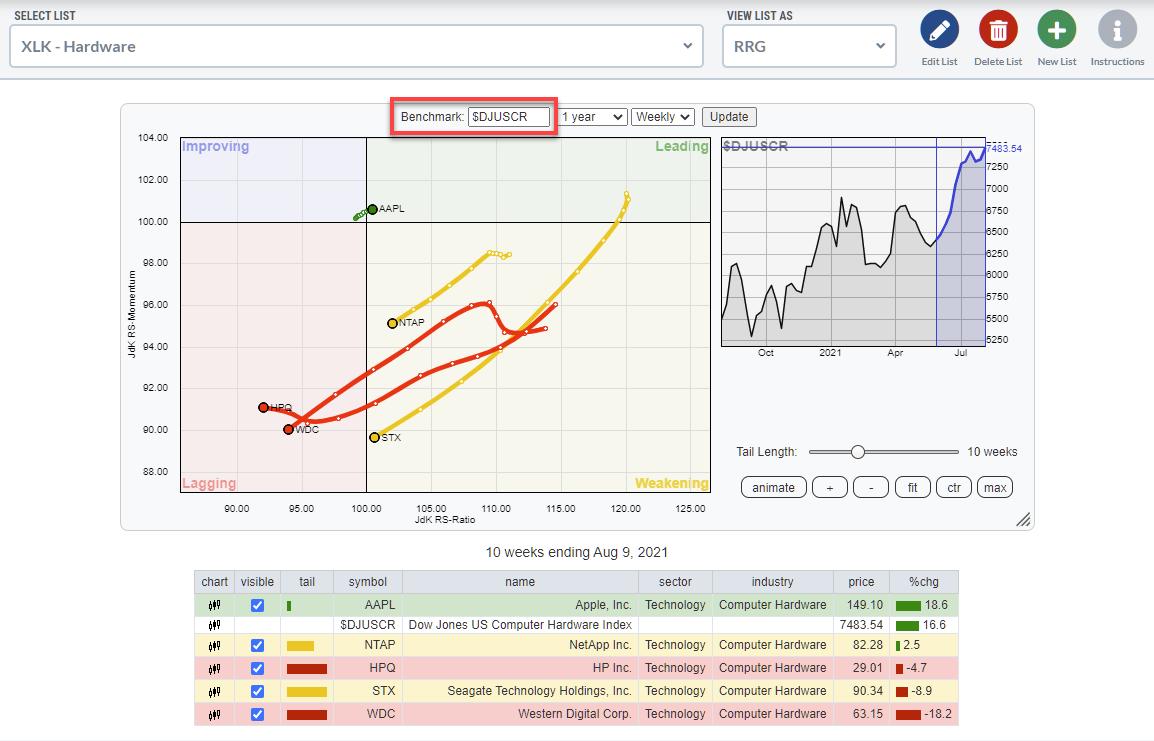
Changing the benchmark to the group index does not change the image much. It only brings AAPL even closer to the benchmark (center), indicating how dominant the stock is.
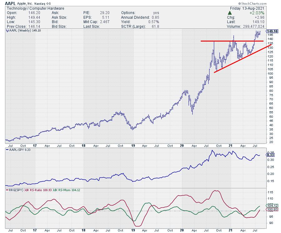
You can copy this workflow to all other sectors and groups and find the good/dominating stocks per group and per sector. In this example, AAPL in the Computer Hardware group in the Technology Sector is an exception because it is such a heavyweight. In other sectors' groups, you will find broader rotations and more opportunities in potentially interesting stocks. But, on the other hand, it also shows how potentially vulnerable the Computer Hardware group is. The Software group has much broader participation, for example.
Enjoy your weekend, and let me know what you think about this workflow or how you use these functionalities!
#StaySafe, -- Julius
My regular blog is the RRG Charts blog. If you would like to receive a notification when a new article is published there, "Subscribe" with your email address.
Julius de Kempenaer
Senior Technical Analyst, StockCharts.com
Creator, Relative Rotation Graphs
Founder, RRG Research
Host of: Sector Spotlight
Please find my handles for social media channels under the Bio below.
Feedback, comments or questions are welcome at Juliusdk@stockcharts.com. I cannot promise to respond to each and every message, but I will certainly read them and, where reasonably possible, use the feedback and comments or answer questions.
To discuss RRG with me on S.C.A.N., tag me using the handle Julius_RRG.
RRG, Relative Rotation Graphs, JdK RS-Ratio, and JdK RS-Momentum are registered trademarks of RRG Research.


