The gold price zig-zagged its way down between August of last year and April of this one. Since then, it's really been in a trading range and now looks as if it is breaking out.
I'll start off by taking a look at the longer-term picture. In that respect, Chart 1 compares the price (on a quarterly basis) to its Coppock Curve. The green-shaded areas flag periods when the Coppock is in a rising mode, a condition that, since the 1970s, has enabled gold to participate in every major rally, except the early 1977 and 2009-2011 advances. Equally as important, this technique has avoided all major declines. Despite the 2020-2021 correction, the indicator remains in a rising and therefore bullish mode. It is also above its 9-quarter MA.
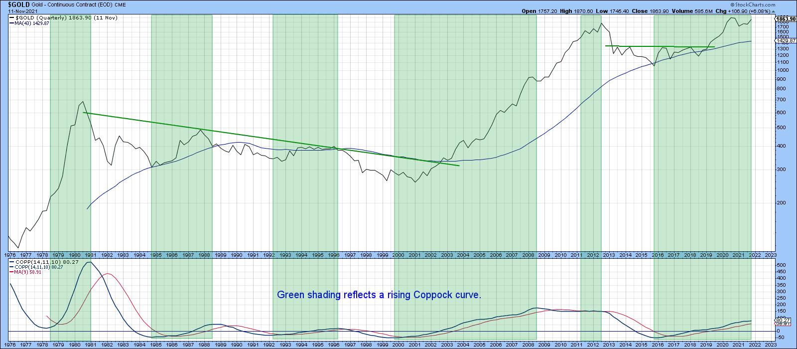 Chart 1Chart 2 features another long-term indicator, a PPO, using the 6- and 15-month parameters. This oscillator is bullish for gold when it is above zero (i.e. the 6-month EMA is above its 15-month counterpart). This approach also captures the majority of the advances and sidesteps serious trouble. One of its joys is that it has only experienced three whipsaw signals since 1977. They have been flagged by the two red arrows and one green one. The oscillator is above zero at present, but barely so. It has, though, tentatively penetrated the 2014-2021 up trendline, which could prove to be a problem should its condition worsen. The oscillator's overall technical position is therefore still bullish, but definitely in need of an imminent rebound.
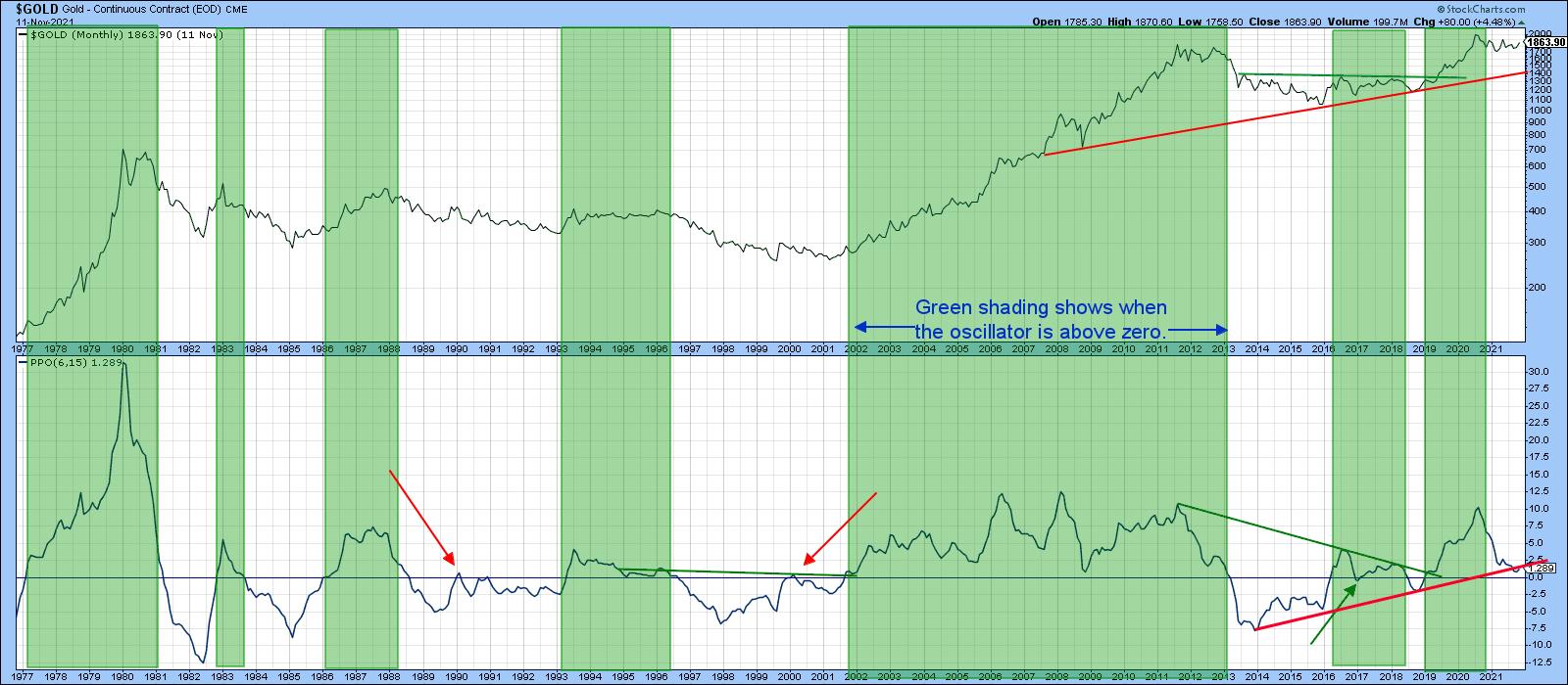 Chart 2
Gold vs. The CPI
Chart 3 shows that, if the price breaks to a new CPI-adjusted high, that could be a very big deal as far as inflation is concerned. That's because the price recently touched a trendline joining the 1980 and subsequent highs. The line's 40-year length means that it represents very significant resistance. From a technical perspective, a successful upside penetration would suggest that a major rally had begun. Given gold's penchant for discounting future inflation, it would be a very worrying development. I am not predicting that it will happen, as there is insufficient evidence at present to come to such a conclusion. However, it's certainly something worth watching.
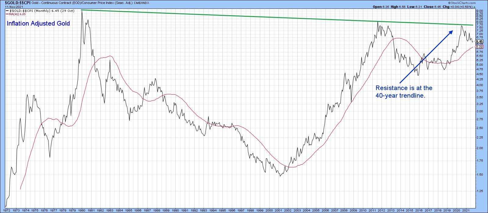 Chart 3
Gold vs. Commodity Prices
The arrows in Chart 4 show that gold has a strong tendency to lead commodity prices at major turning points. The problem is that those leads vary considerably. Additionally, it is possible for the magnitude of these to diverge considerably. Look at the relatively small gold drop in 2008 compared to the devastating bear market that the CRB Composite experienced. It seems that this relationship is useful for predicting the direction rather than magnitude of a move. Nevertheless, that can be a very useful piece of information.
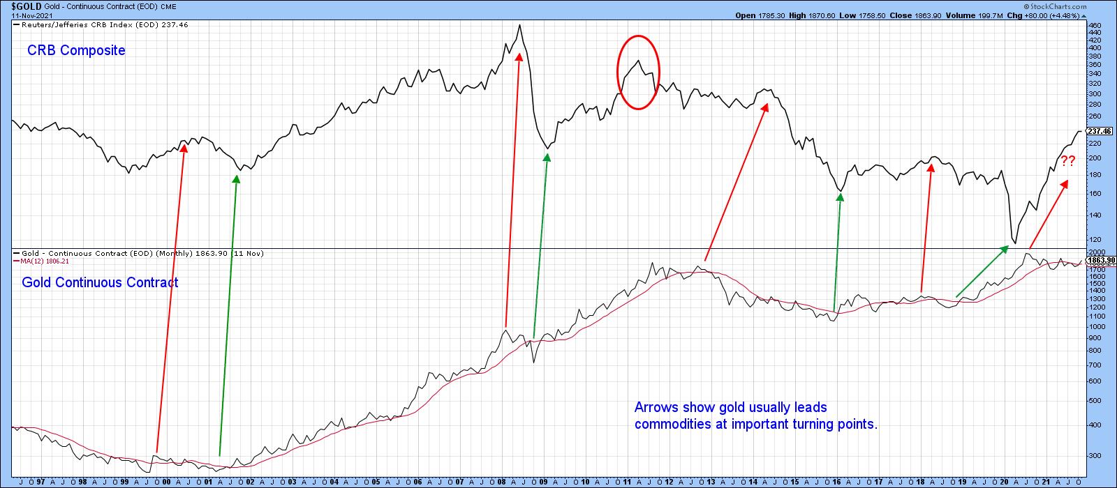 Chart 4
That's where the relationship between gold and commodities comes in. For example, the arrows in Chart 5 approximate points where the KST of the ratio crosses above its MA, thereby indicating that gold has started to outperform the CRB. Note that, in the vast majority of situations, these crossovers are followed by a gold rally. That was not the case in 1990 and 1998, nor for a short period in 2015. By and large, though, the odds favor firmer gold prices when the ratio is moving in gold's favor. Currently, the KST is still declining, but it is starting to stabilize.
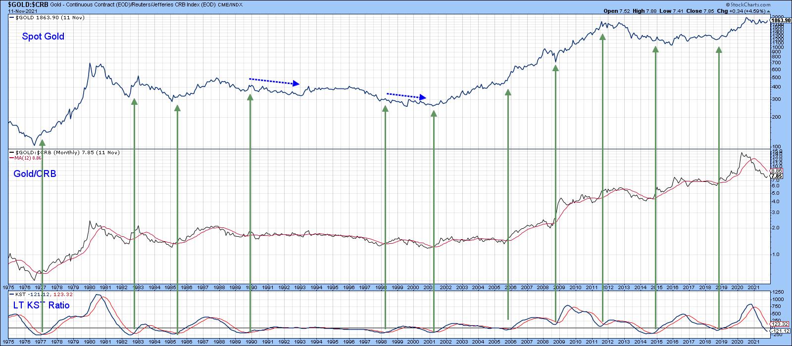 Chart 5
Chart 6 says that negative condition could be about to improve, as the ratio between the SPDR Gold Trust and the DB Commodity ETF (GLD/DBC) is right at its 2021 down trendline. The gold price itself has already cleared its 2020-2021 correction down trendline. The green arrows show that similar setups, when completed by both series, were followed by a gold rally of intermediate significance.
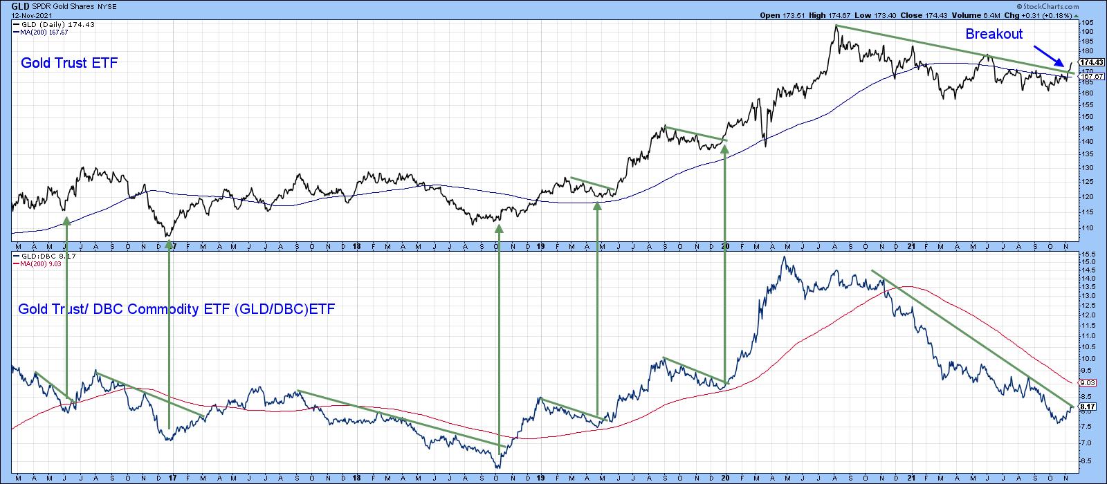 Chart 6
Gold and the Dollar
Most of the time, gold and the dollar move in opposite directions. At the moment, the Dollar Index is bullish, as it is above its 12-month MA and its long-term KST is rising. That could be a problem for gold. Nevertheless, there are some periods when these two markets move in the same direction. When that direction is up, it simply means that gold rallies in other currencies, but less so when expressed in dollars. That may well be the case currently, as Charts 7 and 8, featuring euro- and yen-based gold, have broken decisively to the upside.
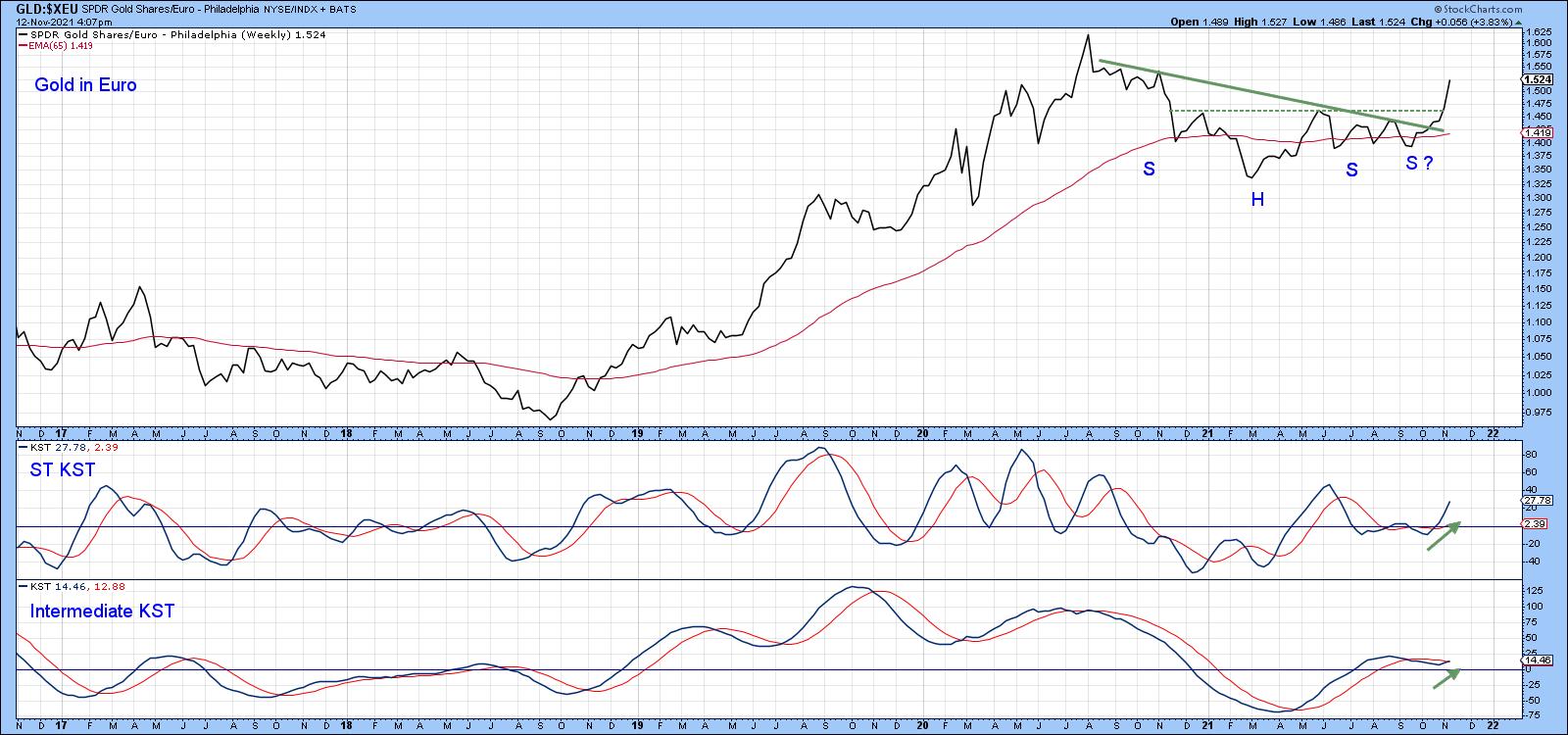 Chart 7
Euro gold (Chart 7) is well above the green correction trendline. It has also surpassed the neckline of a potential reverse head-and-shoulder pattern. The rising short- and intermediate-term KSTs suggest there is more to come.
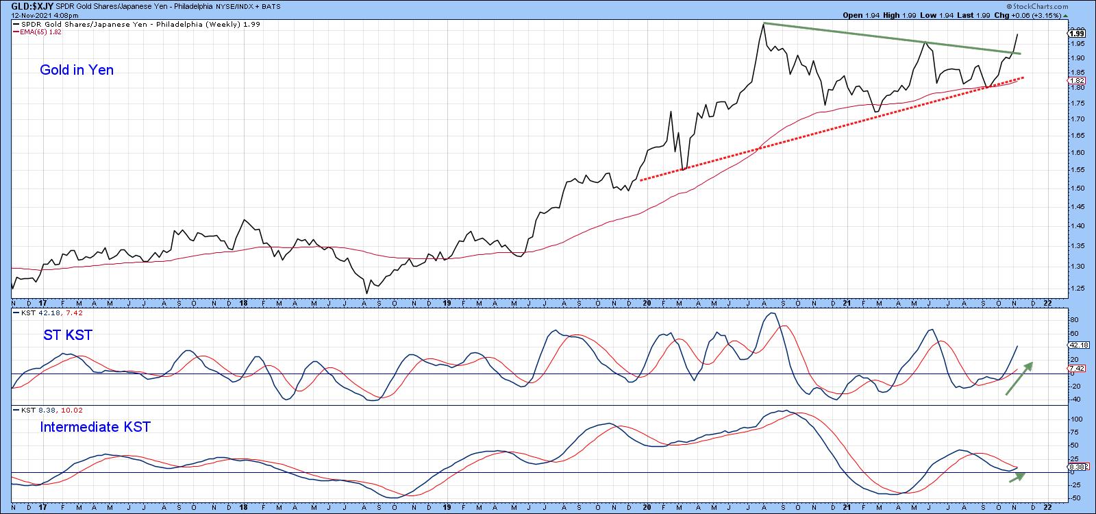 Chart 8Positive momentum is also a factor for gold expressed in yen, as the price has completed a symmetrical triangle formation.
This article is an updated version of an article previously published on Thursday, October 28th at 12:20pm ET in the member-exclusive blog Martin Pring's Market Roundup.
Good luck and good charting,
Martin J. Pring
The views expressed in this article are those of the author and do not necessarily reflect the position or opinion of Pring Turner Capital Group of Walnut Creek or its affiliates.