
February, according to the Stock Trader's Almanac 2023, tends to be a weak month, especially in pre-election years. Now that February is behind us, does it mean the worst is over? Not necessarily. Each year comes with unique scenarios and challenges; this year, all else being equal, a huge worry is that the Fed's attempt to tame inflation may not work as planned. Recent economic data has been sending mixed messages, making it difficult to see stock market directionality.
Stock Market in Holding Pattern
Earnings season is winding down and estimates, in general, were down compared to last year. We also got February's Consumer Confidence Index, which came in weaker than expected. And the Case-Shiller National Home Price Index for December indicated a deceleration in home prices. The Manufacturing Purchasing Managers' Index for February came in at 47.7%, slightly lower than estimates. A reading less than 50% indicates contraction.
None of these pieces of data moved the markets much. Inflation is still way above the Fed's 2% target. Until there's some certainty about how prices could move, the stock market will probably continue to be rattled. There's talk about the possibility of a 5.4% terminal rate, which is higher than the 5% a month ago. It's a similar story across the pond, with expectations for an ECB terminal rate of 4% by early 2024.
Given the jittery macroeconomic backdrop, how long before we see tailwinds or headwinds that can break the market's holding pattern? Given that the next Fed rate decision isn't till March 22, we could still be a few weeks out. And in the stock market, that can feel like eternity.
A Technical Perspective of the Stock Market
If you pull up a daily chart of the S&P 500 index ($SPX), you'll see a few points that are worth noting (see chart below). Note: Click on chart for live version.
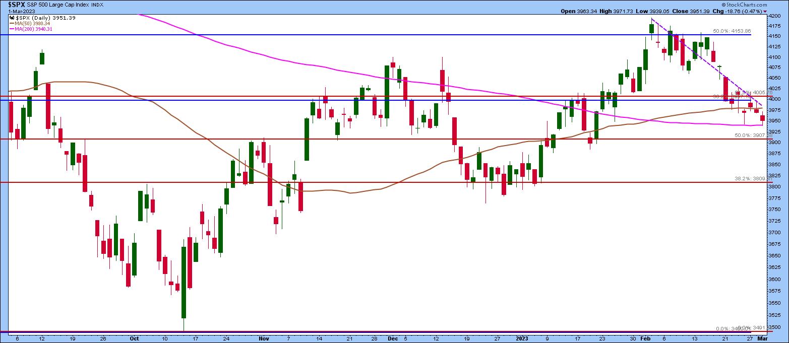
CHART 1: S&P 500 INDEX STILL HOLDING SUPPORT. The 200-day moving average is a support level to watch as investors await jobs data and the next Fed meeting. Chart source: StockCharts.com. For illustrative purposes only.
- The S&P 500 is in critical territory. It's hovering close to hitting its 200-day moving average support; there's a chance the index could bounce off the support and move more sideways until some certainty surfaces. When that happens, it could break out either to the upside or downside of its trading range.
- If the S&P 500 breaks below the 200-day moving average, the next support level could be the 50% retracement level from the August high to the October low. That would bring the S&P 500 to around the 3,900 level.
- The downtrend that started on February 2 is still intact. If there's a bounce off the 200-day moving average and a break above the downward-sloping trendline, it could mean the market could trade sideways between 3,940 and 4,000. On the flip side, the downtrend could continue if the S&P 500 falls lower.
Market Breadth Indicators: Pick Up the Clues
It may help to watch market breadth indicators to see if there are shifts in investor sentiment. Are investors becoming more bearish? What about institutions? There are several market breadth indicators available in the StockCharts platform, including advance-decline indicators, bullish percent indexes, percent of stocks above a moving average, and so on. Some of these indicators give you the overall market breadth, but you can also focus on the breadth of specific sectors, industry groups, or indexes.
In the one-year daily chart of the S&P 500 Index below, you'll see the McClellan Oscillator in histogram style and the S&P 500 bullish percent index. Not surprisingly, both indicators are showing negative breadth. The Fed is saying that the disinflationary process has started, yet inflation is still hot, the labor market is strong, and the economy seems to be growing less slowly than expected.
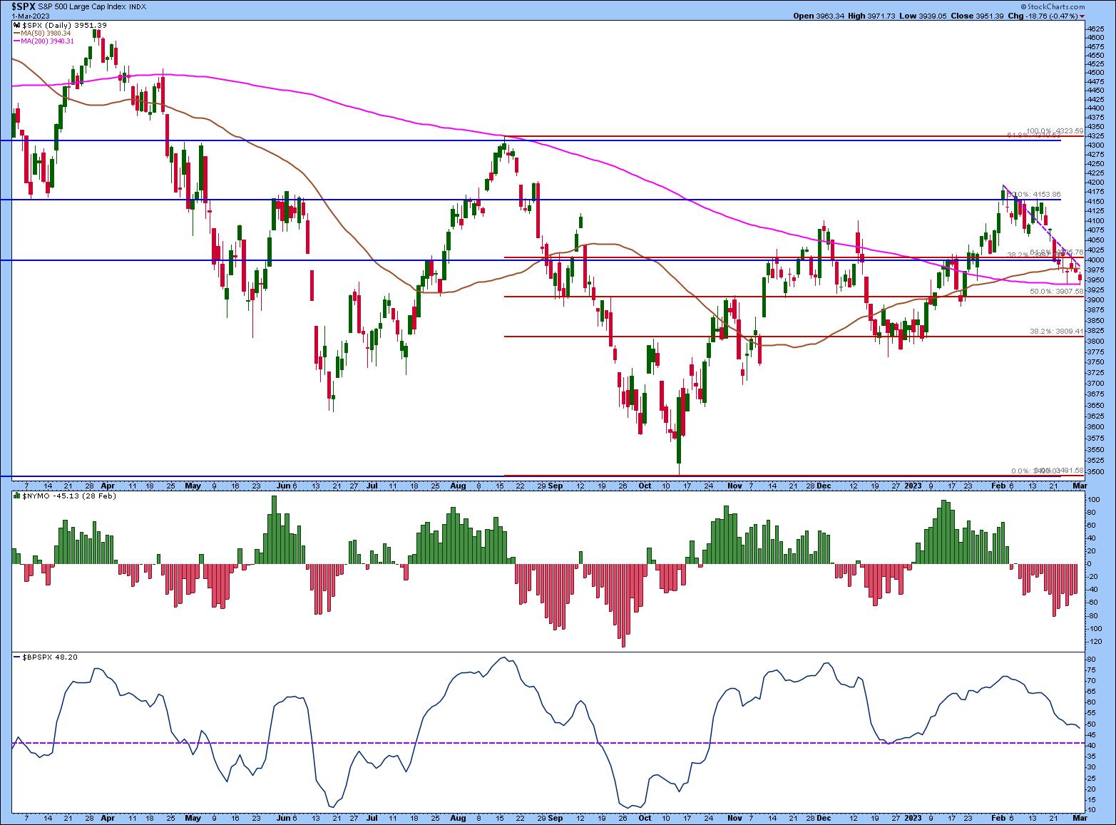
CHART 2: S&P 500 MARKET BREADTH INDICATORS. Indicators such as the McClellan oscillator and Bullish Percent Index can help identify reversals in investor sentiment, which in turn could reverse market trends. Both indicators are showing bearish sentiment. Keep an eye on these for any changes. They could give clues for market direction.Chart source: StockCharts.com. For illustrative purposes only.
The McClellan Oscillator and Bullish Percent Index can stay in negative territory for a while. Both can be used to identify reversals in sentiment, which could indicate potential reversals in the overall market, sectors, or industry groups.
- McClellan Oscillator. The ratio-adjusted McClellan Oscillator ($NYMO) indicates that there are more declining issues versus advancing issues. Keep an eye on any sign of divergence between the S&P 500 and the histogram bars.
- Bullish Percent Index. Typically, when the bullish percent index drops below 30%, that could indicate very bearish sentiment. The S&P 500 hasn't reached that level yet, although it's getting below the 50% threshold, which is a bearish sign. It's coming close to the December 41.82 level, which could coincide with the 50% retracement level of the S&P 500, which is 3907.
Prepare For Any Scenario
The next jobs report could provide further clues about the state of the overall economy. But that isn't till March 10. Until then, remain engaged with the market. There's no better time to pull out your favorite indicators and run through different "what-if" scenarios. The charts provided in this article are a starting point, but explore other indicators and set up a ChartList for a "holding pattern" market, then scroll through those charts to see if anything jumps out. Maybe by the time the Fed makes its next interest rate decision, you'll start seeing the wind blowing in some direction.

Disclaimer: This blog is for educational purposes only and should not be construed as financial advice. The ideas and strategies should never be used without first assessing your own personal and financial situation, or without consulting a financial professional.
Happy charting!