TAKEAWAYS
- The stock market could continue its bullish run on interest rate cut speculation
- The S&P 500 Equal-Weighted Index is a good indication of the health of the overall stock market
- Bond market action is often a leading indicator of stock market action

With the S&P 500 ($SPX) and Nasdaq Composite ($COMPQ) hitting all-time highs and the Dow Jones Industrial Average ($INDU) trying hard to get there, are the broader indexes overstretched and ready to snap?
At the moment, all indications point to a bullish move. Investors are anxiously awaiting the June CPI data point that drops on Thursday. If it comes in much hotter than expected, there's a chance of a selloff. But that could change during the trading day; how the market closes is more important.
The Stock Market Big Picture
Overall, the macro picture is bullish. The S&P 500 and Nasdaq Composite are trading well above their 20-day simple moving average (SMA). This is predominantly driven by the price action in the Magnificent Seven stocks. Apple (AAPL) and Tesla (TSLA), two stocks hit hard earlier this year, have overcome their tailwinds and are trending higher.
The bullish outlook may not be as rosy outside of the large-cap AI-related world. Look at the daily chart of the S&P 500 Equal Weighted Index ($SPXEW) below.
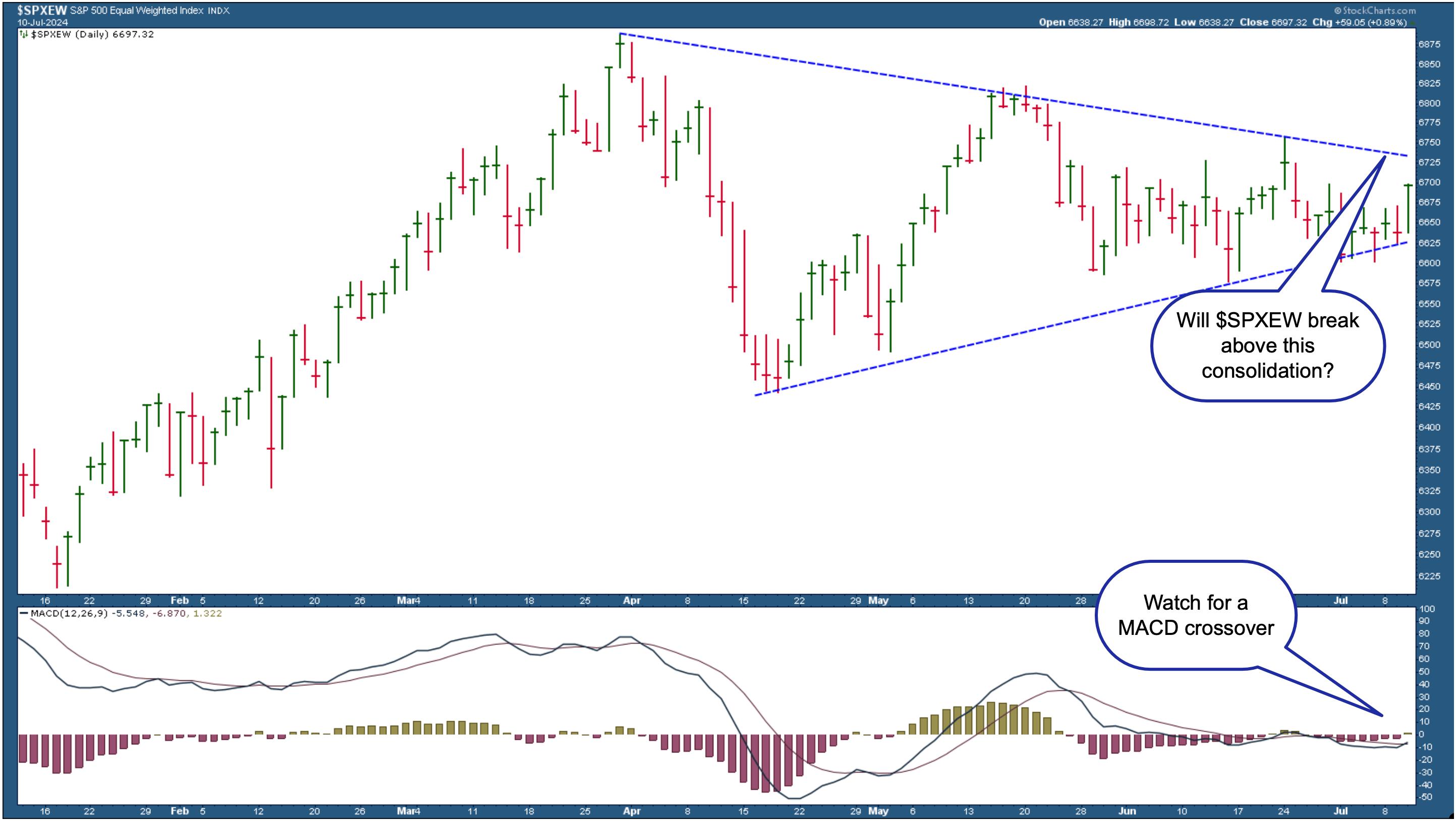
CHART 1. THE S&P 500 EQUAL-WEIGHTED INDEX ON THE VERGE OF BREAKING OUT? Look for the index to break above the triangle pattern and the bullish MACD crossover to confirm the market's bullish move.Chart source: StockCharts.com. For educational purposes.Though not hopeless, it's still got some room to cover before hitting new highs. $SPXEW is consolidating in a large triangle pattern and has avoided breaking below the lower side thus far. It's been closer to the lower line in the last few days, but Wednesday's 0.89% rise has brought it closer to the pattern's upper side. This is something to watch closely.
The Moving Average Convergence/Divergence (MACD) oscillator in the lower panel shows the lack of upside momentum at present. However, the histogram has moved just above the zero line, and it looks like the MACD line has just crossed above its signal line. If this crossover follows through, there's a chance $SPXEW could break through the upper triangle line and reach its all-time high. This would be a further optimistic indication of the overall bullishness of the equity market.
If you isolate the Technology sector and look at the Nasdaq 100 Equal-Weighted index ($NDXE) chart, you'll see that it's inching up towards hitting new closing highs. However, the Nasdaq 100 index ($NDX) is outperforming $NDXE by about 17%.
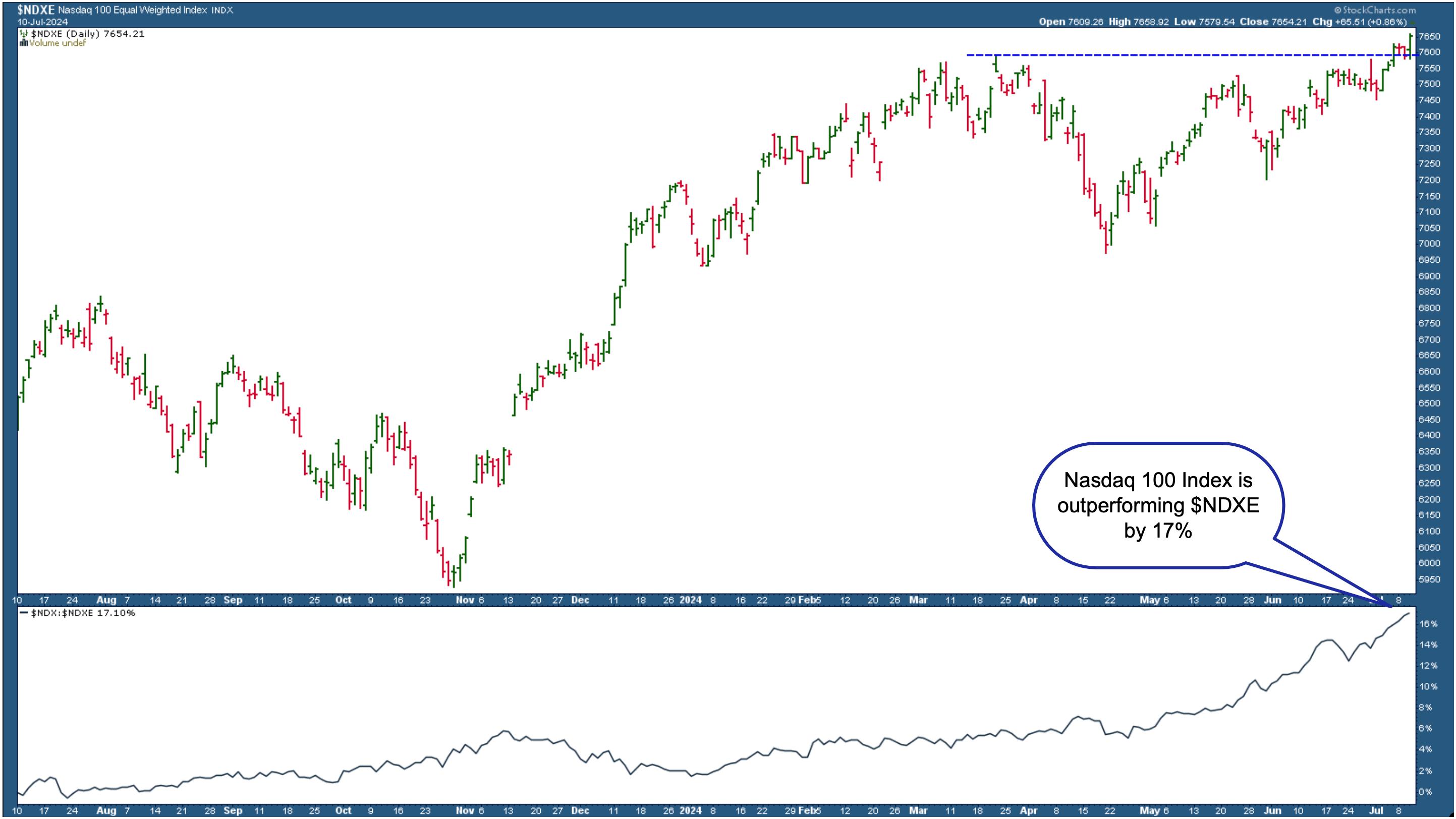
CHART 2. NASDAQ 100 EQUAL-WEIGHTED INDEX HITS NEW HIGHS. In spite of hitting new highs, the Nasdaq 100 index is outperforming the Nasdaq Equal Weighted index by about 17%.Chart source: StockCharts.com. For educational purposes.
It's all about tech stocks. Technology has been the best-performing sector for the last year. If you look at sector performance for the past year, all 11 S&P sectors are green—yes, even Real Estate.
The bullish outlook is still in play from a bird's eye perspective. Keep a close eye on the charts of the broader indexes. If they break below significant moving average support levels, objectively analyze your holdings to see if it makes sense to sell them.
It's All About Interest Rate Cuts
According to the CME FedWatch tool, the probability of a September rate cut continues to increase, as does one of a second rate cut in December. The stock market has priced in these cuts even though Fed Chair Powell, in his recent testimony, didn't indicate when rate cuts will start.
There's still more data before the September meeting, so have your ChartLists within easy reach. For as long as investors are speculating rate cuts, the market will probably keep moving the way it has been. But when those rate cuts arrive, things may change. Consider watching the bond market, which can often be a leading indicator of when interest rate cuts will start.
The weekly chart of the iShares 20+ Year Treasury Bond ETF (TLT) below shows that bond prices haven't made a decisive move yet. They will probably remain this way until the timing of rate cuts is crystal clear.
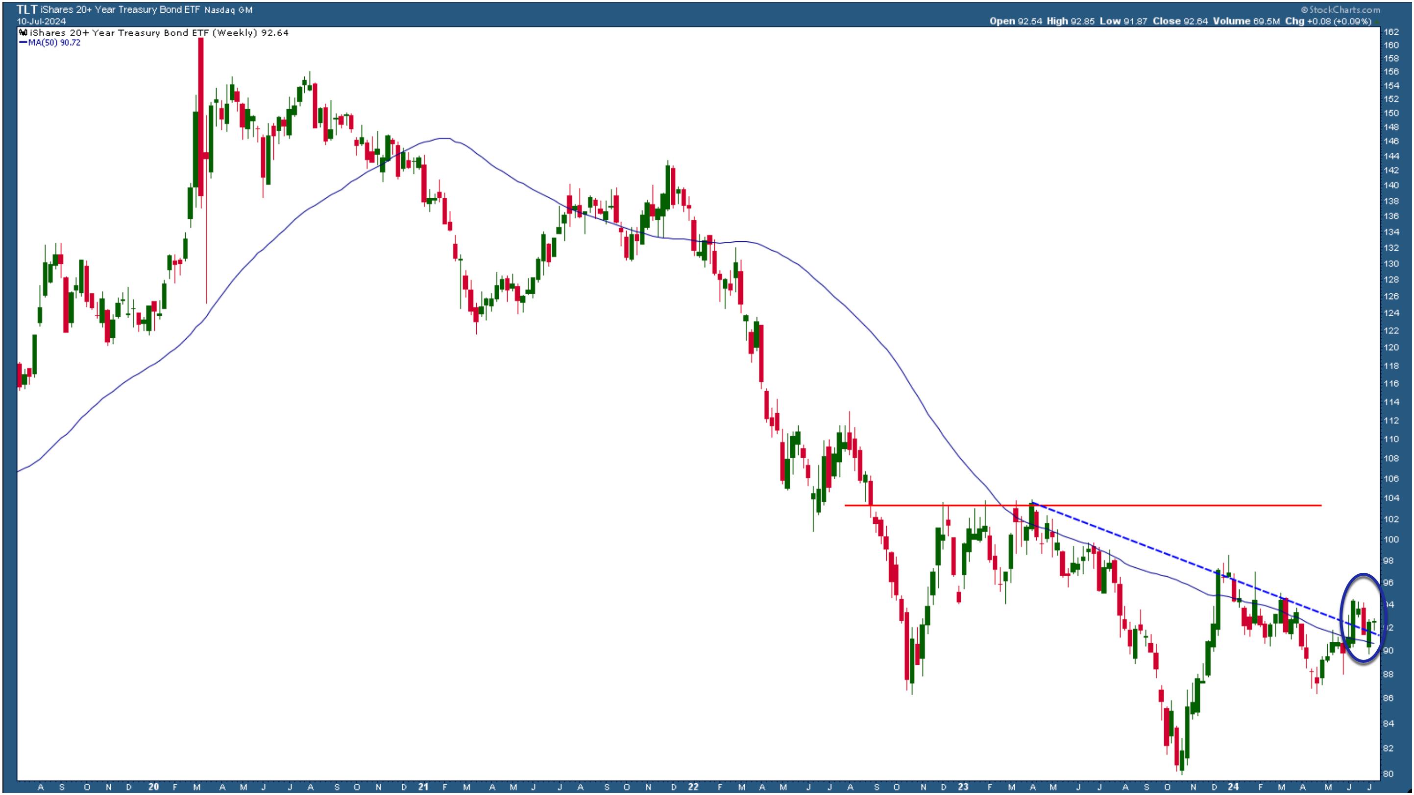
CHART 3. WEEKLY CHART OF TLT. Bond prices are still close to their five-year low. When the Fed cuts interest rates, TLT could see upside movement.Chart source: StockCharts.com. For educational purposes.
TLT is trading close to its five-year lows. If TLT remains above the blue-dashed trendline, investors speculate that interest rate hikes will probably happen. If TLT breaks below the trendline and declines, it would indicate that rate cuts aren't on the table yet.
Closing Position
Yes, the stock market is getting toppy. The extended bull run has been mainly driven by rate cut anticipation. Enjoy the bullish stock market ride, but know when to jump off.
Charts to add to your ChartLists:
S&P 500 Equal Weighted Index ($SPXEW)
iShares 20+ Year Treasury Bond ETF (TLT)

Disclaimer: This blog is for educational purposes only and should not be construed as financial advice. The ideas and strategies should never be used without first assessing your own personal and financial situation, or without consulting a financial professional.
Happy charting!