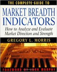
 We are progressing with the rebuilding of my “The Complete Guide to Market Breadth Indicators” book. We are rebuilding the entire book using StockCharts.com tools and also including the indicators into StockCharts.com’s symbol list. This article will cover the first half of Chapter 4, which deals with Advance Decline Difference Indicators. Please keep in mind that this article only will show selected indicators from chapter 4. Chapter 4 has 47 charts, so will be divided between two articles with this being the first article.
Important Note: Once the book is complete, I will be publishing a ChartPack on StockCharts.com which has ALL of the charts from the book (including the ones from these articles) in it.
Advances - Declines
The breadth indicators in this chapter all utilize the difference between the advances and the declines as their primary relationship.
Advance Decline Difference Indicators
- Advances - Declines
- Advance Decline Overbought Oversold
- Plurality Index
- Advance Decline - Fugler
- Advance Decline Line
- Advance Decline Line - 1%
- Advance Decline Line - Eakle
- Advance Decline Line - Normalized
- Advance Decline Line - Bolton
- Advance Decline Line - Adjusted Total Issues
- Big Movers Only
- Advance Decline Line Oscillator
- Absolute Breadth Index
- Absolute Breadth Index – Adjusted
- Advance Decline Power
- Coppock Breadth Indicator
- Haurlan Index
- McClellan Oscillator
- McClellan Summation Index
- Merriman Breadth Model
- Swenlin IT Breadth Momentum Oscillator
- Swenlin Trading Oscillator – Breadth
- Zahorchak Method
Each of these is covered in their own section below.
Advances - Declines
Also Known As: Overbought Oversold
Data components required: Advances (A), Declines (D)
Description: This is the difference between the advancing issues and the declining issues (Advances minus Declines).
Interpretation:
Anytime you deal with the difference or the ratio of two items, it is always best to smooth the data because the raw information will be too erratic to be useful. Chart 4-1 is the 21 day moving average of the advance decline difference. You can see that it is generally above the zero line during up moves and below it during down moves. The arithmetic smoothing has a couple of anomalies with it; it unfortunately delays the crossings of the zero line, but then avoids a large number of whipsaws (short term crossing that reverse direction quickly). Using shorter term periods would help the timing of the crossings but increase the whipsaws.
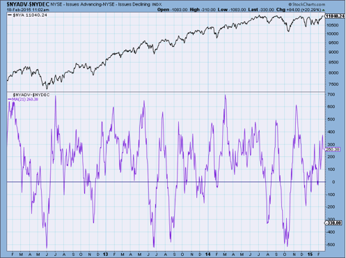
Chart 4-1
Author Comments:
Gerald Appel has stated that he looks at this difference in Advances and Declines by smoothing it with a 3 day exponential average. He said in a 1994 interview that when this indicator went above 500, it could be the start of a good rally. Also, if it goes below -600, standby for a good down move. Soon after the interview with Gerald Appel, the volume and number of issues on the New York Stock Exchanges began to increase significantly. Chart 4-2 shows this advance decline indicator with the zones changed to +1000 and -1000. These seem to keep his concept alive and up-to-date.
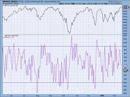
Chart 4-2
Justin Mamis, who, with Stan Weinstein started the Professional Tape Reader newsletter, likes to look at the 10 day average of the Advance Decline difference plotted with the 30 day average of the difference. The digital (squared corners) line in chart 4-3 is showing the times when the 10 day average is above the 30 day average. Whenever it is above the zero line, the 10 day is above the 30 day and it is bullish. If you are familiar with a moving average crossover system, this is very similar; instead of using price this indicator uses the difference between advances and declines.
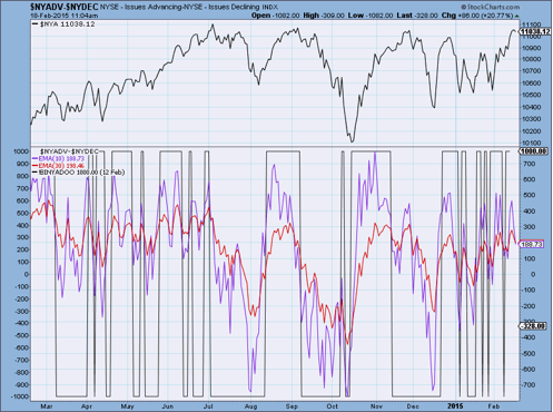
Chart 4-3
Formula: Advances (A) - Declines (D)
StockCharts.com Symbol: $NYADV-$NYDEC
(It can also be created using the single symbol $NYAD)
References:
Appel, Gerald, “Gerald Appel, with Systems and Forecasts.” Stocks & Commodities, Volume 12, March 1994, pp 98-105.
Mamis, Justin, “Justin Mamis and the Meaning of Life.” Stocks & Commodities, Volume 13, August 1995 pp 359-365.
(Note: Charts 4-4 thru 4-7 will be available in the book.)
Plurality Index
Author/Creator: Paul Dysart wrote about it in 1937, Ralph Rotnem used it, and Alan Shaw named it.
Data components required: Advances (A), Declines (D).
Description:
This is a moving total of the absolute difference between advances and declines over a 25 day period. According to James Alphier, this was part of Paul Dysart’s broader “Theory of Equalization.”
Interpretation:
Alan Shaw used benchmarks of 6,000 and 12,000. If the indicator drops below 6,000, a sell warning is signaled. He then waits until the index turns back up, at which point the signal becomes a definite sell. If the indicator rises above 12,000, it gives a buy alert, at which point he waits until it starts to drop, when it gives a definite buy signal. Chart 4-8 shows this technique.
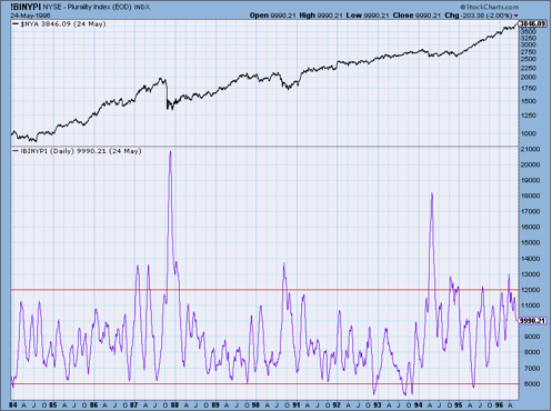
Chart 4-8
The reasoning behind this indicator is that there is usually complacency at the top and panic at the bottom. John McGinley, of Technical Trends, says that a bull market dies of exhaustion. While at market bottoms, everyone is rushing in to buy.
Author Comments:
I have seen the Plurality Index calculated using a moving average, instead of a sum. They look similar, but the zones need to be reset.
Since 1994 this indicator has had an upward bias that makes Alan Shaw’s zones in need of adjustment. It would appear that 23,000 can replace Shaw’s 12,000 zone, and that 14,000 can replace the 6,000 zone. Incidentally, I’m quite sure Alan Shaw knows this or at least uses different zones than when Art Merrill wrote about it in 1990. Art Merrill claims that this must be a daily indicator and not one that uses weekly data. Alan Shaw says that this indicator doesn’t always give a signal, but when it does, it should be noted. Chart 4-9 shows zones at 23,000, and 14,000.
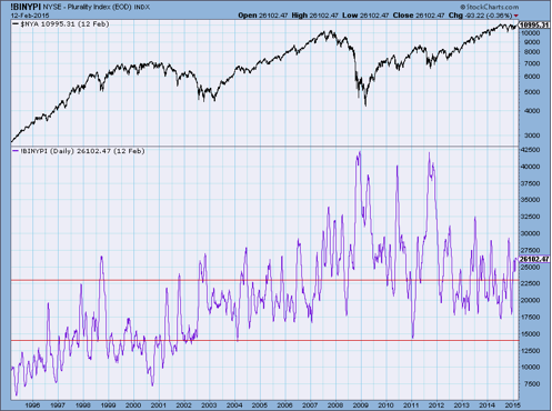
Chart 4-9
Formula: ∑|A – D| over 25 days.
StockCharts.com Symbol: !BINYPI
References:
Merrill, Arthur A., “Plurality.” Stocks & Commodities, Volume 8, April 1990, pp 137-138.
Advance Decline - Fugler
Author/Creator: George Fugler
Data components required: Advances (A), Declines (D).
Description:
George Fugler called this his “quick and dirty” indicator. If the value of Advances minus Declines is positive on three successive trading days, an up (buy) signal in generated. If they are negative on three successive days, a down (sell) signal is generated.
Interpretation:
Arthur Merrill said that his indicator is afflicted with whipsaws, but it stays in gear during a trend. Chart 4-10 shows each signal for up and down. The up spikes represent the buy signals and the downward spikes represent the sell signals. There are usually a few similar signals in a row before a reversal, so one should ignore multiple signals.
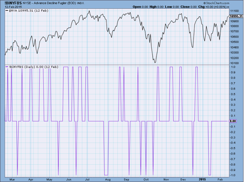
Chart 4-10
Author Comments:
Arthur Merrill is correct when he said this has lots of whipsaws. He was never one to mince words.
Formula:
"+1" if (A – D) > 0 for the past 3 consecutive days
"-1" if (A – D) < 0 for the past 3 consecutive days
otherwise "0"
StockCharts.com Symbol: !BINYFBS
References:
Merrill, Arthur, “More Trend Detection.” Stocks & Commodities, Volume 6, Sept, 1988, pp. 219.
(Note: Charts 4-11 thru 4-15 will be available in the book.)
Advance Decline Line - 1%
Also known as: Momentum Index by Stan Weinstein
Author/Creator: Stan Weinstein and Carl Swenlin (Carl says it was Weinstein's work that influenced him)
Data components required: Advances (A), Declines (D).
Description:
This is the Advance Decline Line with a long term smoothing of 200 days. Carl Swenlin prefers using an exponential moving average and Stan Weinstein prefers a simple / arithmetic moving average.
Interpretation:
Stan Weinstein suggests that it gives buy and sell signals when it crosses the zero line. From below to above the zero line was bullish and from above to below was bearish. He further refines it to say that the longer it remained on one side of the zero line before crossing it, the better the signal. Also, the further into positive (above zero) or negative (below zero) territory that it had been would add to the value when it did cross the zero line. His most meaningful bearish signal is when the indicator has been in positive territory for quite a while and moved to an extreme. Chart 4-16 shows Weinstein’s Momentum Index.
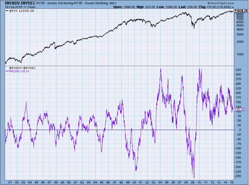
Chart 4-16
Author Comments:
I found Weinstein’s comment that this was more helpful at spotting tops than bottoms to be interesting. This is not usually the case when it comes to technical indicators. I believe the fact that he used a simple moving average might be the reason. Remember, with a simple average, the data from 200 days ago is carrying the same weight as the most recent data. To really make this point, the data from six to eight months ago (60+ days) is carrying the same weight as the data in the last three months. Most market tops are long spread out affairs of distribution and take a while to be put in place. This would somewhat explain that, and also why Weinstein thought it was not that good at bottoms, as most bottoms are sharp and decisive.
I have always preferred to use exponential smoothing when using large time periods. In this case the Swenlin version seems better at keeping you in most of the move, either up or down. Additionally, Carl uses the ratio of the difference between advances and declines divided by the sum of advances and declines. Here is what Carl Swenlin says about it: “I find it much more useful to watch where this indicator forms tops and bottoms. For example, in 1990, when the Dow made two successive new highs, the 1% Advance Decline Line was topping below the zero line. The 1990 bear market followed immediately after the second top. Again in late 1994, as the Dow was putting in a double top, this indicator was topping below the zero line. The market subsequently went to its final low prior to the monster rally of 1995, which leads to the significance of bottoms on this indicator. When you see it bottoming in the area of -100 to -150, chances are that the market is putting in a major low. This happened in late 1994, late 1990, late 1987, and mid 1984. The bottom in 1981 did not lead to a major rally, but it was followed in 1982 by two higher indicator bottoms corresponding with two lower market lows, the final low being in August, 1982.” Chart 4-17 shows Carl Swenlin’s exponential version of the momentum index, which he calls 1% EMA (exponential moving average) of Advance Declines. While it offers more whipsaws, it is also considerably more timely than the Weinstein version.
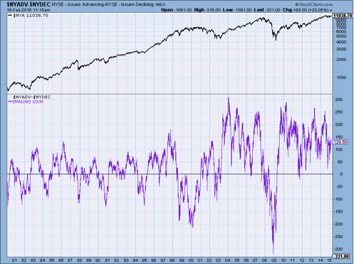
Chart 4-17
Formula: Previous Value + (A – D) smoothed by 200 days.
StockCharts.com Symbol: $NYADV-$NYDEC (or $NYAD) with the 200-period EMA added
References:
Weinstein, Stan. Secrets for Profiting in Bull and Bear Markets. Dow Jones-Irwin, Homewood, IL., 1988
Swenlin, Carl - DecisionPoint, http://www.stockcharts.com
Stay tuned! Chapter 4, part 2 will be out soon.
Greg Morris