 This article sort of ties in with the article I wrote about Modern Finance, “So What Is It with Modern Finance?” I really questioned whether something like this belonged on StockCharts.com, but finally decided that if it gave just a few folks some information that they deemed as valuable, it would be worth it. Sorry about the algebra, but I hope I will explain it so the formulae aren’t necessary. When I explain these things I just type in my own definitions, a purist might challenge some parts for exactness, but the concept is the goal. I’m sure you have heard the media and money managers talk about Alpha and Beta. Alpha in its loosest form is outperformance with whatever it is compared to, usually its benchmark. Beta is more about the movement of the issue relative to its benchmark. If it goes up more when its benchmark goes up, then it has a higher Beta. A Beta of one means it moves just like its benchmark. Have you ever wondered how academic finance calculates Alpha and Beta? You’re about to find out.
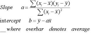
Chart A is known as a Cartesian coordinate system, sometimes (almost always) referred to as a scatter diagram, used often to compare two issues and derive relationships between them. The returns of one are plotted on the X axis (abscissa / horizontal) and the returns of the other are plotted using the Y axis (ordinate / vertical). Those small diamonds are the data points. A concept known as regression is then applied by calculating a least squares fit of the data points (see next paragraph for more detail). This is the straight line that you see in Chart A, angling up and to the right. Then a little high school algebra is used on the equation for a straight line, which is y = mx + b, where m is the slope of the line, and b is the where the line crosses the Y axis or Y-intercept. So once you have the linearly fitted line, you can measure the slope and Y-intercept and this will give you the beta (slope) and alpha (Y-intercept).
Least Squares is a mathematical process to produce a single straight line that best represents all the data points in the chart. In other words, the sum of the distances from the data points to the line are at a minimum. In order to avoid using negative numbers, the distances are squared, and hence, least squares. The angle of the line is called the slope (m) and the point where the line crosses the vertical axis is called the Y-intercept. Modern finance believes that the slope is the Beta and the Y-intercept is the Alpha. Let me pick that apart a little bit.
The outcome of this process yields the alpha (Y-intercept), beta (slope), and the correlation (R). The important point here is the value derived by squaring the correlation: r-squared. Now only academia would square something of value like correlation and give it an entirely new name called Coefficient of Determination. I’m serious R-squared is called that.
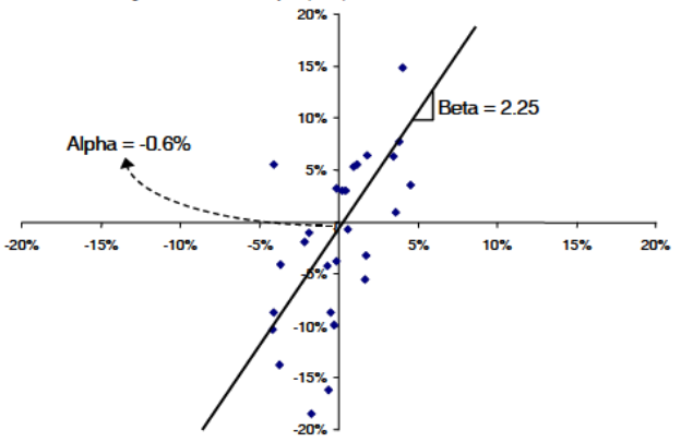
Chart A
Chart B is a chart of an equity (ABC) plotted against an index. The least squares line’s formula is shown and the data points are red circles. From the formula we can see that the slope is 0.5997 and the Y-intercept is 0.0005. A slope greater than 1.0 means ABC is moving more than the index. A positive crossing of the Y-intercept means its performance (return) was better. OK, so what is R-Squared? In Chart B, R-Squared is 0.7965. A reasonably high value, it says the regression line does a fairly good job of approximating the data points. An R-Squared of 1, means it represents them perfectly. If you ever see that, you better check your data as you just might be plotting the security against itself. Which by the way would yield a regression line that perfectly divides the positive quadrant and the negative quadrant, or a slope of 1.0. Okay, I’m way off track.
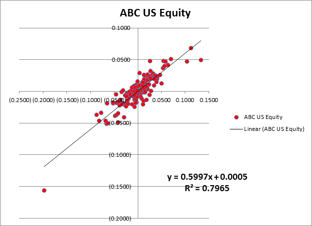
Chart B
Chart C is another example using a different security, XYZ. In this example the data is the blue diamonds. The regression line shows that the Beta is 0.5997, the Alpha is 0.0005, and the R-Squared is 0.2051. Please notice that the Alpha and Beta are exactly the same as the example in Chart B. Only the R-Squared is different; well except the color and shape of the data points. How can that be? It is because R-Squared is saying the regression line does not do a good job of representing the data points, in other words it is not well correlated.
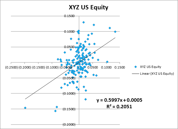
Chart C
Chart D visually demonstrates this. The regression line is exactly the same for both XYZ and ABC securities. Okay, so what? Here is the issue. If the data isn’t correlated, are the values given for Alpha and Beta of any use? I think not. Yet, most do not bother to point that out and while they show R-Squared, they also show Alpha and Beta as if they were just fine. Many websites that show statistics on performance do this. I would like to mention a few of them but I have actually learned a few things over the decades, and have never been in jail. They will present a list of funds, showing their R-Squared, Alpha, and Beta, with absolutely no mention that if R-Squared is small, Alpha and Beta are essentially meaningless. Sad, indeed. If you are searching for an investment and like to pick them based upon Alpha and Beta, hopefully you will want the mathematical calculation of Alpha and Beta to be based upon a good linear representation of the data.
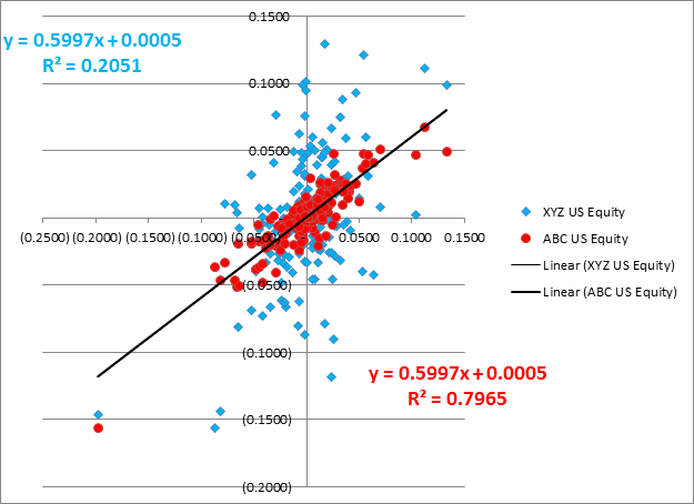
Chart D
Are you still with me? Congratulations, I’m sure anyone other than StockCharts.com users bailed out long ago. Personally, I NEVER bother to look at the Alpha and Beta especially when they are calculated using linear analysis (least squares line). Here is a real gotcha! Since R-Squared is the square of correlation (R), then a highly inversely correlated relationship could have the same R-Squared as a highly correlated relationship. Hopefully, since you are also looking at ShartCharts that would not come as a surprise. And finally, if I were going to write and promote Alpha and Beta as determined by linear analysis, I’d modify the equation of a line to: y = bx + a. Think about it.
I NEED YOUR HELP - If you have been reading my articles for the last few months, you know that most of what I write is not tied to market action and is an opinion about something I believe or have experienced in the last four decades as a technical analyst. Often the articles are about things I have observed in the markets and witness others doing that I am bothered by. Well, I’m a little concerned that at some point one of two things will happen. One is that I will have offended everyone and there will be no one remaining to read my articles. The other is that I’m concerned that the well will go dry. Both scare me, but it is the dry well that concerns me. I’m asking for your feedback, via the comments, on any subjects, concepts, indicators, whatever, that you would like to see me attempt to cover. Please!
Trade smart!
Greg Morris