 This is the final article highlighting the chapters and indicators in my new second edition of The Complete Guide to Market Breadth Indicators. This is a completely new chapter as I did not include non-internal breadth in the first edition; I stuck with internal breadth only. Don’t ask me why. I do not have an answer. However, I will accumulate questions from readers via the Comments section and will write additional articles addressing those questions.
A brief sales pitch to follow: Before we begin the review of Chapter 11 for the 2nd Edition of The Complete Guide to Market Breadth Indicators, I am proud to announce that after over a year of work with many of the fine folks at StockCharts.com, the book is now available in Kindle format from Amazon. You can click HERE to go to the Amazon page. I priced it to sell – only $19.99. It has lots of new material from Tom McClellan, George Schade, and Dick Arms, plus all of the charts are from StockCharts.com. Plus, an entirely new chapter (11) on non-internal breadth indicators, which is highlighted in this article.
And even more good news, we (StockCharts.com and I) have created a ChartPack that has all of the charts in the book, not only for the New York Exchange (in the book), but also for the NASDAQ Exchange and the Toronto Exchange. The ChartPack has 187 charts for the NYSE, 187 for the NASDAQ, and 148 for the TSX Toronto. Toronto is slightly fewer because not all of the breadth data was available, in particular, the weekly breadth data. CGMBI ChartPack – Click Here. This ChartPack means that you have every chart in the book plus the NASDAQ and TSX versions updated each day. The ChartPack is only $49.95 and is good as long as you are a subscriber to StockCharts.com. The other really nice feature of publishing with Kindle is that if I want to add something to the book, say I discover a new breadth indicator, I can do so. And everyone who bought the book will receive the update for free. And guess what? This will be the last sales pitch on these products; at least until I forget that I said that.
Chapter 11 – Non-Internal Breadth Measures
This chapter is completely new; the first edition of the book had an interview with my co-workers at Stadion Money Management. When the first edition was published I decided to only include internal market breadth which I viewed as advances, declines, up and down volume, new highs and new lows. However, there are other breadth measures which I should have included such as the Bullish Percent Indices, the Percent above a moving average, Carl Swenlin’s Participation Indices, and a few breadth indicators that use US Common Stocks Only. Because these are considerably different, I’m going to deviate from the chapter set up I outlined earlier.
Note: Much of the content in this chapter was gleaned with permission from StockChart.com’s ChartSchool.
Percent Above Moving Average
Introduction
The percentage of stocks trading above a specific moving average is a breadth indicator that measures internal strength or weakness in the underlying index. The 50-day moving average is used for the short-medium term timeframe, while the 150-day and 200-day moving averages are used for the medium-long term timeframe. Signals can be derived from crosses above/below 50% and bullish/bearish divergences. On StockCharts.com the indicator is available for the Dow, Nasdaq, Nasdaq 100, NYSE, S&P 100, S&P 500 and S&P/TSX Composite. SharpCharts users can plot the percentage of stocks above their 50-day moving average, 150-day moving average or 200-day moving average.
Calculation
(number of stocks above 50-day moving average)
Percent above MA = -----------------------------------------------------------------
(total number of stocks in index)
Nasdaq 100 example: 60/100 = .60 or 60%
S&P 500 example: 80/500 = .16 or 16%
Dow Industrials example: 7/30 = .2333 or 23.33%
Calculation is straight forward. Simply divide the number of stocks above their XX-day moving average by the total number of stocks in the underlying index. The NYSE Index (Chart 11-1) shows 60% stocks above their 200-day moving average. As the chart shows, these indicators fluctuate between zero percent and one hundred percent with 50% as the centerline.
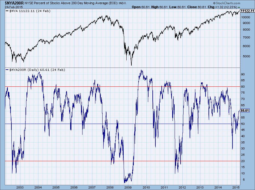
Chart 11-1
Interpretation: This indicator measures the degree of participation. Breadth is strong when the majority of stocks in an index are trading above a specific moving average. Conversely, breadth is weak when the minority of stocks are trading above a specific moving average. There are at least three ways to use these indicators. First, chartists can obtain a general bias with the overall levels. A bullish bias is present when the indicator is above 50%. This means more than half the stocks in the index are above a particular moving average. A bearish bias is present when below 50%. Second, chartists can look for overbought or oversold levels. These indicators are oscillators that fluctuate between zero and one hundred. With a defined range, chartists can look for overbought levels near the top of the range and oversold levels near the bottom of the range. Third, bullish and bearish divergences can foreshadow a trend change. A bullish divergence occurs when the underlying index moves to a new low and the indicator remains above its prior low. Relative strength in the indicator can sometimes foreshadow a bullish reversal in the index. Conversely, a bearish divergence forms when the underlying index records a higher high and the indicator remains below its prior high. This shows relative weakness in the indicator that can sometimes foreshadow a bearish reversal in the index.
Chart 11-2 shows the percent of stocks above their 200-day EXPONENTIAL average. Keep in mind that because the exponential average hugs the data closer, move away from it is more difficult and therefore will not show the high and low readings that you get when using the SIMPLE moving average.
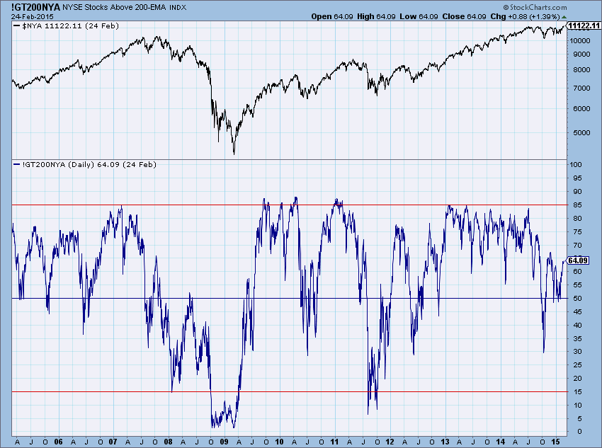
Chart 11-2
Chart 11-11 shows how you can plot the Bullish Percent with its associated Index. As with most of these non-internal breadth indicators, they will show strength and weakness earlier than most.
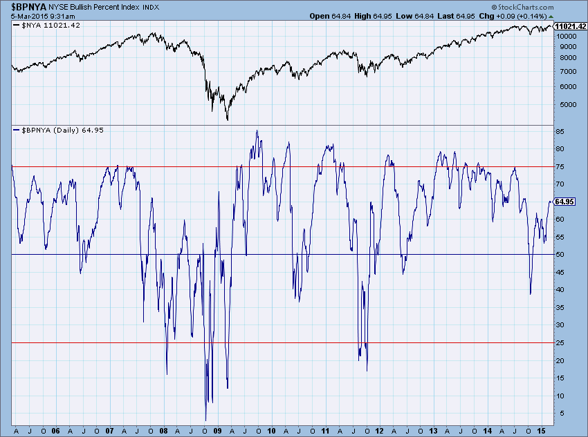
Chart 11-11
Conclusions
The Bullish Percent Index offers something for all sorts of traders. Bottom pickers can look for bullish reversals below 30%. Top pickers can look for bearish reversals above 70%. These are the riskier entries because tops and bottoms can extend over time. There may also be a test of the prior lows or prior highs. Trend followers can look for bullish reversals occurring above the 50% level. A bullish bias is already present when over 50% of stocks are on P&F buy signals. A new column of X's above 50% signals renewed strength when the bias is already bullish. A bearish bias exists when below the 50% threshold. A new column of O's signals renewed weakness when the bias is already bearish. Traders can use the Bullish Percent Indices to define a trading bias before looking for trades in individual stocks or ETFs. Buy signals are preferred when the Bullish Percent Index favors the bulls. Sell signals are preferred when the Bullish Percent Index favors the bears. It is important to use the Bullish Percent Index in conjunction with other indicators.
Participation Index
NOTE: The descriptive material that follows was written by Carl Swenlin, the creator of the Participation Indexes.
This is the creation of Carl Swenlin who ran DecisionPoint for many years and is a superb technical analyst. The Participation Index (PI) measures short-term price trends and tracks the percentage of stocks in a given index applying maximum pressure to move prices higher or lower. There are actually two Participation Indexes: Participation UP and Participation DOWN.
The Participation Indexes are driven by a short-term Price Momentum Model (ST-PMM), which is applied to each stock in the particular index being tracked. The ST-PMM is strictly mechanical and is always set on BUY or SELL. For a new signal to be generated, price must: (1) reverse at least1% from the extreme price for the current signal; and (2) pass through the 20-day exponential moving average (20EMA). Both conditions must be met at the same time before the signal can change.
For example, if the model is on a SELL signal, in order to change to a BUY signal, price must rise 1% from the lowest price reached during the SELL signal, and price must cross up through the 20EMA.
If the model is on a BUY signal, in order to change to a SELL signal, price must decline 1% from the highest price reached during the BUY signal, and price must cross down through the 20EMA.
Certain conditions will cause the model results to score a point for either UP or DOWN Participation. The results are charted as a percentage of the total stocks in the market index being tracked.
PARTICIPATION-UP is registered when one of the following occurs:
1) The first day a BUY signal is generated;
2) The current BUY signal profit is equal to the highest profit of the current signal;
3) The signal is a SELL signal, but the signal has a loss which is equal to the highest loss of the current signal.
PARTICIPATION-DOWN is registered when one of the following occurs:
1) The first day a SELL signal is generated;
2) The current SELL signal profit is equal to the highest profit of the current signal;
3) The signal is a BUY signal, but the signal has a loss which is equal to the highest loss of the current signal.
Specifically, we track participation of each stock in a given index. We then see how UP participation, the number of stocks actually driving the up move expands as the market moves higher, then contracts prior to short-term market tops. A similar thing can happen with DOWN participation as the market is about to bottom. Bottom Line: A trend needs a strong plurality of participation to be maintained.
What we look for are climactic readings that identify points where internal pressure is likely to have reached the point of exhaustion. The chart below shows a one-year period during a bull market. DOWN Participation climaxes most often signal the proximity of a price bottom; whereas, UP Participation climaxes frequently signal the deceleration of the price move. However, the UP climaxes should always be considered a warning that a price top may be near, and stops should be adjusted accordingly.
Chart 11-12 below shows the up and down participation indexes. The Nasdaq 100 (NDX) data was used as the NYSE for Participation is not available.
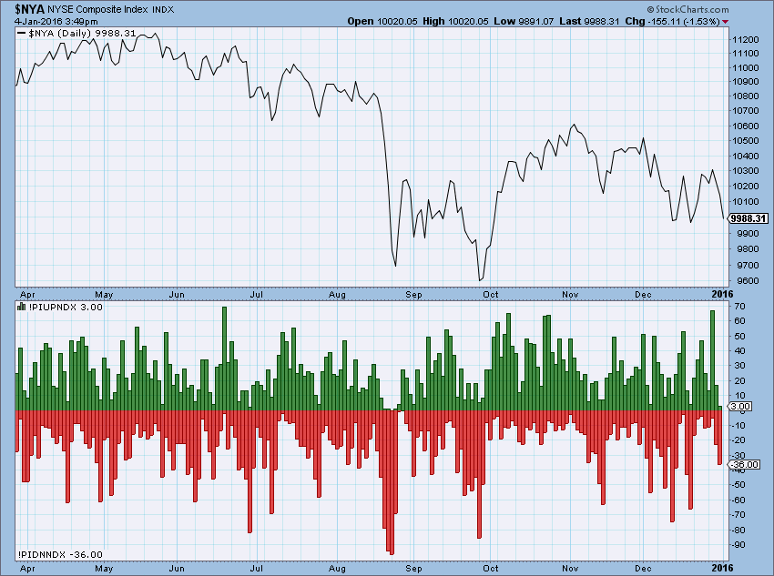
Chart 11-12
I wish to encourage you to ask questions via the Comment section below each article. I will accumulate them and periodically answer them. Thanks.
Trade with Understanding,
Greg Morris


