 I am repeatedly asked what are the most important DecisionPoint charts to watch for determining trend reversals or how to use the DecisionPoint indicators for confirmations. I'll preface this article by reminding everyone that all indicators and trend following models have limitations, but the charts below are the ones I look at everyday before writing my blogs. These charts are available in our free DecisionPoint ChartPacks or you can review the DecisionPoint Chart Gallery for the four indexes covered (or just S&P 500 charts for non-members). For more information on downloading ChartPacks, you can click here.
Chart #1: Obviously, the first chart should be the daily chart. I'll use the S&P 500 for the example in this blog. All of the information you need as far as the DP Trend Model is included on this chart. Short-Term Trend Model signals are attention flags because they change too frequently. You can determine these signals using the 5/20-EMA crossovers. The Intermediate-Term Trend Model is can be used for timing signals, but these crossovers should be accompanied by analysis of other indicators, especially the Price Momentum Oscillator (PMO). The Intermediate-Term Trend Model uses 20/50-EMA crossovers for its signals. The Long-Term Trend Model uses 50/200-EMA crossovers and determine whether an index or stock or ETF, etc. is in a bull or bear market environment. Currently, all Trend Model signals are on a BUY except the Long-Term Trend Model. A look at the daily chart below and we can see that crossover will occur very soon.
All DP Charts include the PMO. Basically it tells which direction momentum is going as well as market condition, overbought or oversold.
The daily chart below tells us that support is near the 200-EMA or September high. We know that momentum has been swinging higher, but it is now negative since the PMO topped.
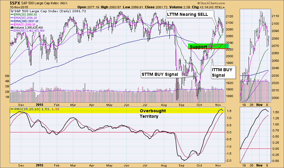
Chart #2: Next I look at Ultra-Short-Term Indicators. The primary are the Climactic Volume Indicator (CVI) and Participation Index. Look for the "climactic" readings or spikes. They indicate an initiation impulse or exhaustion climax. Typically, if a positive spike happens after a short decline, it is likely an initiation to higher prices. If we see a negative spike at the end of a decline, it will usually represent exhaustion. Many follow the VIX so no explanation there, except that notice during the climactic readings on the CVI/Participation Index, readings were generally on the edge or past the Bollinger Bands. Currently, we are watching for the CVI or Participation Index to spike in either direction. In either case. because we are in the midst of a decline, a positive spike would likely mean an initiation to higher prices and a negative spike would probably be an exhaustion.
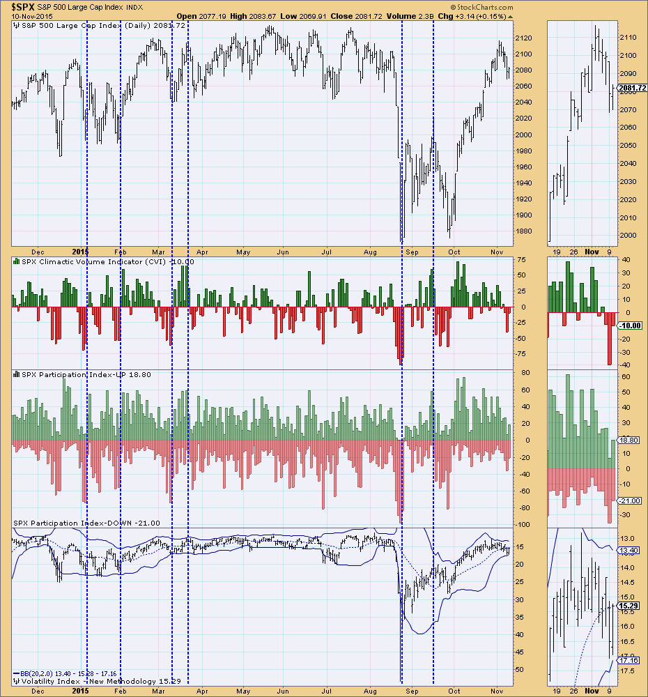
Chart #3: Short-Term indicator chart. The primary short-term indicators are the Short-Term Volume Oscillator (STVO) and the Swenlin Trading Oscillators (STOs). These tell us the short-term conditions of the market and can confirm Trend Model signals. Look for overbought and oversold readings, but direction and divergences with price also clue us in. Notice that during the finish in the recent extended rally showed directionless indicators moving simply sideways. This is a negative divergence. Currently they are all declining which confirms the pullback that is in motion.
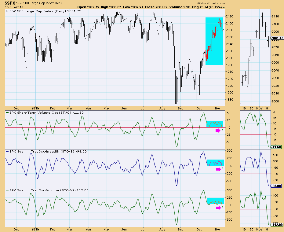
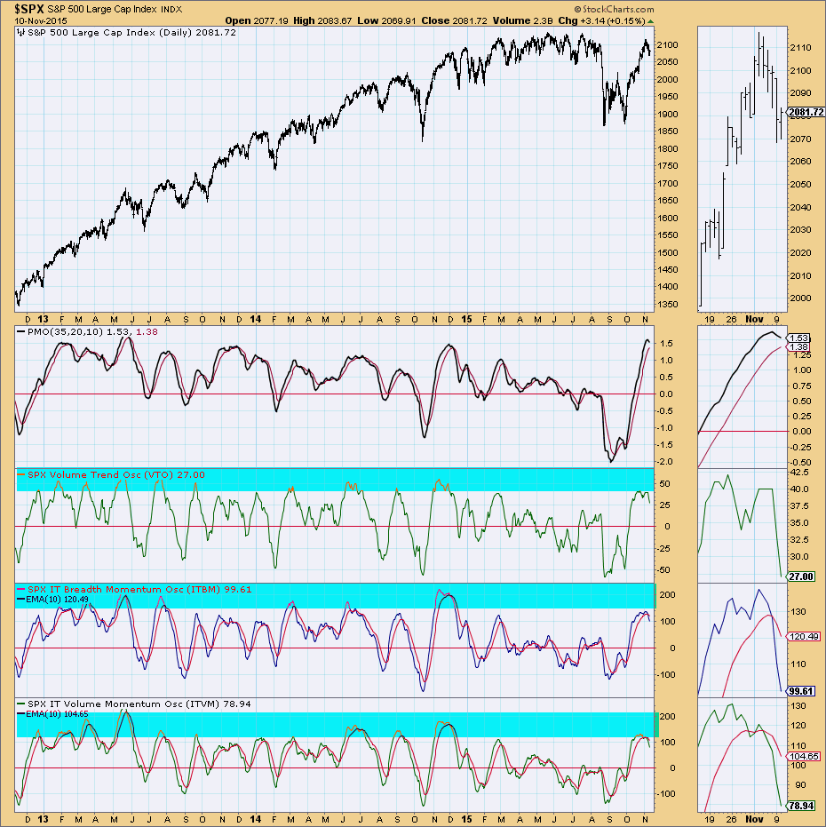
Chart #4: Intermediate-Term indicator chart. The primary intermediate-term indicators are the Volume Trend Oscillator (VTO), Intermediate-Term Breadth Momentum Oscillator (ITBM) and the Intermediate-Term Volume Momentum Oscillator (ITVM). Look for overbought/oversold readings, direction and divergences. The current IT indicators are bearish. They have reached very overbought territory and have now turned lower, crossing over their signal lines.
Conclusion: These four charts can tell you nearly all you need to know about an index's support and resistance levels and conditions in all three time frames. The DecisionPoint ChartPack "Trend and Condition" collection includes these charts not only for the major indexes, but also for various sectors. To extend this to your investment hunt, you can either use the index and sector ETFs or find stocks within a strong sector based on the charts I discussed above. Watch these charts now for clues and read the DecisionPoint Alert daily to learn how best to analyze them.
Come check out The DecisionPoint Report with Erin Heim on Wednesdays and Fridays at 7:00p EST. The archives and registration links are on the Homepage under “What’s New”.
Technical Analysis is a windsock, not a crystal ball.
Happy Charting!
- Erin