The Fed - Federal Reserve - has made massive accomodations over the last 4 years. Walmart WMT has been an interesting chart to watch. Lets lay it in here and analyze it with a bit of depth.
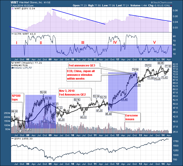
First of all, the top purple shaded area plot is the SPURS - $SPX Relative Strength. The Relative Strength of Walmart compared to the $SPX. When it is going up, Walmart is outperforming the $SPX. We can see two areas where the SPURS really started going up. It broke out in Ocober 2007 and in the second quarter of 2011.
The next plot is the SCTR or StockCharts Technical Ranking system. You can see 5 clear zones on the chart. Zone I, can't get above 50. Zone II, Walmart breaks out and and spend 18 months above 50. Its final peak (SCTR) coincided with the $SPX low. Zone III has some interesting clues. As Walmart was testing new highs around $51, the Fed announced QE2. That was the SCTR peak just to the right of III. WMT continued to make a little progress, but essentially wound sideways. Zone IV saw the SCTR move well above 50 and stay there. After the Fed QE2 wound down and the Eurozone issues flared up, Walmart rose 65% in 15 months. As if to stop the Walmart rally, all four central banks announced easy money policies in September 2012. Walmart sits $3 higher today after a 15 month move that saw the $SPX explode higher. The sideways consolidation in WMT for Q1 2012 was just a pause in Zone IV it seems. The 4 central banks were able to reverse both the bond market and the Walmarts fortunes by implementing coincident strategies. Zone V shows Walmart stuck below 50 ever since.
The timing of the 4 central banks all pushing their chips in during September 2012 was interesting. With the rapid rise in a defensive stock like Walmart, it would appear the Central Banks were concerned. The reality is that major indexes all over the world had the dreaded triple top structure. The $SPX was stalling around 1500, The $COMPQ spent all of 2012 oscillating around 3000 which was marginally above the 2007 high. India, Germany, London all had levels that technicians would probably have defined as resistance.
Analyzing the Walmart price plot, Walmart was actually up 15% from the $SPX October 2007 high to the March 2009 low. You can see Walmart has continued to make rising lows from the 2007 top. The two blue shaded areas match the SCTR areas above 50. Notice that both of the boxes highlight enthusiastic growth in Walmarts share price while the $SPX was selling off. After those periods, Walmart has essentially traded sideways and the volume has gone to sleep. Should Walmart start to jump above 50 million shares a week and the SCTR shoots above 50, it would suggest starting another blue box. Until then, its business as usual. With the SCTR at 43, it would not hurt to set an alert.
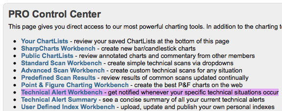
Extra, Extra RT and Pro members can create alerts. To do that, go to your members tab and select setting a technical alert.
Once there, you can enter a simple command string.
While some of this is suggestive and coincident, the extreme moves of the last 7 years have really helped us analyze the market with different indicators. Walmart is clearly a defensive play during times of upheaval. Investors seem to be watching the Fed and Walmart in tandem so maybe we should too.
Greg Schnell, CMT
We try to keep our articles informative and entertaining. Make sure you check out the other blog writer articles in Mailbag, Chartwatchers, Traders Journal, Decision Point and The Canadian Technician. All of these articles are free to subscribe to. The subscriber button is top right on most articles. One of the little known secrets of StockCharts is our Blog or Articles section. The Blog tab will bring up a view of some of the most recent articles. StockCharts.com subscribers have two additional daily feature articles.
Lastly, Chartcon 2014 in Seattle is rapidly booking up. Click here for more information.


