In evaluating whether a positive (or negative) divergence exists on a chart, you must remember to use closing prices. If you use candlesticks like I do, it's not always easy to spot divergences. I'll give you an example - Baidu (BIDU). On the chart below, the top portion is a candlestick chart and the bottom portion is a line chart. Evaluating divergences is one of the few times a line chart is preferred. Take a look:
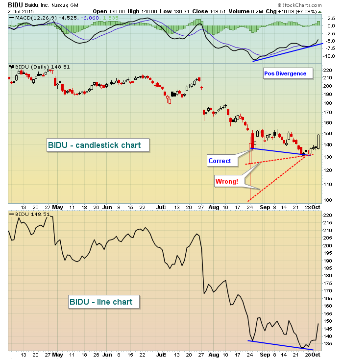
On the candlestick chart, the huge gap lower and long tail to the downside produces "noise" on the chart and you may try to connect those lows with the lows made the following month. If you do, you'd incorrectly determine that prices have not moved lower and therefore you cannot have a positive divergence. However, the line chart - which only uses closing prices - clearly shows that we've seen lower lows in price. That, combined with a higher MACD produces the positive divergence, which is a sign that selling momentum is slowing. Always remember that hollow candlesticks have closes at the TOP of the rectangle. Opens are at the bottom. The "tails" or "wicks" mark the intraday high and low.
Happy trading!
Tom


