 A lot of (very educated) people want us to believe that the market is a random walk. And you know... Maybe sometimes it is, but not always.
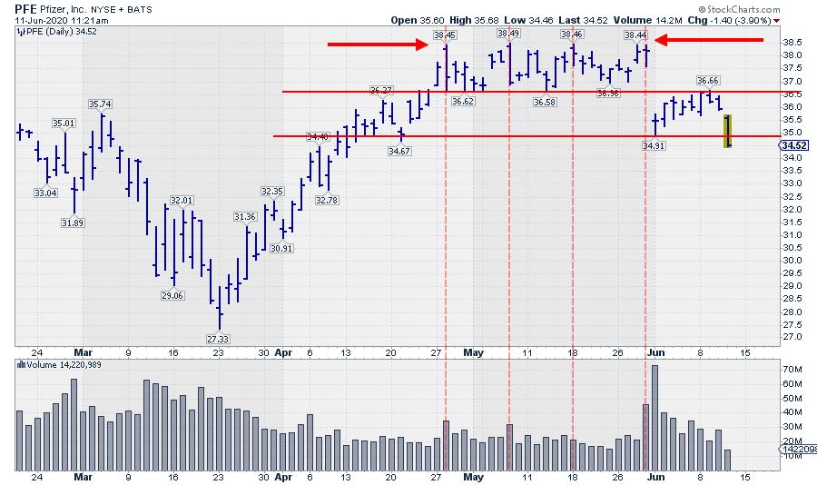
This morning, I ran into the chart of Pfizer (PFE) again. I've been monitoring that chart since I wrote about it in a previous DITC article here. The good news is that the resistance area between $38.50-$39.00 was never taken out. So no harm done. The bad news is that it is now becoming increasingly unlikely that this barrier will be taken out anytime soon.
For me, it is crystal clear that a (big) seller has been active around $38.45. I would not be surprised if the order was to sell millions, or even tens of millions, of shares at $38.40 limit. The algo or the human trader handling this order would come to the market every time the bid for PFE would hit $38.40 or higher and probably would have blocks to sell in the market at offers between $38.45/38.50. You can see an increase in volume on the days that PFE hits the resistance zone, while volume eases when PFE trades below that level.
To me, such market behavior does NOT look like a random walk to me...
In the same period, from 28 April to 29 May, it looks like a buyer was active at levels around $36.60 providing support. That is, until 1 June, when PFE gapped lower, steering away from a possible upward break.
That move changed the characteristics of the chart and the possible scenarios. Instead of looking for an upward break, $34.50-$35.00 had all of a sudden become resistance and a break below $34.90 would be the trigger for an acceleration. And guess what's happening today... ;)
After gapping down and setting the low at $ 34.91, PFE pulled back even further towards the bottom of the gap and the old support level that started to act as resistance ($36.60). Since the low at 23 March, the rally, followed by the consolidation and then the break lower, is a textbook case for technical analysis trends, support/resistance and breaks.
And the weight of the evidence is currently pointing to lower prices for PFE.
#StaySafe,
--Julius
My regular blog is the RRG Charts blog. If you would like to receive a notification when a new article is published there, simply "Subscribe" with your email address.
Julius de Kempenaer
Senior Technical Analyst, StockCharts.com
Creator, Relative Rotation Graphs
Founder, RRG Research
Host of: Sector Spotlight
Please find my handles for social media channels under the Bio below.
Feedback, comments or questions are welcome at Juliusdk@stockcharts.com. I cannot promise to respond to each and every message, but I will certainly read them and, where reasonably possible, use the feedback and comments or answer questions.
To discuss RRG with me on S.C.A.N., tag me using the handle Julius_RRG.
RRG, Relative Rotation Graphs, JdK RS-Ratio, and JdK RS-Momentum are registered trademarks of RRG Research.


