|
|
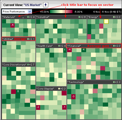
The Sector Carpet values reflect the average change for the stocks in that sector. First, let’s take a look at the default sector carpet. Nine sectors are represented. Each sector has a title box with its name and the average change for each stock. You can click on the title box to focus on a sector exclusively. Before leaving this image, notice that +2.1% is the average gain in the utilities sector.
After clicking on the utilities title box, I am now focusing exclusively on the stocks in the utilities sector. Hover over the green boxes, right click the mouse and choose “show values” to see individual price changes. The numbers in each box reflect the percentage change in each stock. Remember, +2.1% was the average gain for the utilities sector. This average gain is found by adding these numbers together and dividing by the total number of stocks.
Think of the average gain/loss as a breadth indicator of sorts. If the Utilities SPDR (XLU) is up strong, then you can dive into the Sector Carpet to see where the gains are coming from. XLU is a market-capitalization weighted ETF that can be dominated by large-caps. The current utilities carpet shows gains across the board, which means all stocks are participating and this is bullish. If the Utilities SPDR (XLU) was up and the utilities carpet showed an average loss, it would show underlying weakness within the sector. In other words, the gain in XLU would be attributable to a few large-caps and not representative of the entire sector. Click here to learn more about Market Carpets.


