|
|
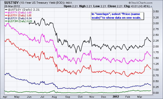
SharpCharts users can use the “Price (same scale)” feature to shows different securities on one scale. This works best for securities that are based on the same scale, such as interest rates or the Bullish Percent Indices. The chart below shows five different US treasury yields on the same scale, which ranges from 0 to 3.5%. As expected, the 10-year Treasury Yield ($UST10Y) has the highest yield, while the 3-month Treasury Yield ($UST3M) has the lowest. Also notice how the yields get progressively higher as the maturity increases.
Click this image for a live chart.
Click “continue reading” to see a table with the treasury yield symbols available at StockCharts.com.


