|
|
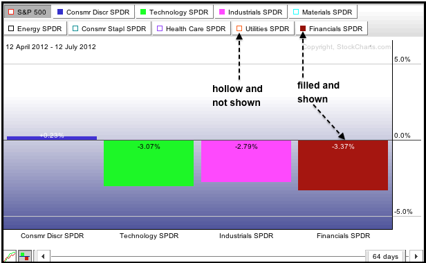
The S&P Sector Perfchart starts by showing relative performance for the nine sector SPDRs. Relative performance equals the percentage change in the SPDR less the percentage change in the S&P 500. Sectors outperforming the benchmark S&P 500 will show positive relative performance, while sectors underperforming will show negative relative performance. Chartists sometimes want to focus on specific sector groups, such as the four offensive sectors or the three defensive sectors. Sectors can be added or removed from the chart by clicking the small colored squares next to the SPDR name at the top. The example below highlights the four offensive sectors because their squares are filled. The other five sectors are not shown because their squares are hollow.
Click this image for a live chart.
The second chart focuses on the three defensive sectors (utilities, consumer staples and healthcare). The four offensive sectors are clearly struggling the last three months, but the three defensive sectors are handily outperforming the S&P 500. Finally, notice that the S&P 500 tab is shaded gray, which makes it the benchmark for comparison. Chartists can click this tab to show absolute performance for the sectors or click on another tab to select a different benchmark. You can read more on Percharts here.


