|
|
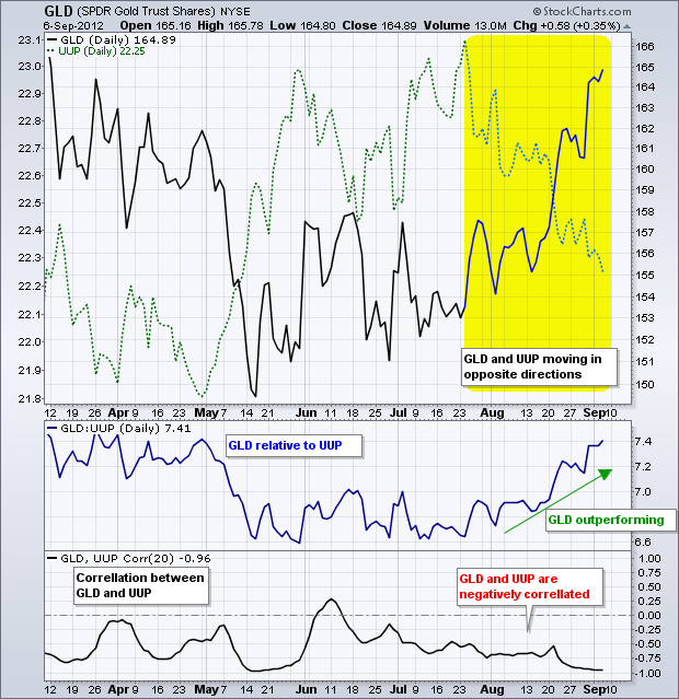
There are at least three ways to compare the performance of two securities. First, chartists can simply place the plot of one security in the main chart window and add the plot of another behind this plot. The chart below shows the Gold SPDR (GLD) in black and the US Dollar Fund (UUP) in green (dotted). Notice how these two moved in opposite directions from late July to early September.

Click this image for a live version

Click this image for a live version
Chartists can also compare two securities by using the price relative and the Correlation Coefficient. The price relative is a ratio of the two. The GLD:UUP ratio shows the performance of GLD relative to UUP. GLD is outperforming when this ratio rises and underperforming when it falls.

The Correlation Coefficient measures the relationship between two securities. Are their adversaries that move opposite each other or are they allies that move in the same direction? As this indicator shows, GLD and UUP are adversaries that move in opposite directions. Even though this example uses gold and the US Dollar, chartists can compare any two securities. For example, chartists can compare a stock to its sector, a sector to the market or industry group to a sector.


