|
|
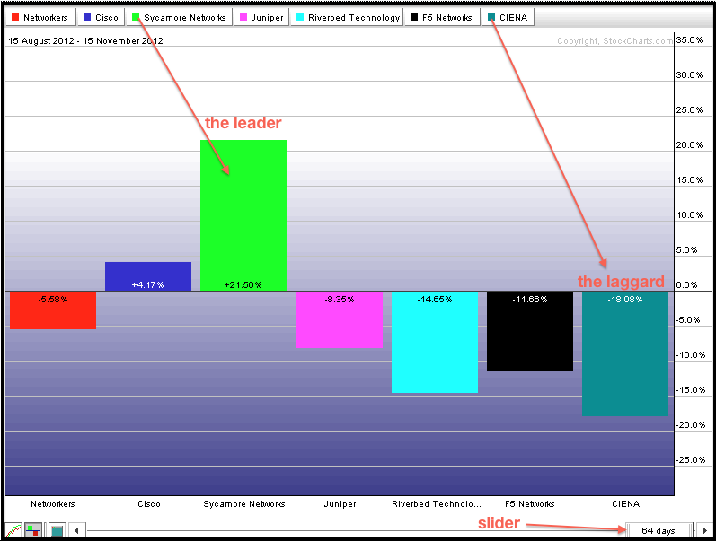
StockCharts.com users can compare stocks within an industry group using our preset PerfCharts. There is a PerfChart section at the bottom of the second column on the Free Charts page. Chartists can choose a preset industry group from the drop down list by clicking “select”. There are dozens of industry groups to choose from. The example below shows the Networking Industry with five stocks and the Networking Index ($NWX). This PerfChart shows the percentage change over a three month period. Chartists can change the timeframe by using the slider at the bottom right. Right click in the middle of the slider for a preset timeframe. Drag and drop the left end to increase or decrease the timeframe.

Click this image for a live chart.

Click this image for a live chart.


