With stock markets in rapid decline this week, mindful investors should be looking around for opportunities. What asset classes are thriving while others are struggling?
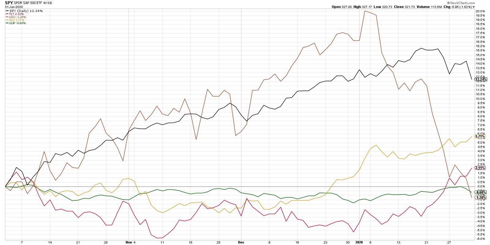
A quick survey of the asset allocation will indicate that, while oil has been in freefall and stocks are now testing and failing at support, gold and bonds have rallied nicely.
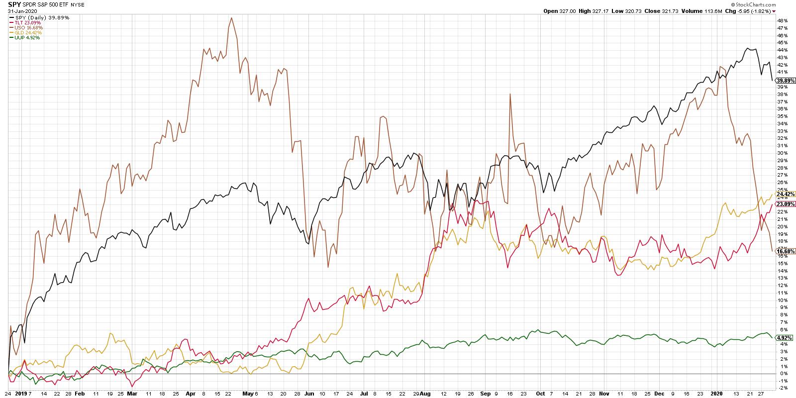
Now, if you start the clock at the December 2018 market low, stocks still appear to be the long-term winners, which is absolutely correct. A shorter-term view, however, shows how the movements of the last month relate to the previous year.
With this view, we can see the last month in much better detail, including the topping pattern of stocks and the break to new swing lows this week. We also can see both the GLD and the TLT breaking to new closing highs at the same time.
When you dig deeper into the gold story from a technical perspective, one of the first things you should recognize is the difference in return profiles between equities and gold. To put it another way, equities and gold just tend to move in very different ways.
One way to visualize these relative movements is through a correlation chart:
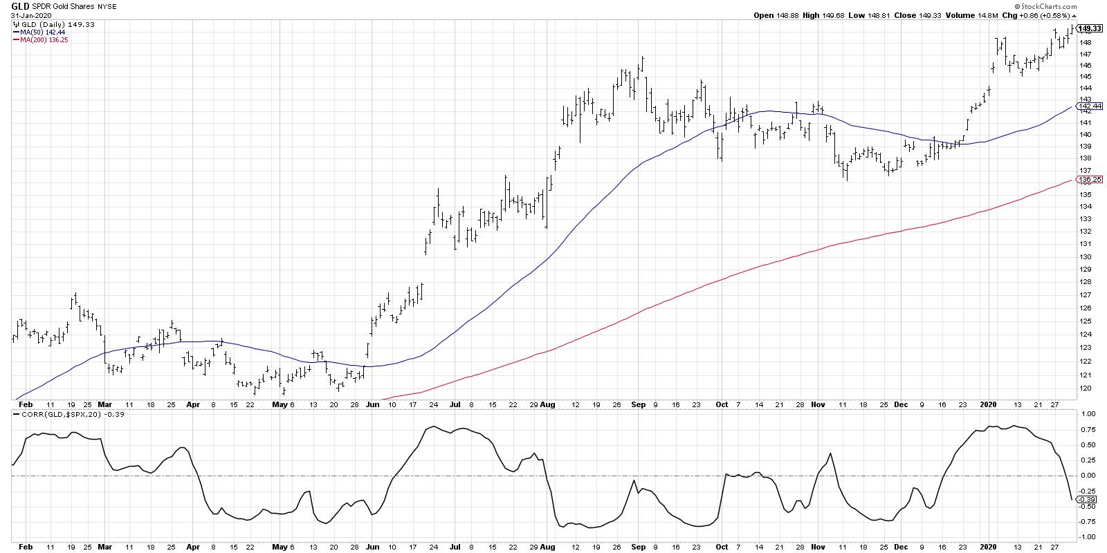
Here, we're showing the gold ETF along with a rolling 20-day correlation to the S&P 500. Many investors think that stocks and gold are inversely correlated, meaning that when stocks do well, gold starts to suffer (and vice versa).
The data actually shows that this is not a consistent phenomenon. There are periods (such as mid-January) where they have moved together. In this case, both gold and stocks were in steady uptrends. However, there are other periods, such as August 2019, where they moved inversely to one another. In that instance, gold rallied while stocks were in mid-summer correction mode.
Long story short, gold and stocks have diversified return streams. This means that, for investors looking to diversify their exposure to price trends, a position in gold could provide some of that.
What are the charts saying about the overall trend in gold here?
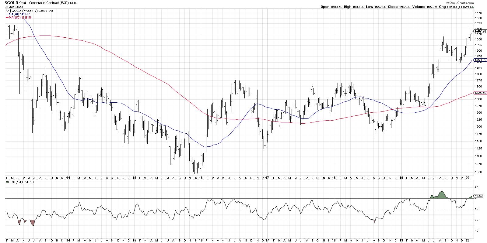
The weekly chart of the gold future illustrates the long-term rotation from downtrend to sideways trend to uptrend. In mid-2019, gold broke above a significant resistance level. "The bigger the base, the higher in space!" as my mentor Ralph Acampora would tell me. This suggests much further upside for gold based on the amount of time spent in consolidation mode.
The daily chart of the GLD shows how the current chart relates to the first half of 2019.
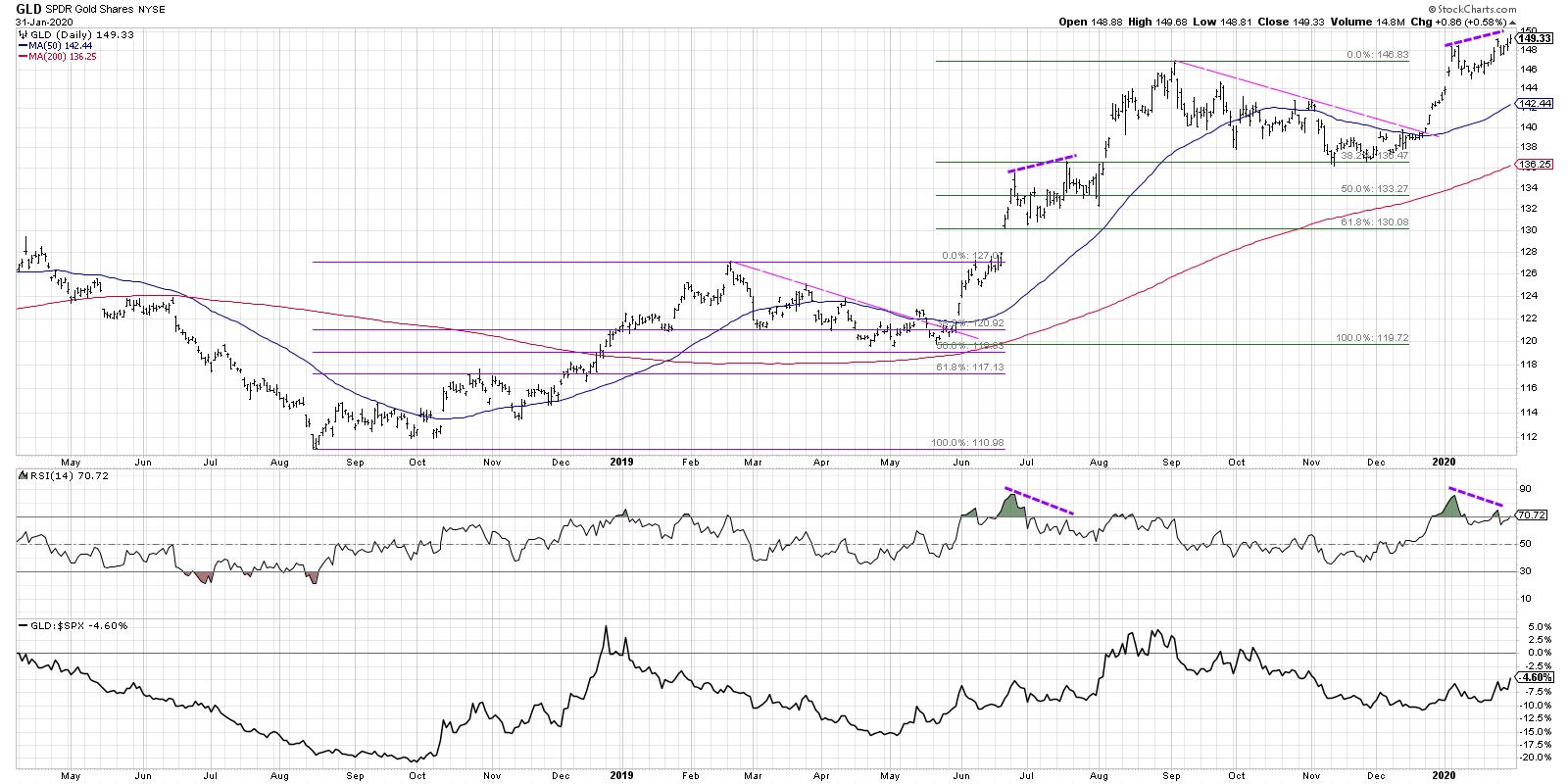
In the first quarter of 2019, gold topped out, then retraced just over 38.2% of the previous uptrend. The GLD then broke back above resistance and continued on to a bearish divergence, with higher price peaks and lower RSI. This bearish divergence actually resolved higher, with the GLD closing above the 137 level in August when stocks were pulling back.
We saw a very similar pattern, with a bullish run followed by a 38.2% pullback, last November. Now, we have the same bullish divergence that we saw in 2019. A confirmed close above the 150 level would complete this pattern that we saw last year, with a bearish divergence indicating more of a pause before the resumption of the long-term uptrend.
Regardless of the future trend in gold, the differentiated return profile from other asset classes suggests it is worth considering as part of a mindful asset allocation exercise.
RR#6,
Dave
David Keller, CMT
Chief Market Strategist
StockCharts.com
Disclaimer: This blog is for educational purposes only and should not be construed as financial advice. The ideas and strategies should never be used without first assessing your own personal and financial situation or without consulting a financial professional.
The author does not have a position in mentioned securities at the time of publication. Any opinions expressed herein are solely those of the author and do not in any way represent the views or opinions of any other person or entity.


