I've often said that by looking at individual stocks, you can get a deeper level of understanding of what's moving the overall equity markets. While some investors insist that "a rising tide lifts all boats" and you're better off just following the broad market, I have found (from working with some of the best stock pickers around!) that there is great value in looking at individual names.
Patterns that occur in the S&P 500 or Russell 1000 charts often emerge beforehand in the charts of individual stocks and groups. This is especially true at market tops, where particular stocks and themes (e.g. small-cap stocks) will start to break down while the broader market indexes will continue higher. This is due to investors rotating out of higher beta names and into safer stocks like mega cap technology and consumer names.
Recording The Final Bar every Monday is my favorite because we hit the markets from three directions: top-down macro, sector rotation and bottom-up stock picking. On this week's show, I keyed in on three particular stocks that bubbled up during my weekend review of the S&P 500 charts. All three of these stocks have rallied nicely from the March lows, all three have set recent swing highs and all three have recently tested support levels. I am following these charts now to see if they either a) rebound to their previous swing highs and break higher, signaling further upside potential, or b) break down through key support levels and suggest further weakness in store for equities.
First, we have Starbucks (SBUX) in the Consumer Discretionary sector.
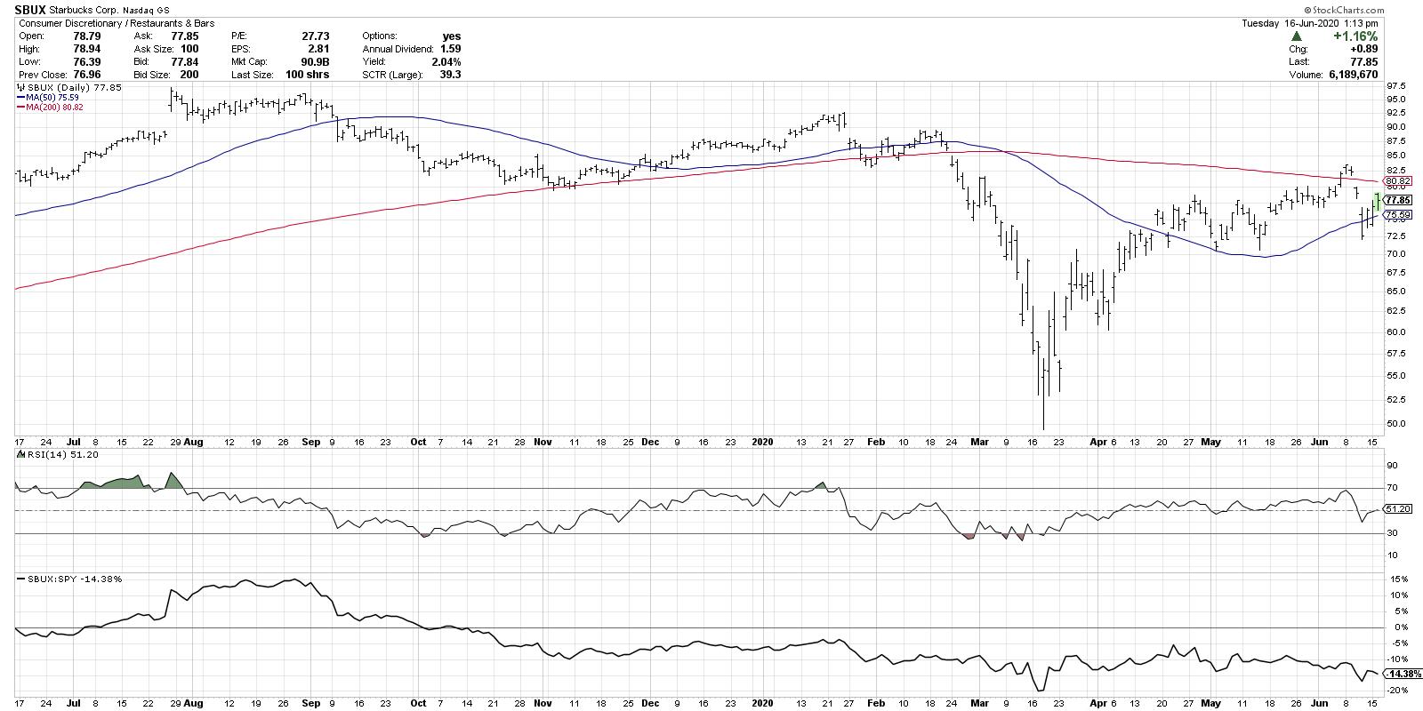
SBUX has essentially been a market performer since the March low, even though the relative strength has slowly deteriorated over the last four weeks. The price closed above its 200-day moving average last week before dipping right back below a few days later. That pullback pushed the stock back down to test its recent swing lows around $71-72. The RSI notably remained above the key 40 level, which is more characteristic of bull phases than bear phases.
Now, the price is trapped between $72 and $83. Either SBUX breaks back above the 200-day moving average and continues on through $83 and beyond, or it reverses down through its 50-day moving average before breaking down to new swing lows.
Next, we have a Technology name, Applied Materials (AMAT).
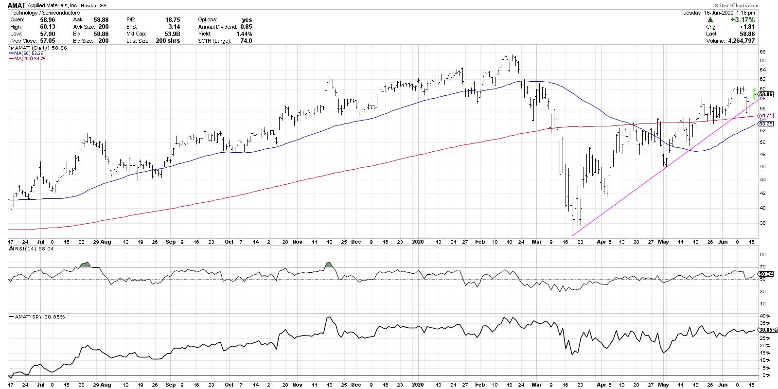
I often speak of semiconductors as a leading indicator for the equity markets. A classic bellwether group, these stocks tend to do well in bull phases and tend to struggle in bear phases. If you think about how these companies essentially provide the backbone of our interconnected world, it makes sense!
AMAT is a little further in its uptrend compared to SBUX, having already broken above its 200-day moving average and now testing it from above. AMAT recently broke down through trendline support, although it has not remained below. I see clear price resistance from the recent swing high around $61 and now support at the 200-day moving average.
Does AMAT continue the medium-term uptrend of higher highs and higher lows, moving past $61 on the way to higher highs? Or does it blow out support and make a new swing low, suggesting weakness in store for this bellwether group?
Finally, we have Morgan Stanley (MS) in the Financial sector.
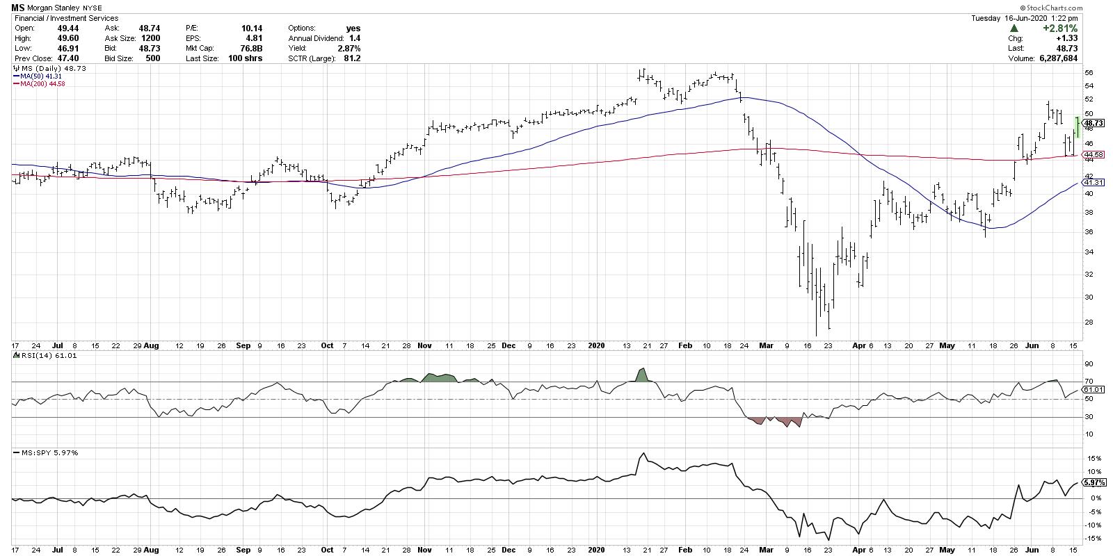
The MS chart looks strikingly similar to the AMAT chart, which is interesting as they are in very different sectors. Morgan Stanley has outperformed nicely since the March 23rd market low, recently breaking above and then successfully retested its 200-day moving average.
Now we have the same situation as AMAT: does MS continue the uptrend above $52 and beyond, or does it break down through price and moving average support around $44 before moving lower?
So those are three charts, all at key junctures, all with the potential to break higher or break lower. As a trend-follower, I will always assume that the current trend will persist until proven otherwise. So until these stocks make lower highs and then lower lows, the trend is up by definition.
But I've also learned that drawing key "lines in the sand" on charts like this, as described above, help me to manage risk and define my potential drawdown. And, in a case like this, they may just help you understand how the overall equity markets will evolve over the coming weeks.
RR#6,
Dave
David Keller, CMT
Chief Market Strategist
StockCharts.com
Disclaimer: This blog is for educational purposes only and should not be construed as financial advice. The ideas and strategies should never be used without first assessing your own personal and financial situation, or without consulting a financial professional.
The author does not have a position in mentioned securities at the time of publication. Any opinions expressed herein are solely those of the author, and do not in any way represent the views or opinions of any other person or entity.


