 I have learned over my career to be skeptical. I have learned to question my investment thesis and actively argue the other side of any position to challenge my own analysis. I have learned to actively search out people that disagree with me and try to see what they are seeing. Most importantly, I have learned to focus not on what "should" happen, but rather what is happening.
Note: This article originally appeared in the 3/13/21 ChartWatchers newsletter.
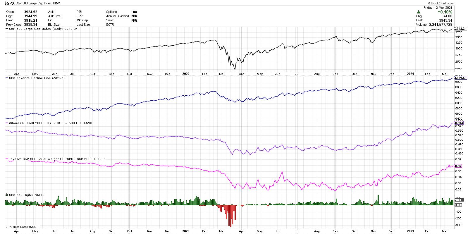
Based on a number of conversations I've had this week with industry peers, including guests on The Final Bar, I put together the chart below. Each of the five series on this chart are bullish, by any measure. As long as these five factors remain bullish, I find it challenging to assume that the path of least resistance is anything but higher.
Are semiconductors in a short-term downtrend? Yes. Have many charts besides just the SMH recently showed glaring bearish momentum divergences? Yes. Have previously high-flying names like ZM and PTON give the distinct impression that their best days are behind them? Absolutely.
But does the market as a whole keep going higher? Yes. And that's the most important thing to watch.

Here are the five components, in order from top to bottom.
1) S&P 500 Index
As legendary technical analysis Paul Montgomery put it, "The most bullish thing the market can do is go up." The top series provides the most important tell of all. Higher highs and higher lows are an uptrend, and the SPX has managed to do just that even without the support of mega-cap technology names.
2) S&P 500 Cumulative Advance-Decline Line
This is an equal-weighted series calculated as a running total of daily advance-decline values for the SPX. This is taken directly from my main breadth chart that I look at every single day. This line trending higher means that the components of the S&P 500 index are going higher - simple as that.
3) Small Caps vs. Large Caps
The ratio of the Russell 2000 ETF (IWM) versus the S&P 500 has been in a steady uptrend really since early October. Now it's worth noting that most measures of small versus large also have a sector bias of sorts, as small-cap indexes tend to have a heavier weight in sectors like financials and industrials and less in technology. But still, this is a classic measure of risk-on versus risk-off, and it is definitely signaling risk-on.
4) Equal-Weighted SPX vs. Cap-Weighted SPX
This is similar to small cap versus large cap, but as the smallest S&P 500 names are in the $7 billion market cap range, this is more mid cap versus large cap. As with the previous ratio, it also signals that the smaller companies are outperforming the larger and is another bullish tell.
5) S&P 500 New Highs and New Lows
Finally, we are looking at how many S&P 500 members are making a new 52-week high or low every day. You may not know that the 52-week lows are on the chart, because there really have not been any since March of last year! We're seeing a consistent number of new highs each week, including about 15% of the S&P 500 members making a new 52-week high on Thursday and Friday. Bullish.
From top to bottom, this chart provides five separate reads on the S&P 500 index. All five are making new highs or confirming the bullish trend.
So what would need to change for the outlook to be less bullish? Quite simply, these four ratios would need to turn lower and the new highs would need to evaporate. That would indicate an exhaustion of buyers, an increase in profit taking, and a pullback in price. Until that happens, these indicators suggest that the path of least resistance is higher.
RR#6,
Dave
P.S. Ready to upgrade your investment process? Check out my free course on behavioral investing!
David Keller, CMT
Chief Market Strategist
StockCharts.com
Disclaimer: This blog is for educational purposes only and should not be construed as financial advice. The ideas and strategies should never be used without first assessing your own personal and financial situation, or without consulting a financial professional.
The author does not have a position in mentioned securities at the time of publication. Any opinions expressed herein are solely those of the author and do not in any way represent the views or opinions of any other person or entity.


