In terms of key developments this week, I would argue that the ten-year Treasury yield breaking below 1.5% was perhaps the most significant. On The Final Bar this week, we've talked about the $140 level on the long bond ETF ($TLT) and how this rotation higher in bond prices has broad implications.
How can we best approach this potential drop in interest rates from a technical perspective?
First, let's start with the $TLT, which indicates a clear transition from bearish phase to bullish phase.
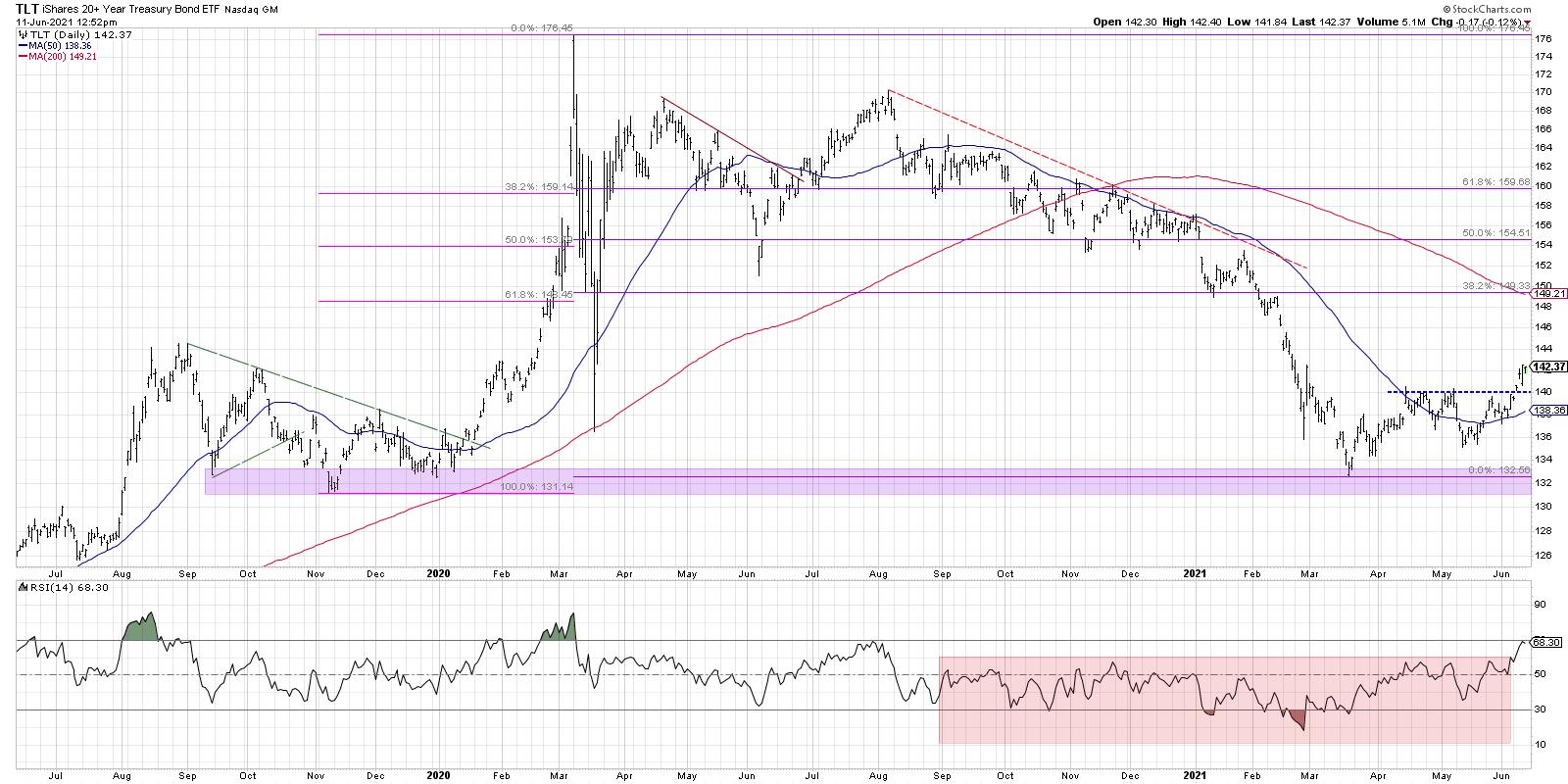
The most important tell here is the RSI, which has broken above the 60 level for the first time since August 2020. The RSI remained below 60 through the second half of 2020 through May 2021 and indicated the overall bearish phase for bonds.
I'll be hosting a FREE webinar called "Demystifying Fibonacci" this coming Tuesday, June 15th at 1:00pm ET. We'll break down Fibonacci retracements, discuss why these percentages make sense and review lots of examples. Sign up on my website if you're interested!
Now that pattern has reversed, as price pushing above resistance around $140 completed a rotation from lower lows and lower highs to higher highs and higher lows. Bond prices are headed higher.
Second, let's review the ten-year Treasury yield.
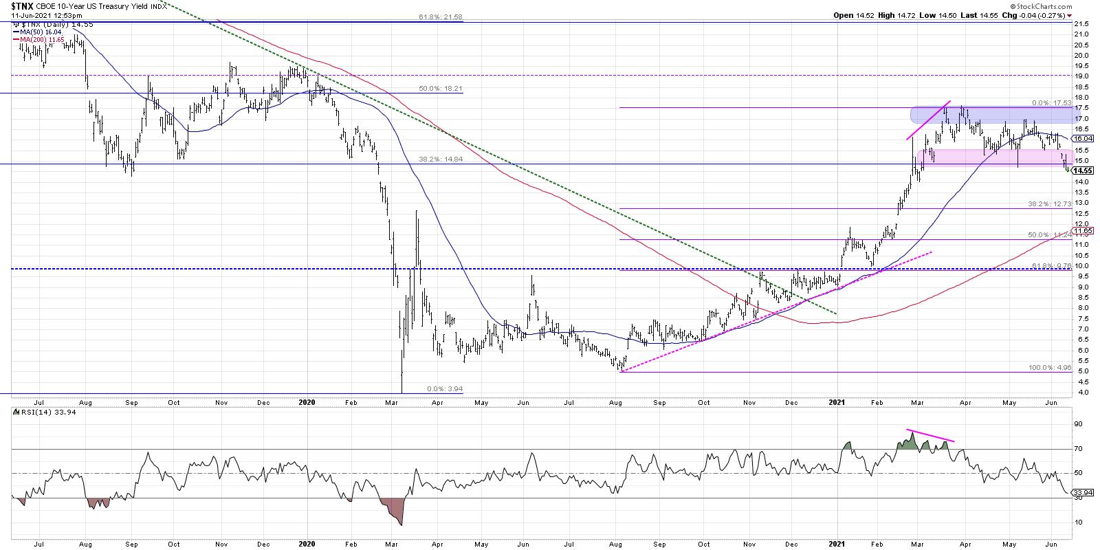
Here, we're using the $TNX (the CBOE 10-Year index), which is basically quoted at 10x the actual yield. So a reading of 14.6 means the ten-year bond is at a yield of 1.46%. We can see how interest rates have been stable for the last three months after the $TNX reached a high around 17.4 in mid-March.
The breakdown here is a change of character, as support levels failed and the RSI dipped below the key 40 level. The first Fibonacci support level, coincidentally, is just below the 1.3% level.
Finally, and perhaps most importantly, we can look at the shape of the yield curve and how that impacts different sectors.
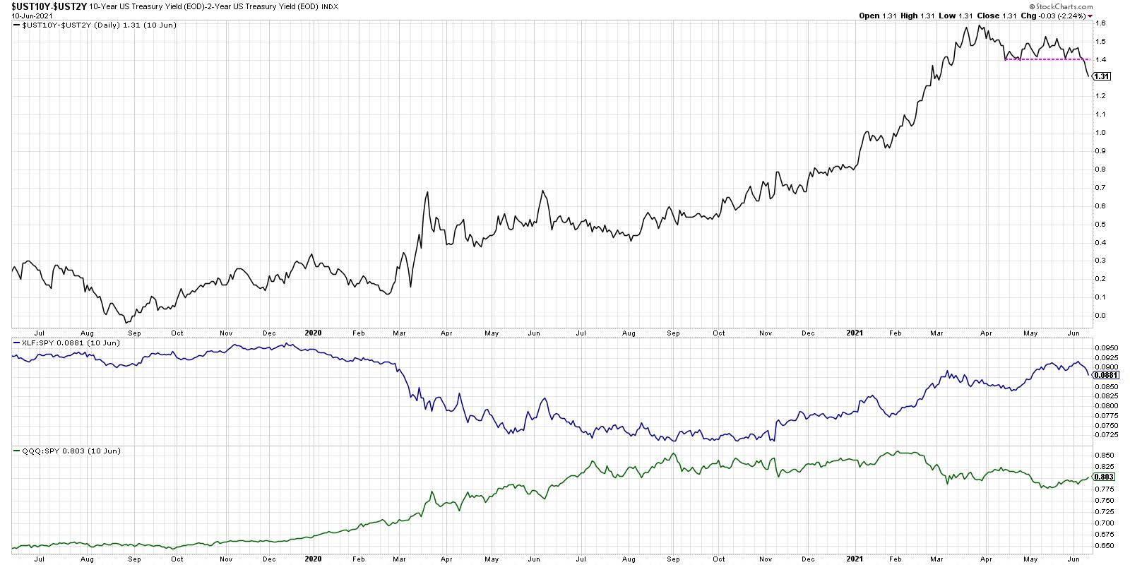
Here, we're looking at the shape of the yield curve by subtracting the yield on the two-year from the yield on the ten-year. So, if this line is increasing, the yield curve is steepening. The opposite would indicate a flattening yield curve. As this ratio has broken down this week, I'd point out other periods where the yield curve has been flattening and its impact on the relative performance of the financial sector.
Banks essentially make money based on a steep yield curve, as they can borrow on the short end of the curve and lend out at the long end. So a flatter curve means more of a headwind for financials, and thus the relative performance suffers.
Growth stocks like technology (represented here by the QQQ), on the other hand, tend to do better as rates come down and the yield curve flattens. If it's easier and cheaper for individuals to borrow, it's easier to spend money as well. Better for growth areas like tech and consumer!
Here, we can track whether the yield curve continues to flatten and see the impact of on the financial and technology sectors. Based on rising bond prices, falling interest rates, and a flattening yield curve, the coming weeks are more likely to see growth stocks reassert themselves in a leadership role. These charts should help you track that thesis and identify when the theme has potentially played out.
Want to see this in article in video form? Check out my YouTube channel!
RR#6,
Dave
P.S. Ready to upgrade your investment process? Check out my free course on behavioral investing!
David Keller, CMT
Chief Market Strategist
StockCharts.com
Disclaimer: This blog is for educational purposes only and should not be construed as financial advice. The ideas and strategies should never be used without first assessing your own personal and financial situation, or without consulting a financial professional.
The author does not have a position in mentioned securities at the time of publication. Any opinions expressed herein are solely those of the author, and do not in any way represent the views or opinions of any other person or entity.


