If you found this article through the Saturday, August 6 ChartWatchers newsletter, please click on this link to read this week's article instead.
If I had just one thing to use to understand the markets and predict what was coming next, it would be a daily chart of the S&P 500 index. If I had a second chart? It would absolutely involve market breadth.
My Morning Coffee Routine involves a number of charts covering market breadth, as breadth is all about participation. If the major averages are in a bull/bear trend, what about all the individual stocks that make up those indexes? At major market turning points (for example, Nov 2021-Jan 2022) you will often find a divergence between the major equity indexes and key measures of breadth. This is because individual names will already start to rotate into the new direction before the indexes themselves begin to change.
Here's how the cumulative advance-decline lines looked in early 2022, so that you can see what I mean.
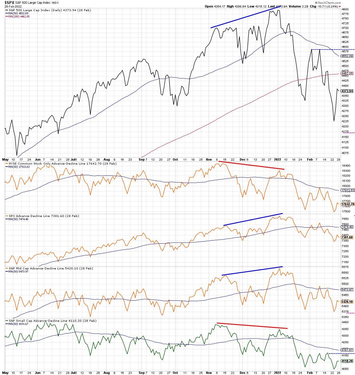
Note how the S&P 500 made a new closing high in early January, which was confirmed by new highs for the S&P 500 and S&P Mid-Cap 400 advance-decline lines. However, this new high was not confirmed by the NYSE advance-decline line (common stocks only) as well as the S&P Small-Cap 600 advance-decline, both of which made lower highs in January 2022. This "non-confirmation" event, where not all the advance-decline lines are in agreement, suggests that not all cap tiers are moving in the same direction, and often indicates a likely change in trend.
The concept of confirmation and non-confirmation is a key part of breadth analysis, which is basically a recognition that individual stocks and groups do not often agree with the direction of the overall market indexes. And I have found, over my career, that certain sectors and groups changing direction is usually a good precursor of a larger directional shift that will become apparent much later for the broad market indexes.
While there are numerous ways to track "participation" through measures of market breadth, today, I'll share three that I'm watching closely, as the current rally feels less like a bear market rally and more like a sustained rise.
First, let's dig into the percent of stocks above key moving averages.
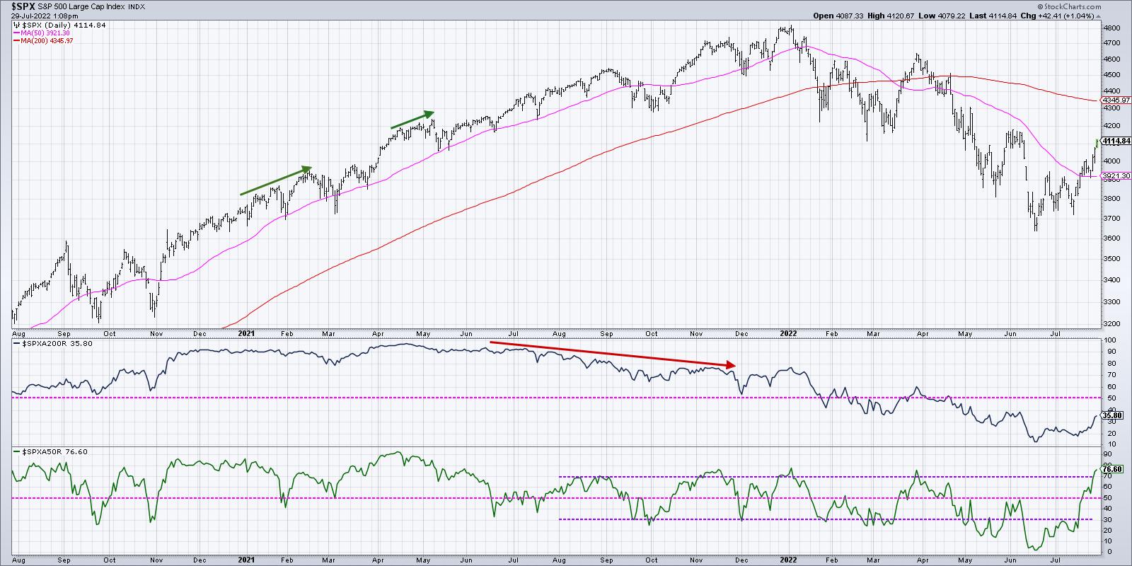
With the strength in stocks around the Fed meeting and some key earnings releases, we now see that just over 75% of the S&P 500 members are currently above their 50-day moving averages (second panel in blue). What's remarkable is that this indicator was around 5% in mid-June. So, in the last six weeks, literally 70% of the S&P 500 members have broken back above their 50-day moving averages.
While this is certainly encouraging to see such broad participation in the current rally, I can't help but notice that we saw a very similar level for this indicator in late March at the end of that bear market rally. The S&P had bounced off 4200 and fired up quickly to retest the most recent swing high around 4600. About 75% of the S&P names were above their 50-day moving averages just as the bear market rally exhausted and the larger downtrend resumed.
Bull market phases often see this indicator go well above 75%, and usually will remain above 50%. When the market pulls back next, check to see if this indicator can remain above 50%. That could indicate more of a bullish rotation to this indicator that has been particularly effective in 2022.
Next, we can look at the Bullish Percent Index.
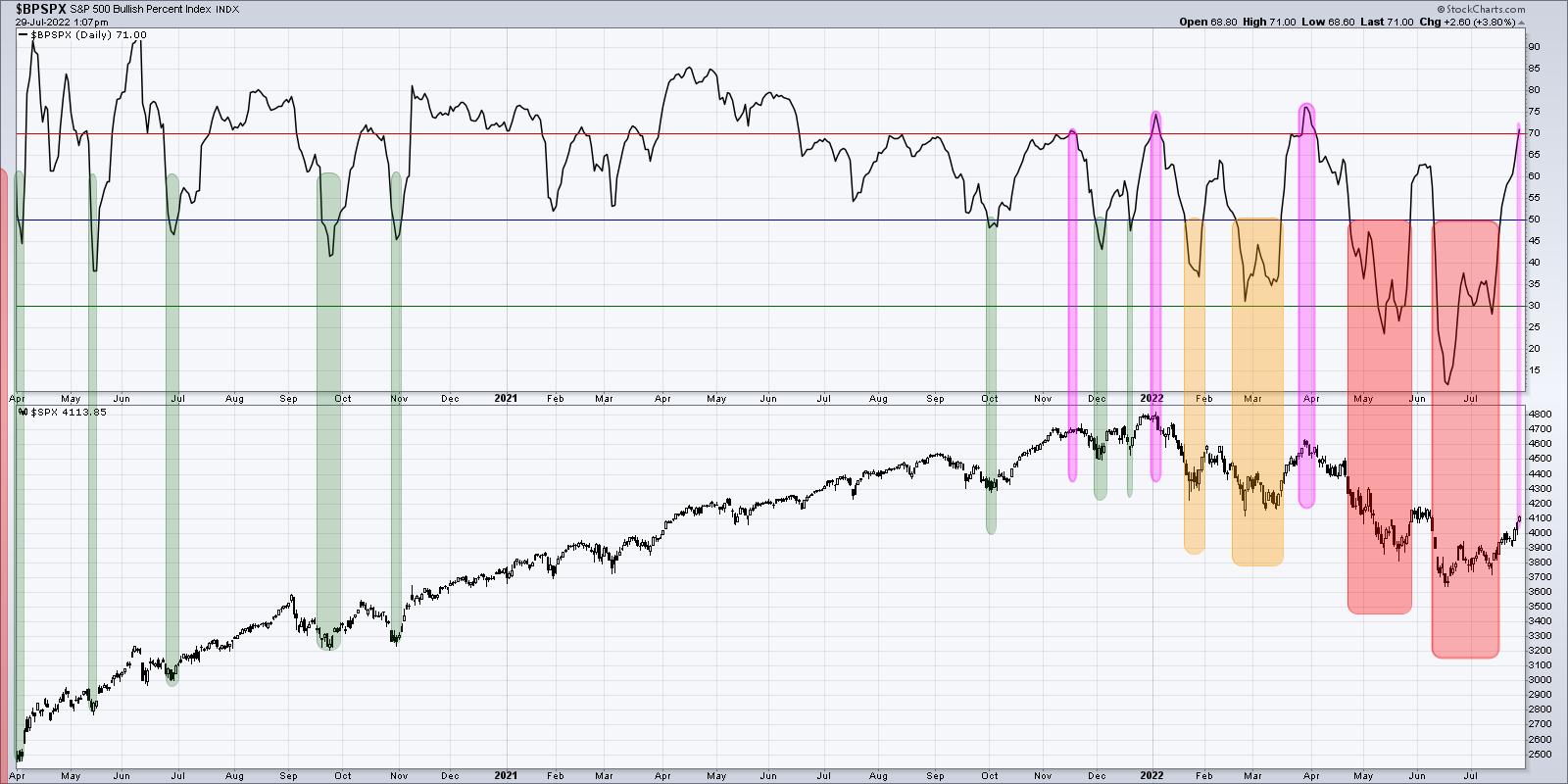
This indicator has gone from lower teens in mid-June to just over 70% going into this weekend. That means that above two thirds of the S&P 500 members had been showing a sell signal on their individual point & figure charts in June, but have now generated a buy signal.
Buy signals do not come easy on point & figure charts. In fact, that is part of their true power. Point & Figure is all about tracking trends, and you need to see enough of an upside reversal to confirm a change in trend from bearish to bullish.
But here's the problem. Look back to late March, and you'll see a very similar pattern, where the indicator was around 30% and then powered to above 70% in a short amount of time. This indicator peaked at 75% at the January and March highs and has now returned to that same level. As we discussed in the previous chart, this indicator needs to go high and stay high to signal a bullish phase. Bear market rallies look like this. The difference between a bear market rally and a broader bull market phase is that breadth indicators like the Bullish Percent Index get high and then remain high. That's what I'm watching for now.
Finally, we can review the cumulative advance-decline lines, which we previewed at the beginning of the article.
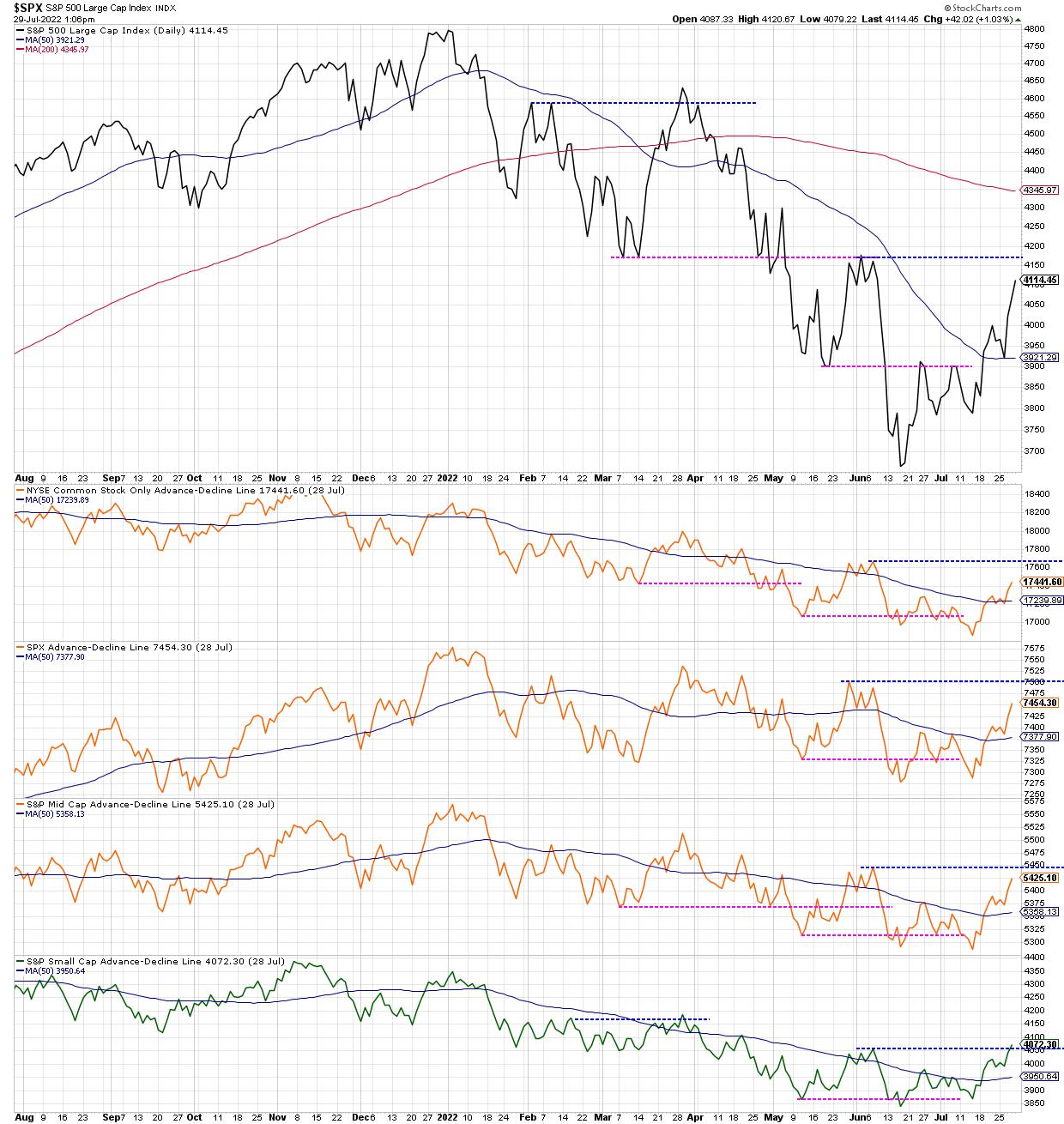
I would consider this the most important chart, because, while the first two are oscillators tracking momentum in breadth, these advance-decline lines are much more tracking the trend in breadth over time.
The S&P 500 is heading higher toward likely resistance in the 4150-4200 range. We can also track the four advance-decline lines to see what happens as they also approach resistance at their June highs. So far, one of them (small cap) has eclipsed its June high, earning a change to green in my very subjective color-coding system. The other three turned neutral orange when they eclipsed their 50-day moving averages, and would turn bullish green if they break to a new swing high as well.
Going into next week, I'll be watching this last chart in particular. Does the S&P 500 break above 4200? Is that breakout confirmed by the cumulative advance-decline lines? And does the Bullish Percent Index and Percent Above the 50-Day MA remain elevated as stocks push higher?
For now, a summer rally is very much in play. And these breadth indicators should help us to understand the momentum behind this uptrend and also when this uptrend may be nearing exhaustion!
Want to know more about cumulative advance-decline lines? Check out my latest video:
RR#6,
Dave
P.S. Ready to upgrade your investment process? Check out my YouTube channel!
David Keller, CMT
Chief Market Strategist
StockCharts.com
Disclaimer: This blog is for educational purposes only and should not be construed as financial advice. The ideas and strategies should never be used without first assessing your own personal and financial situation, or without consulting a financial professional.
The author does not have a position in mentioned securities at the time of publication. Any opinions expressed herein are solely those of the author, and do not in any way represent the views or opinions of any other person or entity.


