TAKEAWAYS
- Bearish momentum divergences suggest exhaustion for buyers after a long bullish phase.
- The 2021 market top was marked by a bearish momentum divergence for the S&P 500.
- Bearish divergences between price and RSI indicate potential downside for leading growth stocks, including AMZN and LRCX.
- The S&P 500 is now showing a bearish momentum divergence, similar to the market top in Q4 2021.
I consider the goal of the trend follower to be threefold: identify trends, follow those trends, and anticipate when those trends may be exhausted. Every day, every week, every month, I'm trying to do those three things in a consistent and repeatable fashion.
That third piece is perhaps the most important. After all, it's fairly easy to identify new uptrends, and it's pretty straightforward to follow those trends using a basic stop-loss approach. But anticipating when the trend is over? That's where things can get pretty challenging, because trends often seem really bullish right up until they aren't.
Bearish momentum divergences have become one of my favorite ways to identify potential trend exhaustion points, because they represent a shift in momentum. Instead of the price moving higher on stronger momentum, that positive "mo" is beginning to dissipate.
Here's a classic example, where the S&P 500 moved higher through the end of 2021 while the RSI sloped lower. A classic bearish divergence occurred, implying that the bull phase of 2021 was nearing its endpoint.

What concerns me here as we begin the 3rd quarter of 2023 is that I'm seeing a growing number of bearish divergences on key growth stocks, as well as with some of our major benchmarks!
Let's start with the semiconductor group, which was one of the top performers in the first half of 2023.
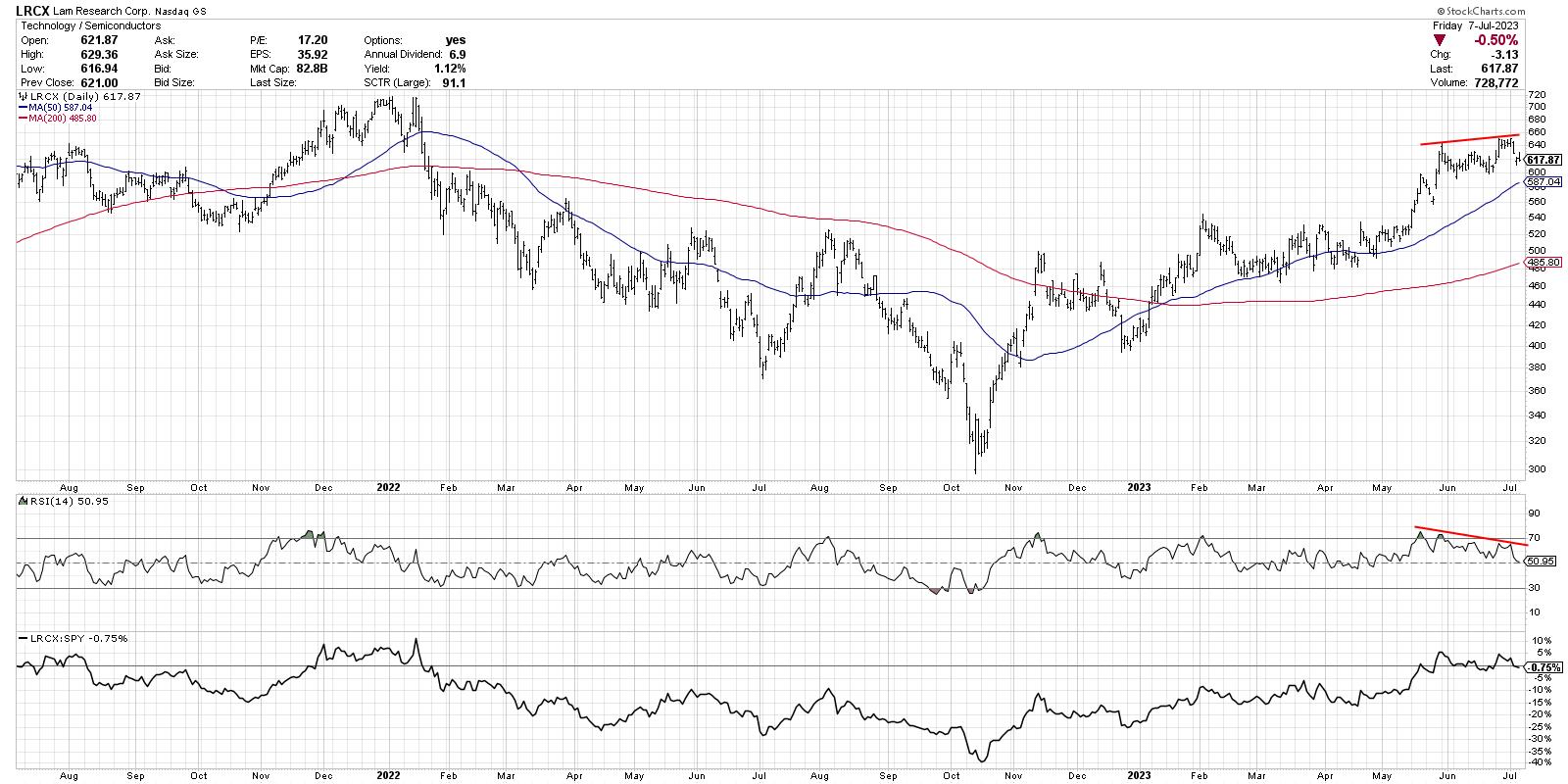
While so many investors are focused on the upside potential for stocks like NVDA (which is also showing a bearish divergence, by the way), I'm thinking Lam Research (LRCX) provides a perfect illustration of this bearish technical signal.
Note the higher highs in May and June and the downward-sloping RSI over the same time period. Again, this indicates a likely upside exhaustion point, as there is less bullish momentum behind every time the price has moved higher in recent weeks.
Amazon.com (AMZN) provides another great example, because this chart shows both the bullish and bearish momentum divergences in the last 12 months.
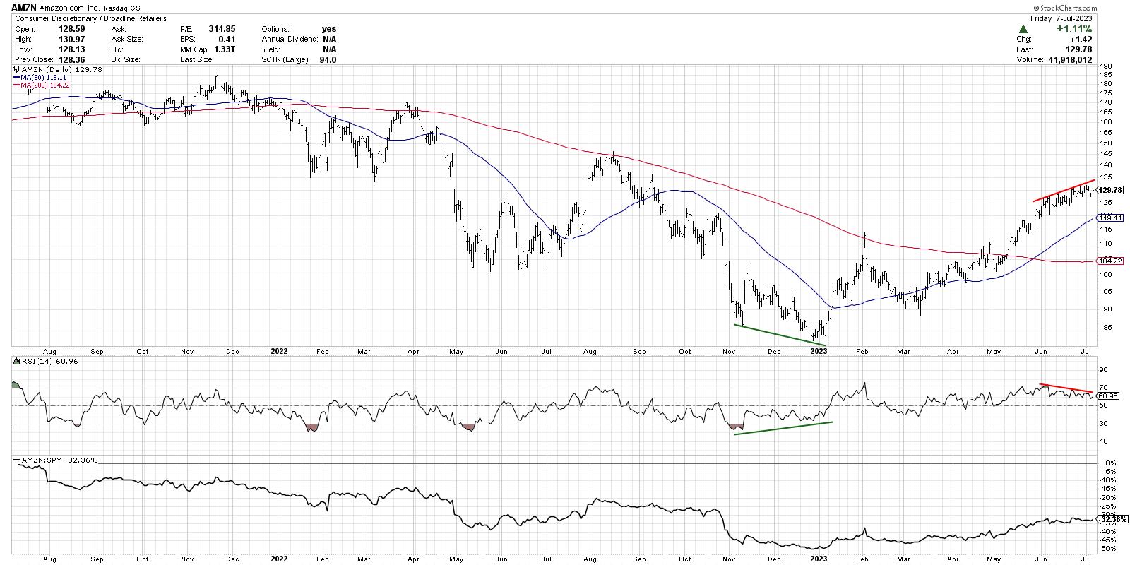
While the S&P 500 and Nasdaq made their lows in October of last year, AMZN actually made a new low into year-end 2022. Here, you'll see that the RSI actually sloped higher from November through December, while the price was making its new low into January. That's a perfect illustration of downside trend exhaustion in the form of a bullish momentum divergence.
Now, look to the right of the chart and you'll see the bearish version of this divergence playing out. Higher prices with a lower momentum reading suggest likely upward exhaustion and downside rotation for AMZN.
Keep in mind that, in both cases, these stocks are in well-established uptrends. As my guest Mary Ann Bartels shared on The Final Bar this week, these stocks have room to pull back, but still be considered in a long-term uptrend. I don't disagree with that assessment, and I would argue there is plenty of room for downside in the 10-15% range on many leading names. I'd also say that I don't necessarily feel the need to participate in that downside move if I can avoid it!
That brings me to the most concerning chart of all, the S&P 500 index itself.
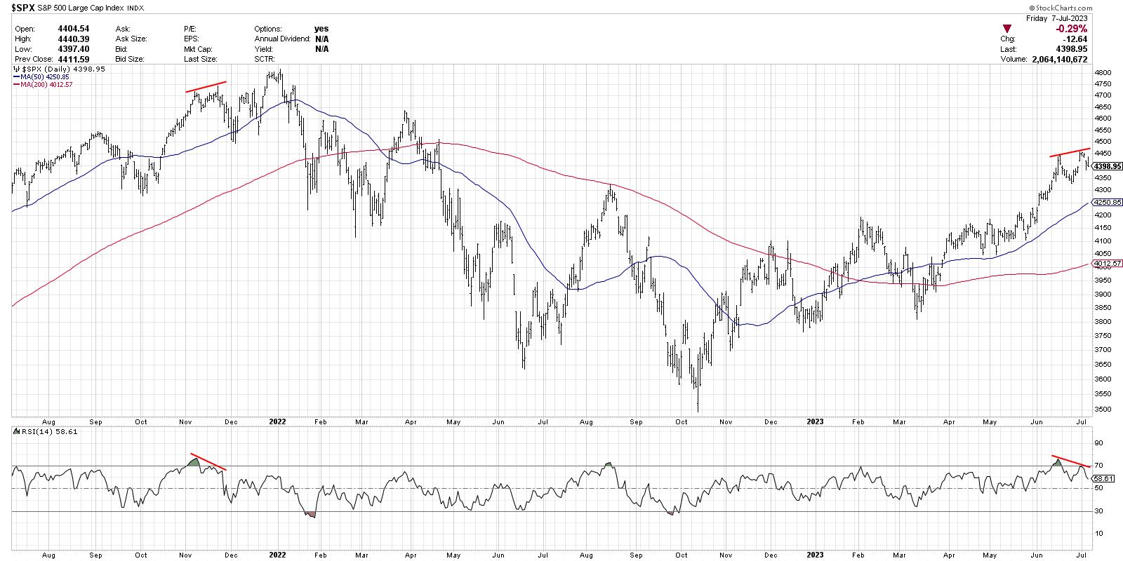
The S&P 500 made higher highs in mid-June through the 4th of July holiday, although it trended lower over this timeframe. You may notice a similar pattern in November 2021, which provided a key warning season leading into the end of 2021.
In 2021, of course, the S&P 500 made one final gasp higher, which created a larger bearish momentum divergence using the November 2021 and January 2022 highs.
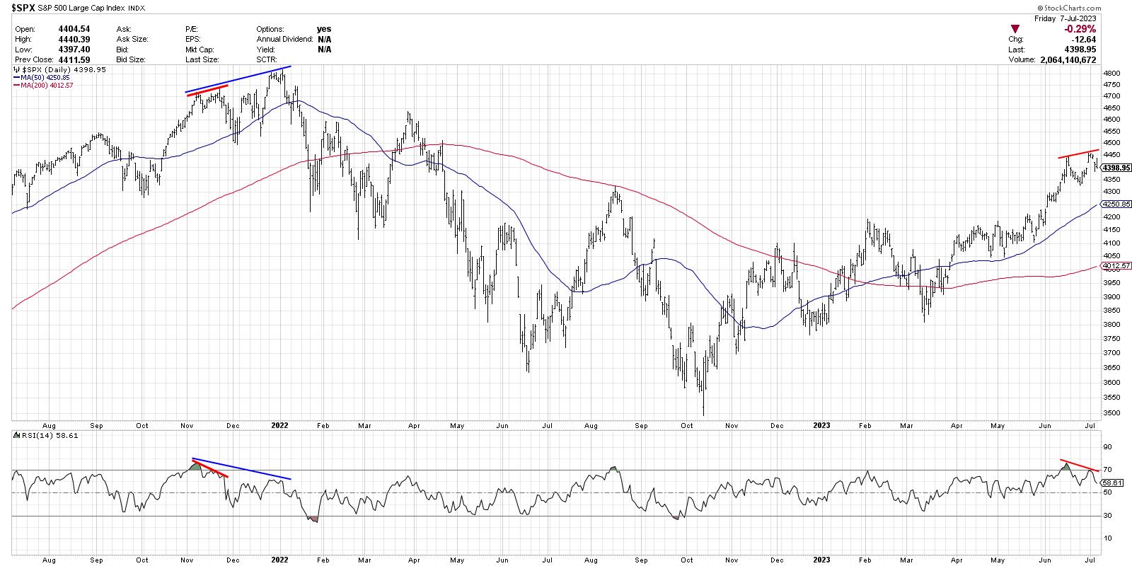
Could July 2023 end up being very similar to December 2021, with a pullback to an ascending 50-day moving average before a push to new swing highs? Absolutely. And it's worth noting that, with all of these divergences, there are upward-sloping 50-day moving averages that could serve as an ideal support level in a pullback phase.
But my key takeaway, for now, is that the uptrend phase is most likely exhausted, and to prepare for downside tests of key support levels.
RR#6,
Dave
P.S. Ready to upgrade your investment process? Check out my free behavioral investing course!
David Keller, CMT
Chief Market Strategist
StockCharts.com
Disclaimer: This blog is for educational purposes only and should not be construed as financial advice. The ideas and strategies should never be used without first assessing your own personal and financial situation, or without consulting a financial professional.
The author does not have a position in mentioned securities at the time of publication. Any opinions expressed herein are solely those of the author and do not in any way represent the views or opinions of any other person or entity.


