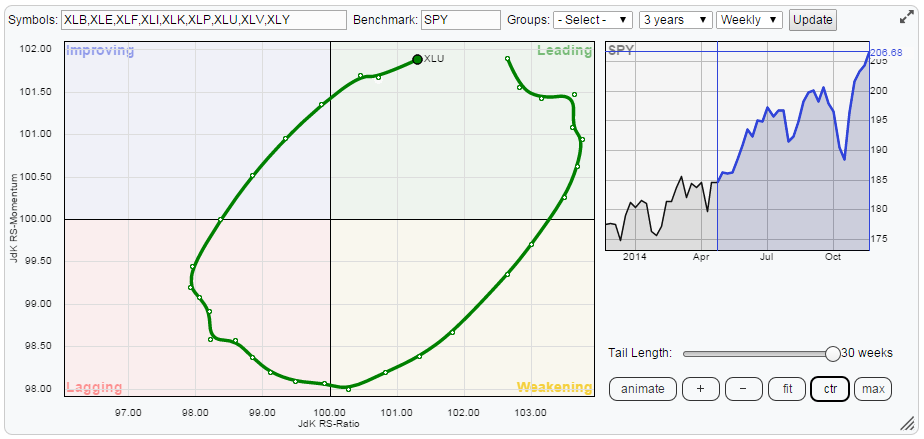
The Relative Rotation Graph below shows the weekly rotation pattern for the nine S&P sector ETFs.
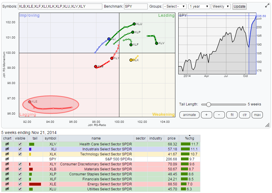
The single one sector that immediately catches attention is Energy (XLE) in the bottom left-hand corner (lagging). This is by far the weakest sector on the chart. Further to the energy sector there are two more sectors inside the leading quadrant that are worth a closer look and also the only sector that is currently moving inside the improving quadrant and heading towards leading deserves some attention.
Energy
The position of the energy sector on the RRG chart is pretty outspoken and one could almost immediately move on to other sectors as it is highly unlikely that energy will turn into an out performer any time soon, even if it would pick up some relative momentum in the next few weeks it will be a recovery within the strong relative down-trend. However the price pattern that is currently developing may be interesting.
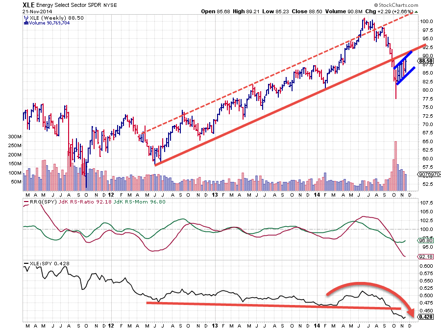
The chart above shows the weekly price chart of XLE in combination with its RRG lines and relative strength. A few months ago the sector was still clearly trading in a strong up-trend which was backed by strong relative strength. At some stage during the summer XLE even broke out above the upper boundary of the rising channel which usually signals a lot of strength.
However, this break was short-lived and after a few weeks XLE came back within the boundaries of the rising channel. Such a move mostly suggests a further decline towards the lower boundary of that channel. The only problem is that XLE did not stop there but blasted right through the rising support line breaking the almost two year old rising trend.
After the acceleration that came to a halt near 77.5 XLE started rallying again but all of that upside movement is taking place below the former rising support line which is now acting as resistance. The wide overlapping bars are characterizing for such a recovery and it looks like a flag-pattern is in the making there (encapsulated by the blue trend-lines). A downward break out of this flag would be very negative again for XLE and will probably trigger another downward acceleration.
With this price pattern in the back of our mind the rotational pattern on the RRG chart will very likely be on the left hand (negative) side of the plot for the time being.
Zooming in
With XLE being such an outlier on the Relative Rotation Graph it makes sense to tick off the selection box in front of XLE in the table and re-draw the RRG with the remaining eight sectors and making better use of the screen real-etsate. That is done in the picture below.
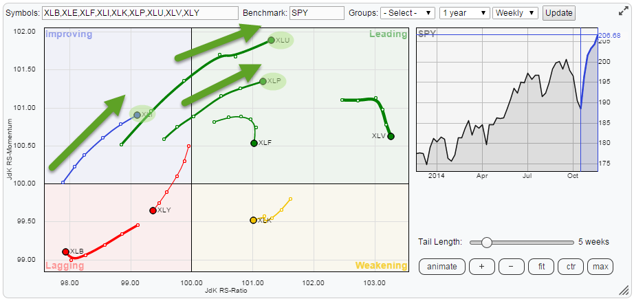
This zoomed in picture shows that there are three sectors that are moving in a nicely up-sloping pattern which is travelling higher on both the JdK RS-Ratio and the JdK RS-Momentum axes. These are Utilities (XLU), Consumer Staples (XLP) and Industrials (XLI).
Utilities
The utilities sector is improving further and recently entered the leading quadrant on the Relative Rotation Graph at the highest relative momentum value in the universe at the moment.
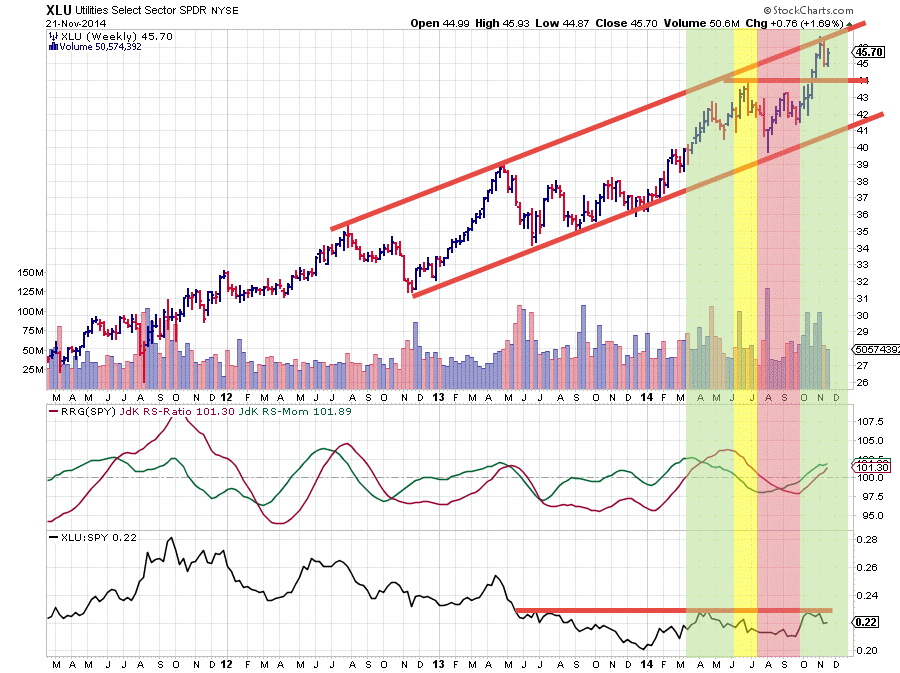
The consolidation below resistance at 44 caused XLU to lose some relative strength, resulting in the JdK RS-Ratio line to dip below the 100-level for a few weeks, before returning with a vengeance.
The break above resistance at 44 was a positive sign and the (raw) Relative Strength line responded to that. This whole sequence as indicated by the shaded backgrounds on the price chart above complete a full rotation on the RRG chart as shown below.
What we need now to maintain the (relative) momentum for this rotation is the (raw) RS line to break above the horizontal barrier that is capping its upside since mid 2013. When that happens (much) more out-performance may be expected from this sector.
Consumer Staples
The XLP chart is characterized by a nice up-sloping trend-channel for a few years already. With the JdK RS-Ratio line clearly below 100 for some prolonged periods, indicating a relative down-trend against SPY, this makes a perfect example of the working of relative strength analysis.
The red shaded areas show when the RS-Ratio was trading below the 100-level but price was clearly moving higher. This indicates that despite the up-trend in price for XLP there were other sectors within the S&P 500 that were moving up faster than XLP in that period causing relative strength to decline.
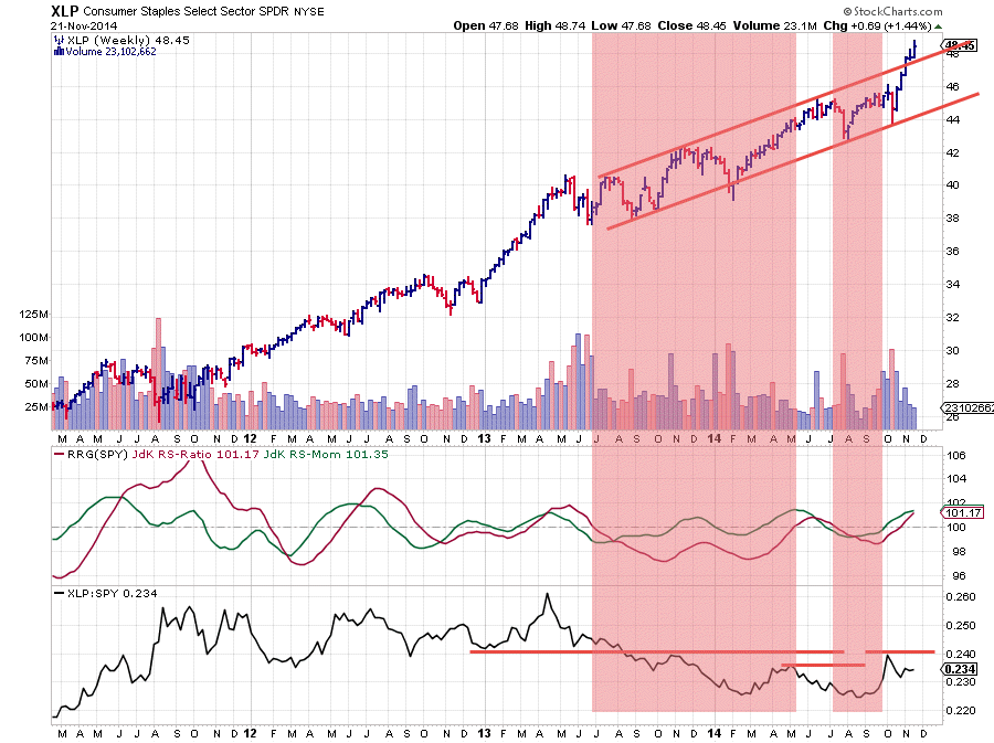
The recent break above the upper boundary of the rising channel is a very strong sign and suggests that more buying, i.e. higher prices, are likely to follow.
The relative picture also started to improve recently. This is already reflected in the RRG-lines where both the JdK RS-Ratio line and the JdK RS-Momentum line are now moving above the 100-level, putting XLP inside the leading quadrant. The RS line (lower pane) is struggling with some overhead resistance offered by previous highs. Once these levels are cleared nothing will stop a further (relative) rise of XLP versus SPY.
Industrials
The only sector in the improving (top right-hand) quadrant on the RRG chart is Industrials (XLI). The price moves over the past few weeks have been horrendous for a chartist.
First the downward break out of the rising channel, a negative sign. Then the pull back to the old support level which started to act as resistance and the formation of a lower high. Confirmation of the negative outlook. Then a swift decline below the previous low confirming that a new series of lower highs and lower lows had started.
And then ... in 5-6 weeks' time this whole negative set-up has been turned around and the sector is trading at all-time-high levels on the price chart and on the verge of a turnaround on the relative chart.
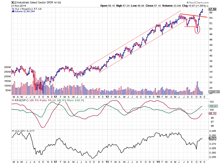
Whoever told you that technical analysis was simple and never wrong was clearly lying :)
Digesting this new information now makes me think that the 54-55 area on the price chart will act as a strong support level and potentially catch any declines in coming weeks and make that buying opportunities. Relative strength is clearly improving when reading from the RRG lines where the RS-Momentum line is already above 100 and RS-Ratio following closely. We need the momentum in the RS line to keep this rotation going towards the leading quadrant. A new period of out-performance over SPY seems to be starting.
Conclusion
- Energy still to be avoided
- Utilities completing full rotational pattern and now back in the leading quadrant
- Staples breaking out of rising price channel, backed by strong relative rotation
- Industrials rapidly turning around and on track for move towards leading quadrant
Julius de Kempenaer | RRG research
