The Relative Rotation Graph below holds the nine S&P sector ETFs showing the weekly relative trends against the S&P 500 (SPY) and against each other.
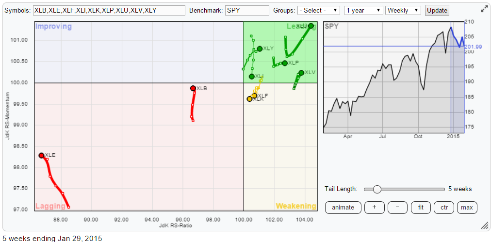
As you can see it is pretty crowded in the top-right, leading quadrant and a lot less so in the opposite lagging quadrant. In there we only see Energy (XLE) and Materials (XLB). Especially XLE is very far away from the benchmark and distorts the picture. But then again it is exactly what is happening. It also confirms a takeaway from research that I did years ago.
While researching the performance and the added value of relative strength analysis one of our conclusions was that it is (far) more important to focus on where you should NOT be invested rather then looking for areas/sectors where you want to be invested. Being able to AVOID (strong) under-performers in a universe almost certainly puts you ahead of the index (your benchmark). A very important goal for, especially, professional investors who do not have the luxury of holding a lot of cash in their portfolios.
Just having been able to avoid XLE over the past months would have put you ahead of the S&P 500 index.
An important pre-requisite for such an analysis is that the universe on which the analysis is performed is a so called "closed-universe". A closed universe is a universe that consists of all the elements that make up the benchmark. So in the RRG chart above the nine sectors, almost, completely make up the SPY (and yes i know that Telecom is missing :). Those who want to be 100% theoretically correct can use the Relative Rotation Graph holding all the sector indices instead of the ETFs. Here is the link.
In order to get some more detail on the recent rotations I have removed XLE from the RRG below.
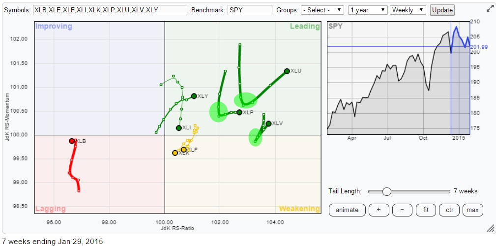
For Utilities (XLU), Consumer Staples (XLP) and Health Care (XLV) sharp "hooks" can be seen over a period of about three weeks two weeks back (the green shaded areas) Although they're not really rotations in a clockwise fashion as we would expect and are used to on RRG charts they are actually rotating when observed on a shorter (daily) time-frame.
A more in-depth clarification of the difference between weekly and daily RRGs has recently been added to the ChartSchool article on Relative Rotation Graphs.
Health Care (XLV)
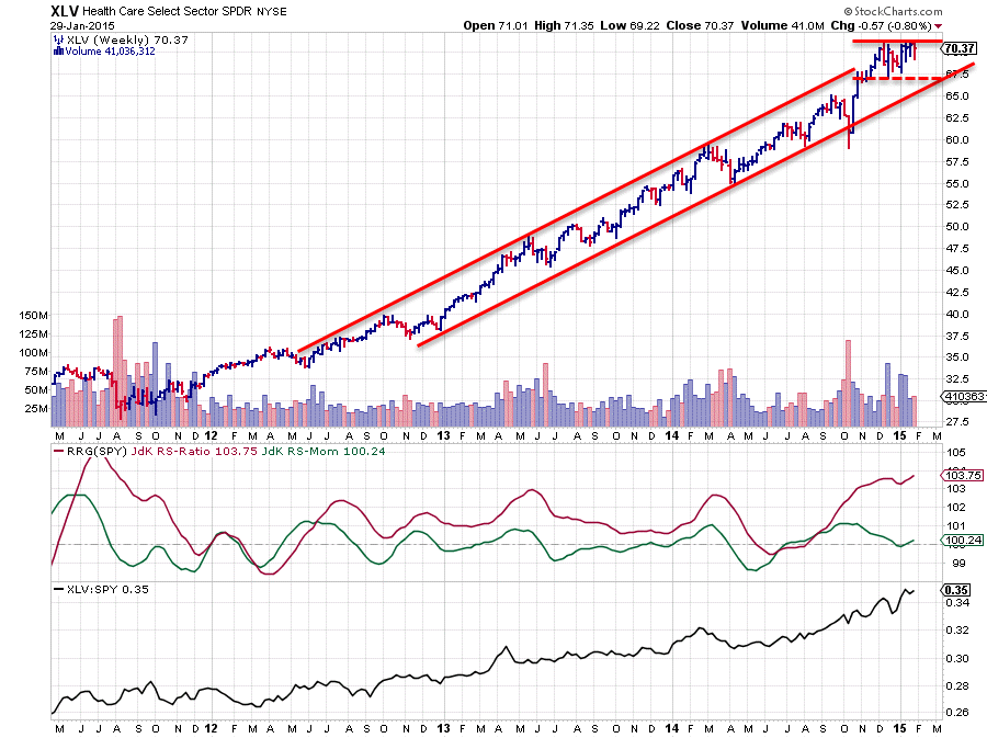
The up-trend on the XLV price chart is still fully intact and the sector has been out-performing the S&P 500 index roughly since mid-2012 with one short set-back where the JdK RS-Ratio dropped below 100 briefly in June-July of last year.
The sharp bounce off the lower boundary of the rising channel in October has provided new fuel for the relative up-trend as well and pushed the RS-Ratio sharply higher again. From a relative perspective this is still a very strong move which has just been confirmed by a break to new highs in the raw RS-line as well.
On the price chart XLV just ran into resistance at the level of the previous high around 70.50. This provides a situation that we need to watch. For the time being no harm has been done yet and price is still well within the boundaries of the rising channel. However, this setup can potentially lead to a double-top (reversal) pattern when the low around 67 is broken downward. The expected decline following the completion of such a double-top can potentially harm the strong relative trend in play. The other option, an upward break to new highs, will obviously once again be a confirmation of the strong picture and will extend the upward trends in both the price and the relative charts. For now all still looks good but keep an eye on support near 67.
Consumer Staples (XLP)
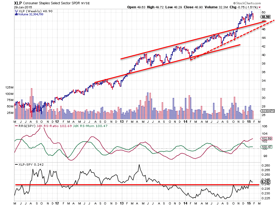
The XLP chart is a little less pronounced and has seen some rotations from out-performing to under-performing and back over the past few years. The latest rotation to positive relative strength started in October last year when the JdK RS-Ratio line crossed above the 100-level. This improvement in relative strength versus the S&P 500 index has recently been confirmed by the raw RS-line breaking above its previous highs.
Just as a side note here, please note the number of "touches" of the raw RS-line with that horizontal 0.24 level. It is in play for over three years now.
On the price chart all still looks good for XLP; the rhythm of higher highs and higher lows is still in play. In 2013 and 2014 the upward slope was not that strong but the break above the rising resistance level in November seems to have started a steepening of this trend.
Old resistance should now start to act as support on both the price and the relative charts.
Utilities (XLU)
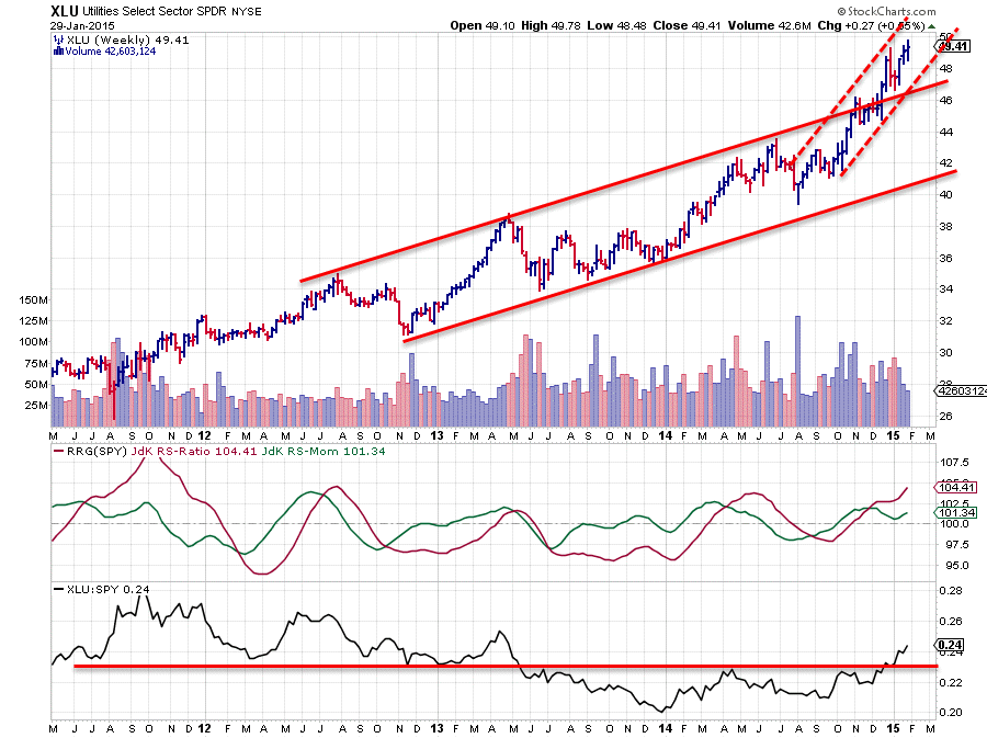
Reading from the Relative Rotation Graph against SPY, the Utilities sector (XLU) is now the strongest, measured on both the JdK RS-Ratio and JdK RS-Momentum axes. This means that the sector is in a (strong) relative up-trend and that this trend is still being pushed higher by strong, and gaining, relative momentum. Firing on both axes so to say.
On the raw RS-line there is again an important horizontal level visible, around 0.23, that keeps coming back either as support or as resistance over the past years. The recent upward break of this horizontal level has certainly added to the strength of this relative trend. On the RS chart there is now plenty of room to move higher in coming weeks.
On the price chart, XLU left the rising channel to the upside back in December. This caused an acceleration of the rally which is still pretty much ongoing.
Recently some resistance seems to have been built up around 49.50 and the sector is pushing to break that level to the upside. A daily chart of XLU will show that price action in more detail. It is not a text-book ascending triangle but from the lows that keep coming in at higher levels I read that buyers are still eager to pay higher prices to get back into the market while sellers remain steady near 49.50 and are not willing to aggressively lower their price to sell. When supply dries up around 49.50 and the resistance is taken out another acceleration is likely to happen.
Conclusion
- Energy (XLE) still deep inside lagging and expected to continue its under-performance
- Health Care (XLV), Consumer Staples (XLP) and Utilities (XLU) all picking up their strong relative trend again
Julius de Kempenaer | RRG Research
RRG, Relative Rotation raphs, JdK RS-Ratio and JdK RS_Momentum are registered TradeMarks by RRG Research


