The rotation of relative trends close to "home" over the past 3-4 weeks. HOME in this context is VBINX (Vanguard Balanced Index Fund) which represents a balanced investment portfolio holding approximately 60% in Equities and 40% in bonds.
The Relative Rotation Graph below shows the relative trends for a number of asset classes vis-a-vis VBINX.
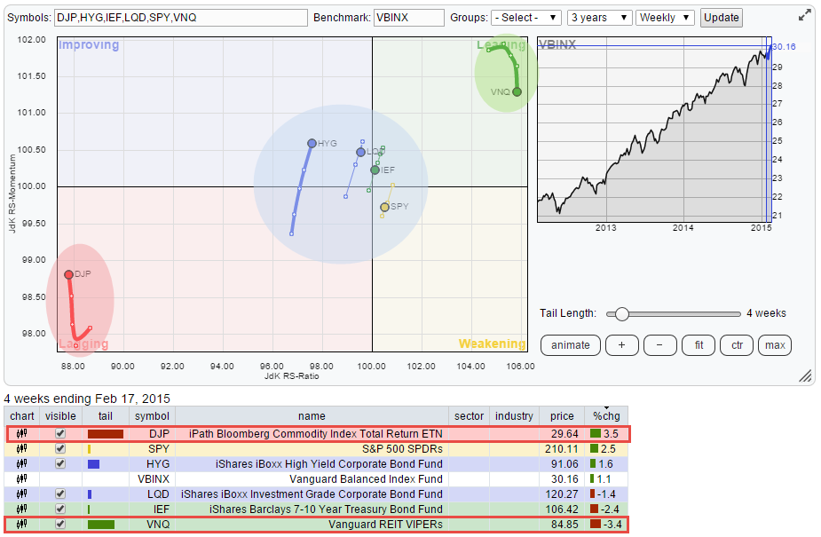
The two asset classes that stand out on this RRG, and have been for a while, are VNQ (Vanguard REIT VIPERs) and DJP (iPath Bloomberg Commodity Index Total Return ETN). The first one in the top-right corner and the second one almost exactly opposite in the bottom left corner.
Actual- vs. TRENDS in- (relative) performance
Let me use this opportunity and this example to explain a subtle, but important, misconception that I often hear on the interpretation of Relative Rotation Graphs. A lot of people refer to the securities inside the 'Leading' quadrant on the RRG as 'out-performing' the index and vice-versa, the securities in the 'Lagging' quadrant as 'under-performing'. Although, in general, this is indeed the case. The statement as such is not entirely true and does not always hold up...
The reason for this is the fact that Relative Rotation Graphs show the movement of relative TRENDS or in other words TRENDS in relative performance which is distinctly different from 'raw' relative performance. As we all know a TREND is never a straight line up or down. Not on a price chart but also not on a relative (performance) chart. They show certain characteristics, for example a series of higher highs and higher lows (up-TREND) or lower highs and lower lows (down-TREND). This makes it very well possible that during such a TREND the actual (relative) performance may deviate from the trend or go counter-trend. And this is exactly what we see happening in VNQ and DJP on the RRG above.
Despite the fact that VNQ is far away in the top-right corner and therefore clearly moves in a relative up-trend against VBINX and DJP is far away in the bottom-left corner and thus moving in a relative down-trend, we can see in the table underneath the RRG plot that over the past four weeks the actual performance of VNQ (-3.4%) lies well below VBINX (+1.1%) and even further below DJP (+3.5%).
To get a better handle on this picture, i.e. the longer-term out- / under-performance, I can extend the trail further out to a maximum of 30 periods (weeks in this case) which gives me the chart below and clearly shows the difference in performance for those two asset classes.
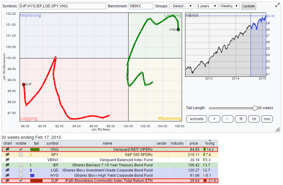
Over a period of 30 weeks VNQ showed a return of + 14.2% while DJP lost 21.6% in relative terms against each other this means an over performance for VNQ over DJP of + 35.8%. In reference to the VBINX benchmark VNQ outperformed the benchmark with 8.9% while DJP under-performed by 26.9%.
VNQ vs DJP
This is even better shown on a chart where we compare VNQ and DJP directly with each other and not via the VBINX benchmark.
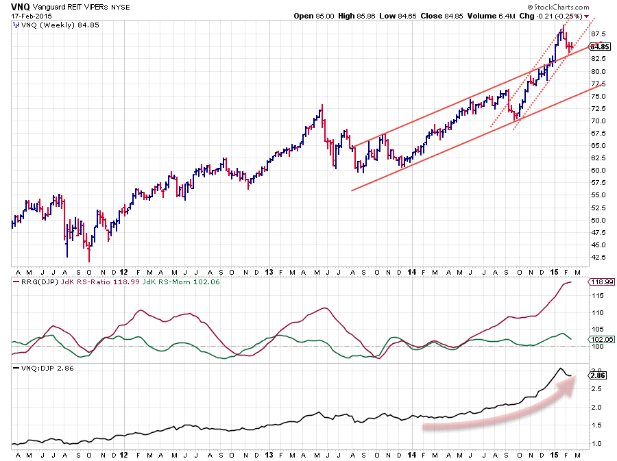
The VNQ (price) chart itself is looking very strong. A nice upward channel emerging from the late 2013 lows which was left to the up-side at the beginning of this year and followed by an acceleration in price. All of this strong price performance translated into a very strong upward trend on the raw-RS chart (lower pane) and very high values for the JdK RS-Ratio. The small drop in relative momentum (JdK RS-Momentum) can hardly be seen as significant and should be judged as a corrective move within a (strong) upward relative trend.
There is no way we can judge or 'forecast' at this moment in time if this will be the ultimate top for VNQ and its relative trend and that it's all down-hill from here. So I'm sticking to the odds that (relative) trends persist longer and more often than they turn around and my observation that the relative trend for VNQ against DJP is still intact...
Greg Morris' latest blog makes an interesting read on the futility of 'forecasting'.
The remaining asset classes on the (first) RRG, caught inside the blue shaded area, Equities (SPY), Government Bonds (IEF), Investment Grade Corporate Bonds (LQD) and High Yield Corporate Bonds (HYG) are all moving very close to the benchmark. This means that there are no meaningful relative trends to be seen in those asset classes. Except , maybe, for HYG.
iShares iBoxx High Yield Corporate Bond Fund (HYG)
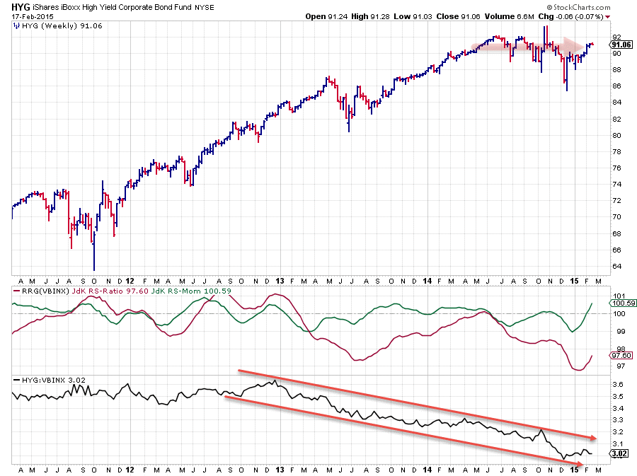
On the price chart of HYG above it can be seen that the price performance has been as good as flat over 2014 and into 2015. With the VBINX benchmark continuously rising this caused a steady down-trend in relative strength.
Just recently relative momentum (JdK RS-Momentum, the green line) has started to pick up and moved above the 100-level. The JdK RS-Ratio line however, remains solidly below 100 indicating that the downward trend in relative strength for HYG against VBINX is still in full force. The parallel declining trend-channel under scores this observation. Within this channel there is definitely some upward potential, i.e. some short-term out-performance, but an upward reversal and a break out of this falling trend is hard to imagine given the current picture.
Equity / Bond rotation (SPY / IEF)
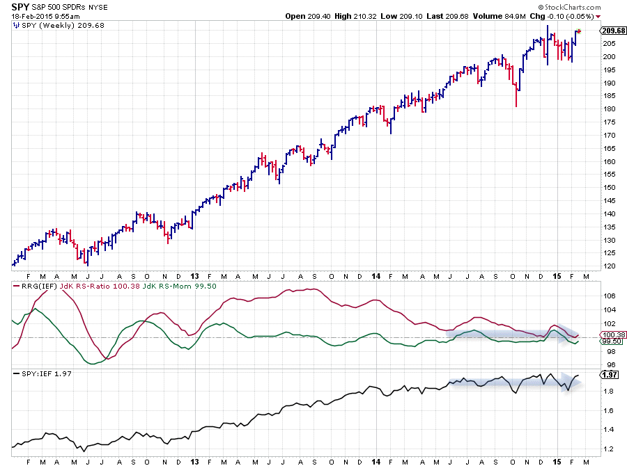
The equity / bond relationship still remains pretty much undecisive. The RRG-Lines are very close to the 100-level and show only minor fluctuations which is fed by the raw RS-line moving sideways for almost a year now. As long as this situation remains it will be of no much use to switch between equities and bonds. It's probably better to focus on alpha generating opportunities that present themselves further away from the benchmark!
Conclusion
- Relative trends in VNQ and DJP still intact despite counter-trend move
- HYG has some short-term upward (relative) potential but remains in longer-term down-trend
- No alpha to be expected from Equity / Bond rotation at the moment
Julius de Kempenaer | RRG research
RRG, Relative Rotation Graphs, JdK RS-Ratio and JdK RS-Momentum are registered TradeMarks by RRG research.


