The Relative Rotation Graph of the 30 Dow stocks shows nicely balanced rotations. All 30 names are more or less evenly spread around on the RRG chart. This is often seen on Relative Rotation Graphs holding a closed universe of securities without one or two mega-caps distorting the picture.
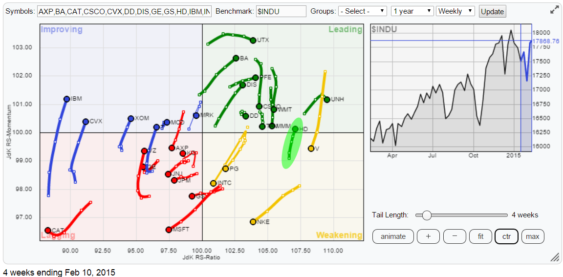
I have highlighted only one stock (HD) in the RRG above to emphasize the added value of the animation functions.
As 30 securities on a RRG chart is quite crowded I like to shorten the trail to 3-5 periods to be able to better see what's going on and, quite frankly, simple being able to read the ticker symbols. Obviously I have to give way to some historical perspective which I would be able to see with longer trails on display. This is where the animation comes in!
Using the animation controls on the RRG chart allows me to visualize the rotation through history without the need for long trails on each observation. The 35 second video below shows this a bit more clearly.
Home Depot (HD)
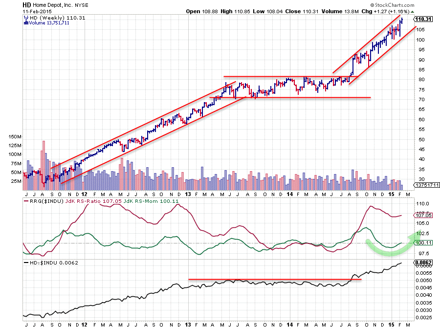
On the price chart HD seems to have started a second leg up after a long sideways consolidation from mid-2013 to mid-2014. The upward break out of the trading range on the price chart signalled the start of a new upward trend which is still in play and captured between parallel rising support and resistance lines. At the moment HD is near the upper boundary of that channel. This can cause a small pause or a little setback but this will be considered part of the "breathing" of the uptrend. It's (almost) never a straight line up.
The relative picture has been following developments on the price chart and also broke above an important horizontal resistance level that had been in play since mid-2013. The move on the raw RS-Line took the JdK RS-Ratio line to high levels near 110, and at the end of last year into the start of 2015 we have seen some loss of relative momentum, but it seems to be turning up again, causing the current rotation from leading into weakening and back up into leading again as shown in the animated clip.
This rotation is considered to be part of a strong relative up-trend which is just starting a new move higher backed by strong price performance.
The good, the bad and American Express (AXP)
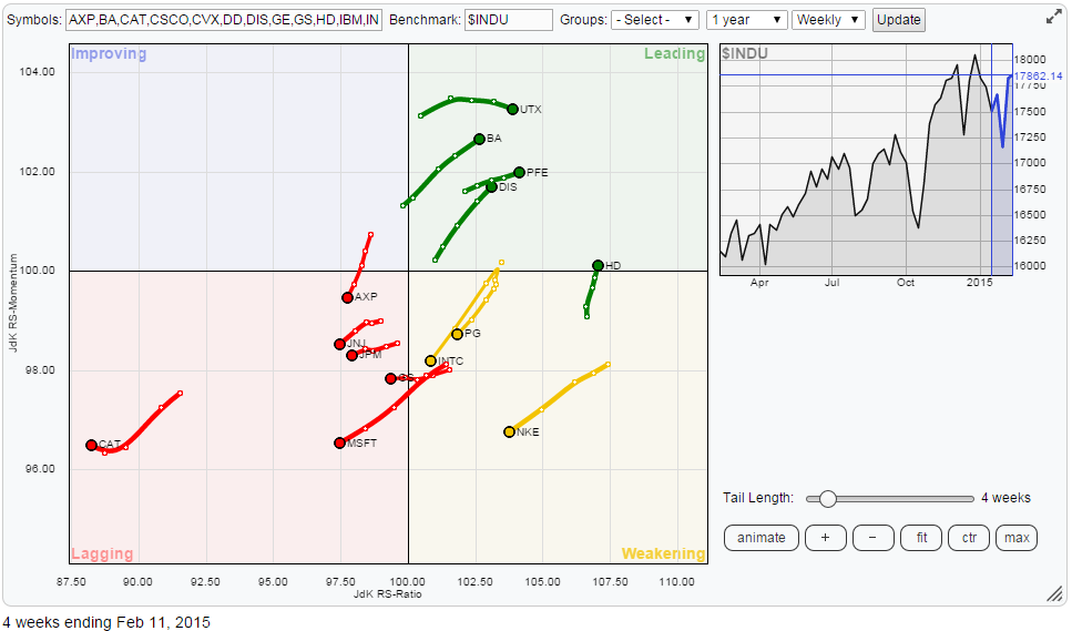
Going back to the Relative Rotation Graph of the Dow stocks at the moment and taking away the "non-interesting" names for the time being leaves me with the picture above. It holds about half of the stocks in the universe.
Home Depot aside there are a few other names in the leading quadrant worth inspecting. These are UTX, BA, PFE and DIS. All these stocks are moving higher on both the JdK RS-Ratio and the JdK RS-Momentum axes and they definitely have price charts showing nice upward breaks suggesting there is more positive (price) performance ahead.
The three names inside the weakening quadrant are technically still in a relative up-trend against the Dow but they are moving lower on both axes and especially INTC is (very) close to crossing over into the lagging quadrant. NKE is rotating down from a period of very strong relative strength and still some distance away from the lagging quadrant. This gives NKE some leeway and the opportunity to turn back up in coming weeks to continue its relative up-trend. Looking at the price chart I would say a new low near support (around 90) is needed to make that work; otherwise chances are increasing that NKE will start a new relative down-trend.
Opposite the good are the bad .... At this moment there are a number of stocks visible that have just entered the lagging quadrant from weakening. They are JNJ, JPM, GS and MSFT. Judging from the length of the trails MSFT is the one in weakest condition as it is picking up pace to the (relative) downside. Caterpillar (CAT) is the furthest away to the left and the weakest stock inside the Dow at the moment.
After that there is one more stock which makes an interesting study...
American Express (AXP)
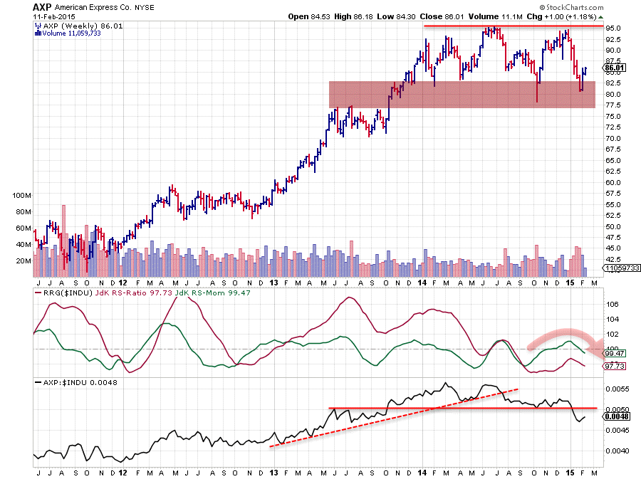
AXP is making almost the exact opposite move (rotation) of HD. The stock is in a relative down-trend already since mid-2014 and went through a period of (relative) recovery However this recovery has not been strong enough to pull AXP through the improving quadrant into the leading quadrant but instead started losing momentum again and is now dropping back from the improving quadrant into lagging. In other words; the relative down-trend is getting new fuel and further under-performance against the dow is therefore likely. The break below support on the raw RS-line is adding to the weak relative outlook.
Those who are interested in pair-trading (opportunities) can take a look at the chart of HD vs AXP.... here is the link.
Julius de Kempenaer | RRG Research
RRG, Relative Rotation Graphs, JdK RS-Ratio and JdK RS-Momentum are registered TradeMarks by RRG Research