On the Relative Rotation Graph showing the sector rotation in the nine S&P sector ETFs there is one that really stands out. But is it good or is it bad?
XLE, the Energy select sector SPDR is showing up in the top-left 'improving' quadrant with a long, almost vertical, trail. The length of the trail and the position of this sector far away from the other sectors as well as the benchmark makes the Energy sector a prime candidate for further inspection.
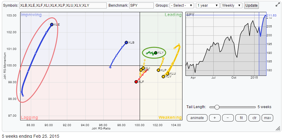
When looking at Relative Rotation Graphs the position on the JdK RS-Ratio axis is most important as that is the measure for the trend in relative strength that is in play. The further away from the cross hair (100) the stronger the trend (up or down). With that in mind it is easy to see that XLE is still the sector that has the lowest reading on the RS-Ratio axis and thus has to be labelled as the 'weakest' sector at the moment. Or better phrased; the sector with the strongest relative down-trend in this universe.
Another sector that stands out for me is XLY, the Consumer Discretionary select sector SPDR. This one is showing up in the top-right 'leading' quadrant but has a very short trail. The difference in the length of the trails for those two sectors is giving some hints about the volatility of the relative move. The long trail on XLE suggests high(er) volatility and thus wider swings in relative strength while the short trail on XLY suggests the opposite, a very stable relative move.
Let's focus on those two sectors. There is clearly some sector rotation in play.
Energy select sector SPDR (XLE)
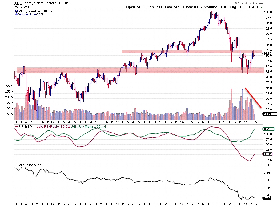
The position of XLE on the RRG chart is the result of the interaction of the RRG-Lines. Reading from the chart above we can see that the RS-Ratio line (red) is at its lowest level of the past 4 years. And as a matter of fact it is at its lowest level of the past ten years. The point I'm trying to make is that this is weak ... seriously weak... and therefore we have to question ourselves if a hiccup in (relative) momentum, as we are seeing now, means that or should be judged as a turn around of this existing trend.
It IS possible but calling it at this moment in time would be (imho) a very bold statement. Usually much more time and (upward) price and relative action is needed to turn such a trend around.
On the price chart this sector has touched support in the area around 72.50 which lines up with a number of highs that were set in 2011 and 2012. Out of that support area a rally emerged which is now testing resistance in the area around 80. This resistance area is coming off a few highs and lows that were set in the past year and a half. Given the fact that the last rally has taken out the previous high and the most recent low has not fallen below the preceding low suggests that downward price action has come to an end, or at least is stalling. A trading range, on the price chart, seems to be a safe conclusion.
On the relative charts the picture is a bit different. In the raw RS-line the down-trend is still in play and the recent sideways move could very well be a pause within that down-trend. It is this small sideways movement that is picked up by the RRG-Lines and which is causing the RS-Momentum line to peek above the 100-level but it is very doubtful whether this rise in relative momentum will be able to pull the RS-Ratio line all the way up and turn the trend around. More likely is that another rotation down into the lagging quadrant is needed before being able to call the low and the turn around in this relative trend.
A good cross-check is always to check another time-frame, in this case daily, which gives a bit more detail. On the daily RRG the XLE sector ETF is already showing up in the weakening quadrant after having travelled through the improving and leading quadrants during the past few weeks.
Another thing that does not make me comfortable calling a low in price nor in relative strength for XLE is the volume pattern. I am by no means a volume expert but one of the things I have learned is that 'volume needs to confirm a trend in price'. In short this means that during an up-trend the up-legs in price need to be accompanied by up-moves in volume and the setbacks in price need to coincide with drops in volume and vice versa in case of a down-trend the down-legs should show rising volumes while hiccups within the down-trend should show drops in volume.
And although the price seems to have started moving in a trading range. The volume pattern still corresponds with a down-trend .... not a strong sign and definitely a sign to remain careful at this point in time.
Consumer Discretionary select sector SPDR (XLY)
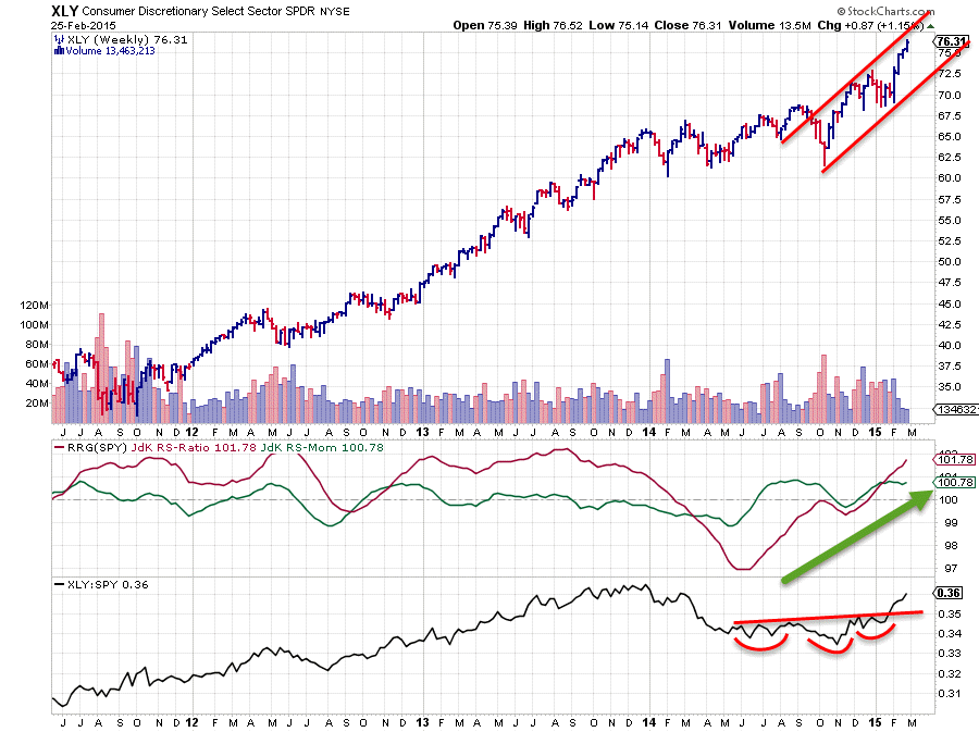
The chart above shows the price action (weekly) of the Consumer Discretionary sector with the RRG-lines and relative strength against the S&P 500 index. Quite a different picture from the XLE one that we looked at earlier.
In this chart an up-trend defined by higher highs followed by higher lows is clearly visible and this up-trend in price has just been confirmed by a break to new highs. The strong up-move over the past few weeks is the result of this break.
From a relative perspective this sector showed a very strong up-trend pretty much all the way emerging from the lows in 2008, check this longer-term chart. 2014 was the first time for this sector to show a real dip in the relative trend. But the good news is that this (temporary) dip seems to have come to an end. The JdK RS-Ratio line already crossed above the 100-level at the end of last year and just recently the raw RS-line crossed above an (almost) horizontal resistance level. With a little fantasy we could even call a completed H&S bottom formation in the RS-line concluding that the recent down-trend in relative strength has turned around and is now on the rise again.
As price is almost touching the upper boundary of the channel and the RS-ratio line is comfortably above the 100-level there is enough leeway for some corrective price and relative movement without immediately harming the current positive conditions.
Conclusion
- Sector rotation remains ongoing
- XLE shows strong relative momentum but relative trend is still weak
- XLY has turned its relative trend around and is on the rise again on both price- and relative charts
Julius de Kempenaer | RRG Research
RRG, Relative Rotation raphs, JdK RS-Ratio and JdK RS_Momentum are registered TradeMarks by RRG Research
