In previous blogs on international (equity) markets I used to plot all markets on one RRG canvas which makes a pretty crowded picture. As most individual ticker symbols are from European markets which are much more fragmented than other global regions I have grouped them together by using one ticker ($STOXX600). This will show the movement for European markets as a whole and I will investigate the European universe separately. This makes the Relative Rotation Graph easier to read and secondly shows a good example of how you can use RRGs in a top-down approach!
The first RRG below holds international equity markets and uses one ticker for Europe ($STOXX600)
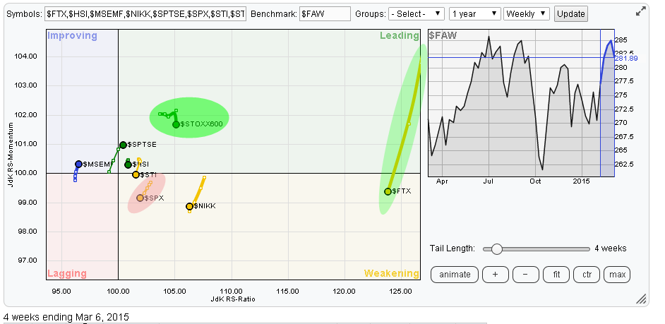
As we are seeing for quite a while now the Chinese market ($FTX) is a big outlier far away on the right of the RRG. European markets, as a group ($STOXX600), are still comfortable inside the leading quadrant. The US ($SPX) continues to weaken, albeit slowly, just like the Japanese Nikkei index but both are still on the right hand side of the RRG. Weakest relative rotation is still found in Emerging Markets despite the little hiccup above the 100-level on the JdK RS-Momentum axis.
China ($FTX)
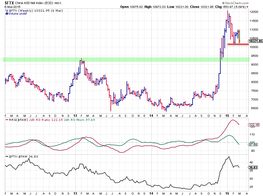
The Chinese market index $FTX (China A50 Net Index) is progressing in its corrective move after peaking at 12.000. Please refer back to the previous blog on international markets for a more in-depth analysis of this market. The big support level to watch is still the area just below 9500.
Over the past few weeks a new low has been set around 10.100 and after a small recovery off of that level $FTX is on its way to test that fresh low or break it. Given the very fast and steep preceeding rise it would be no surprise if 10.100 is going to be taken out on the downside. Such a break will trigger the move for a test of the 9500 area where we will potentially get more information on the sustainability of the up-move that started late 2014.
From a relative perspective there is no doubt that the trend is still up and that China is still one of the strongest, if not THE strongest, markets in the world.
USA ($SPX)
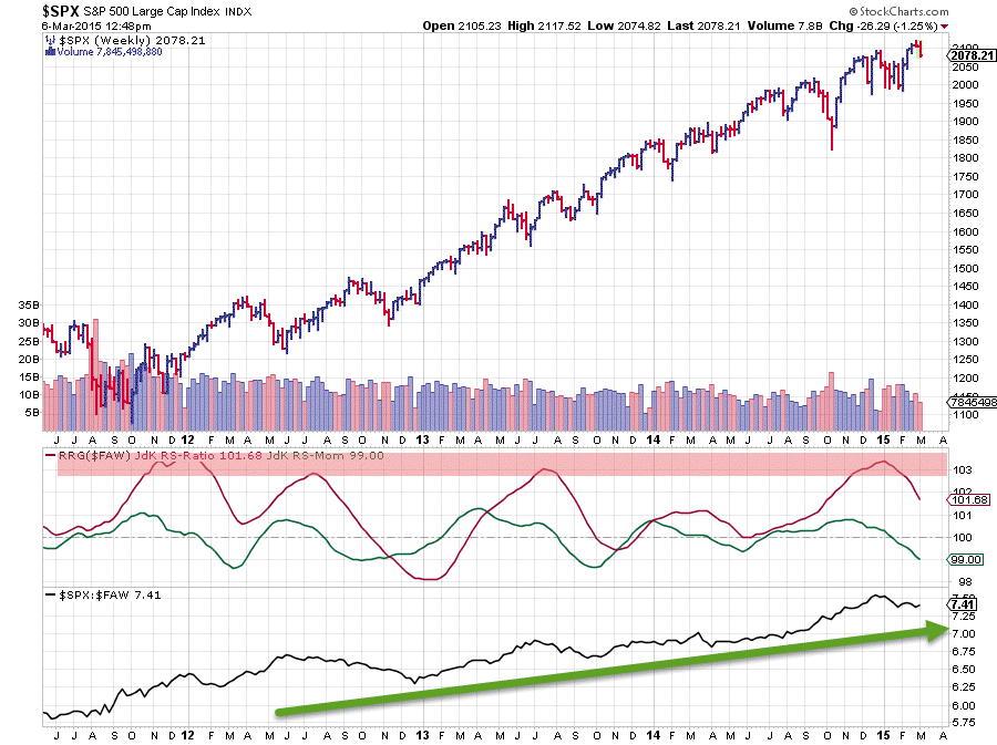
If we were to analyse the S&P 500 chart in isolation with no reference to any other market there is not much of a problem... Just eye-ball the chart, it looks great since late 2011, a fairly regular series of higher highs followed by higher lows and a recent break to new highs. What else do you want?
However a smart investor who is looking beyond his/her nose, for example by putting things into perspective by studying a Relative Rotation Graph :) will see that things are changing and that US equity markets, at this moment, are not the best in the world.
On the RRG we see the S&P 500 sector inside the weakening quadrant and steadily heading towards the lagging quadrant over the past few weeks. The fact that the weekly observations on the trail are very close together means that it is not a highly volatile move but a gradual weakening over time. This can be seen from the interaction of the RRG-lines on the price-chart above, where the JdK RS-Ratio is still above the 100-level but JdK RS-Momentum continues to drop lower below 100, indicating that the relative up-trend is still intact but losing strength and potentially nearing a turning point.
Another observation is that the recent break to new highs could not be sustained and the market dropped back below the former high, ending this week's bar strongly down after completing a small top-formation on the daily chart. All in all this will be limiting the upside potential in the near term, adding to the belief that there are better markets to be found out there.
Europe ($STOXX600)
Sometimes relative strength analysis is very simple .... and you do not need any of these fancy tools. Just look at the two plain vanilla price-charts of the S&P 500 and the STOXX 600 below.
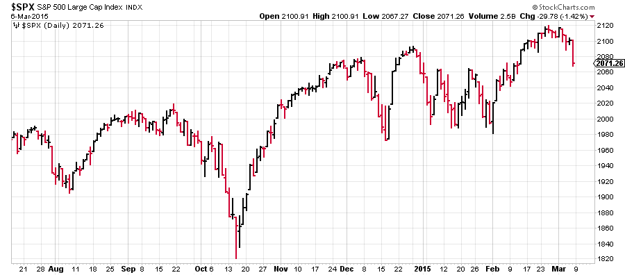
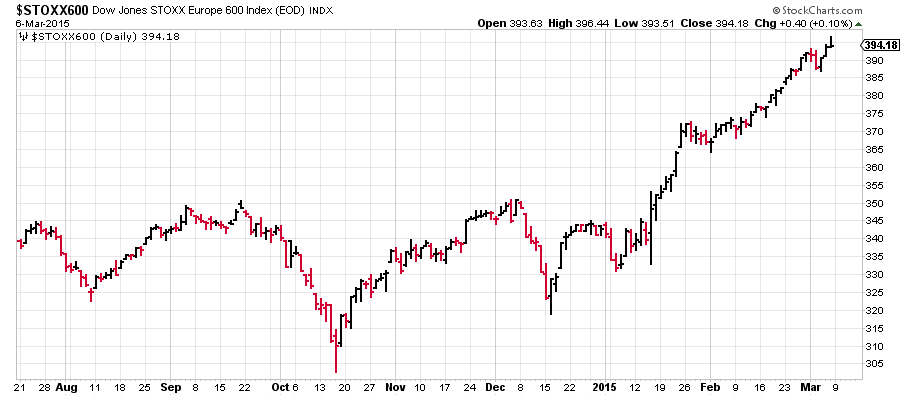
S&P 500 on the left and STOXX 600 on the right ... Just by eye balling, which one would you prefer ...??...... I thought so :)
The Relative Rotation Graph holding international equity markets at the top of this post puts these things into a broader perspective and enables you to view the relative movement of the S&P 500 and the STOXX 600 in relation to each other but also vis-a-vis the other markets on the graph. With the STOXX 600 comfortably inside the leading quadrant it's pretty clear that European equities are still to be preferred over the US.
Now we could stop here and if investors want to get exposure to European markets there are plenty of ETFs available that will track a European equity index. But those who like to get a bit more detail can break down Europe into its various country market indices and that is what I have done in the Relative Rotation Graph below. This RRG holds a number of European country indices and uses the $STOXX600 index as the benchmark.
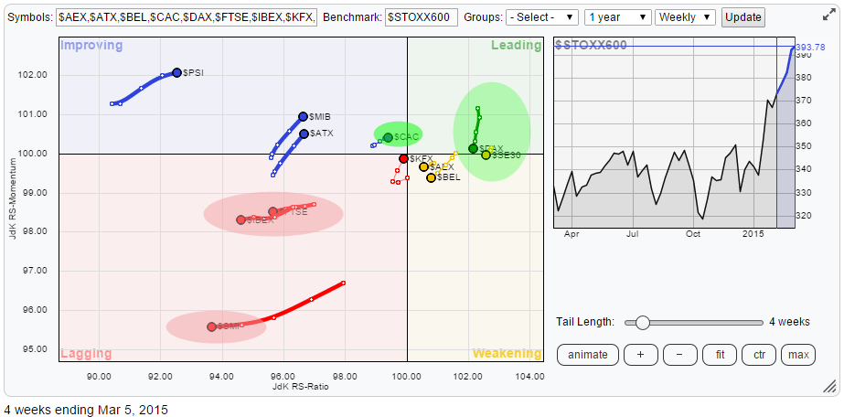
The RRG above shows a few interesting insights about European markets.
First of all the markets in relative down-trends. The most important ones have been high-lighted in the red-shaded ovals. They are Spain and the UK in the big oval in the middle of the lagging quadrant and the Swiss market in the lower part of the lagging quadrant. Clearly these should be avoided in a European portfolio or exposure.
A second observation we can make is that a number of markets are clustering around the benchmark (in the middle); France, Denmark, Belgium and the Netherlands. A bit further to the right and therefore showing a stronger relative trend are Germany and Sweden. Obviously Germany is a more important (bigger) market than Sweden which would justify the conclusion that Germany, at the moment, is the leading market in Europe.
Germany ($DAX)
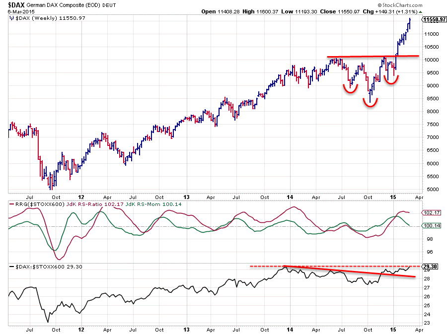
The chart above shows the DAX index with RRG-lines and raw RS against the $STOXX index. The upward break above the neck-line of the inverted H&S continuation pattern is paying off handsomely at the moment but nearing the target that can be calculated off the pattern. Roughly 1.500 points upside after the break.
Relative strength against Europe as a whole improved again in November last year when the JdK RS-Ratio line crossed above the 100-mark and is still holding up well. The raw RS line broke above the slightly down-sloping trend-line and is now challenging the relative peaks that were set late 2013. Taking out this relative resistance level would give the relative up-trend another boost and most likely cause a further out-performance against $STOXX.
From a price perspective there is some down-side risk after the recent rally but for the time being any declines should be judged as corrections within a larger up-trend.
Conclusion
- China in correction but still in a relative up-trend against the rest of the world
- European equity markets remain in the lead over the US
- Within Europe:
- avoid the UK, Spain and Switzrland
- Germany likely to continue its relative up-trend
Julius de Kempenaer | RRG Research
RRG, Relative Rotation graphs, JdK RS-Ratio and JdK RS_Momentum are registered TradeMarks by RRG Research


