Summary
- XLE and XLB expected to turn back to lagging quadrant again
- XLI improving further towards leading
- XLK holding up well inside positive territory
- XLP and XLU both weakening but wider rotation for XLU
- XLF bottoming out in relative trading range?
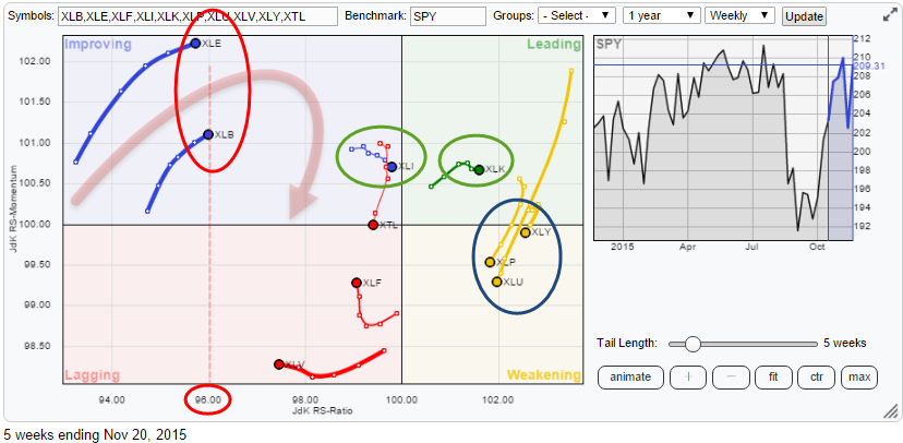
Quick scan
The Relative Rotation Graph above shows the sector rotation of US sector ETFs against the S&P 500 index. A quick scan of the picture tells us that the Energy and Materials sectors (XLE and XLB) are showing us the highest JdK RS-Momentum values at the moment, but they are also furthest to the left on the JdK RS-Ratio scale which means that they are the weakest sectors in this universe at the moment. This combination of higher RS-Momentum but low RS-Ratio values usually leads to a rotation that completes completely at the left-hand side of the plot, characterizing a very weak relative trend.
Also inside the Improving quadrant but much closer to the 100 level on the RS-Ratio scale is the Industrials sector (XLI). There is a bit of loss of relative momentum for XLI but it;s not disturbing (yet).
The only sector inside the leading quadrant, at the moment, is Information Technology (XLK) and the sector is holding up well for the time being.
Inside the weakening quadrant, there are two sectors rapidly losing relative momentum. These are Consumer Staples (XLP) and Utilities (XLU). their charts should be able to tell us more.
Telecom (XTL), Health Care (XLV) and Financials (XLF) are the sectors inside the lagging quadrant, each with a different trail. XLV is heading further into negative territory at a stable (negative) momentum level. XTL just turned back down after a short trip through the improving quadrant without being able to reach the leading quadrant. Financials is probably the only sector that needs to be inspected on the price chart to see how it is behaving and how we should judge the improvement in relative momentum seen over the past few weeks.
Energy - XLE
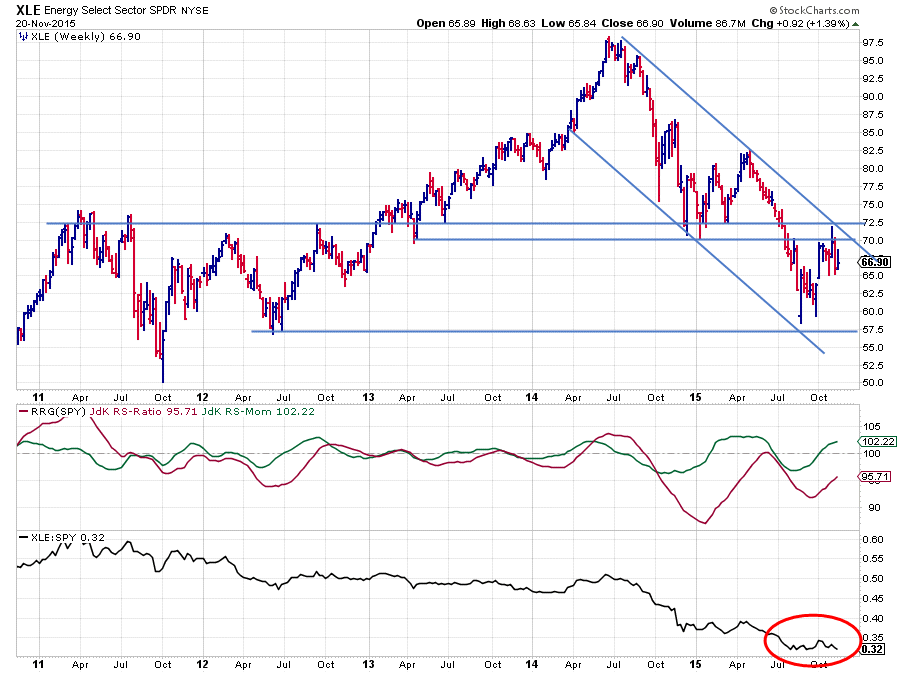
Energy is the sector with the highest JdK RS-Momentum value but at the same time the lowest JdK RS-Ratio. Most of the time this is not a good combination leading to a positive sector rotation. This time seems no different.
On the chart above the raw RS-Line started to move down in the second half of 2014, started 2015 flat, resumed the downtrend during the summer and started to move flat again since August. This behaviour caused the JdK RS-Ratio line to remain below 100 since September 2014 and the RS-Momentum line to oscillate around 100, reflecting the relative improvement during the flat periods. The last up-leg in the RS-Ratio line peaked against the 100-level before it started to drop again.
Currently, the RS-line is pushing against the level of its recent lows. A break lower will very likely cause an acceleration of this relative downtrend again.
The price chart gives every reason to be very cautious with this sector, also, from a price point of view. The downtrend off of the $ 97,50 peak back in 2014 is clearly visible with each major low lower than its predecessor and a similar pattern for all major highs. This rhythm was once again confirmed when the last peak formed itself against the falling resistance line. That resistance came in around the same level as where horizontal resistance is found between $ 70,00 - 72,50. A first support level to watch on the price chart is near $ 57,50 - 60,00 while the upside is capped near the aforementioned resistance level.
All in all upside seems to be limited while relative strength is negative leading to the belief that this sector will rotate back into the lagging quadrant before reaching the leading area.
Materials - XLB
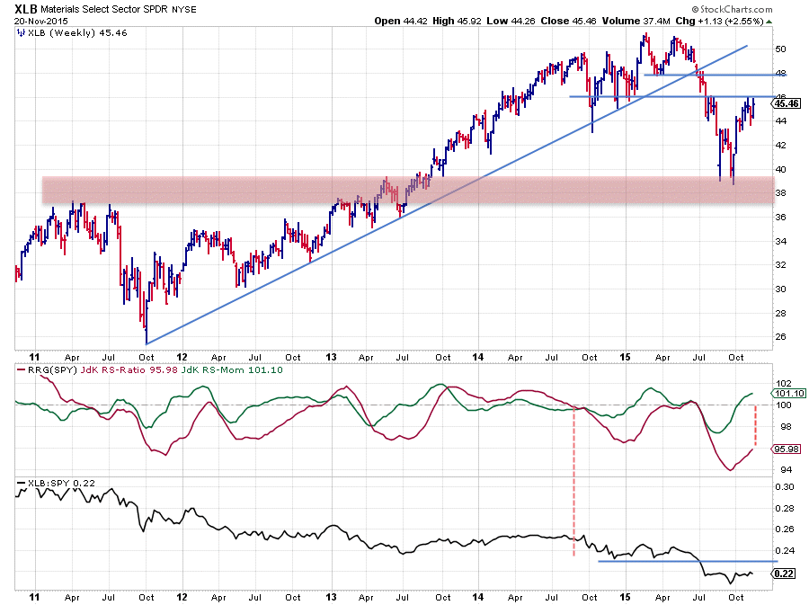
The chart of the Materials sector shows a nice uptrend in price from late 2011 to the highs around $ 51 which were formed earlier this year.
The rising support line, marking the lower boundary of this uptrend, was broken late June and followed by a rapid decline into the support zone around $ 38. Out of that support area a rally emerged, taking XLB back to the $ 45 area where it seems to be running into trouble again now. This is likely to cap the upside potential for the time being.
A look at the relative charts reveals that the JdK RS-Ratio is at a very low level. The JdK RS-Momentum line above 100 at the moment needs to be seen as a recovery within a relative downtrend which is considered to be fully intact. A lot more relative momentum is needed to pull RS-Ratio from 96 back above 100. A drop back below 100 for the RS-Momentum line and, therefore, a rotation back from improving into the lagging quadrant is the most likely scenario for this sector rotation.
The raw RS-Line shows this downtrend in relative strength since September 2014 while switching between clear drops and flat periods of relative strength. A drop of RS below its recent low will very likely ignite a new downward move and cause further underperformance of the Materials sector versus the S&P 500 index.
Consumer Staples - XLP
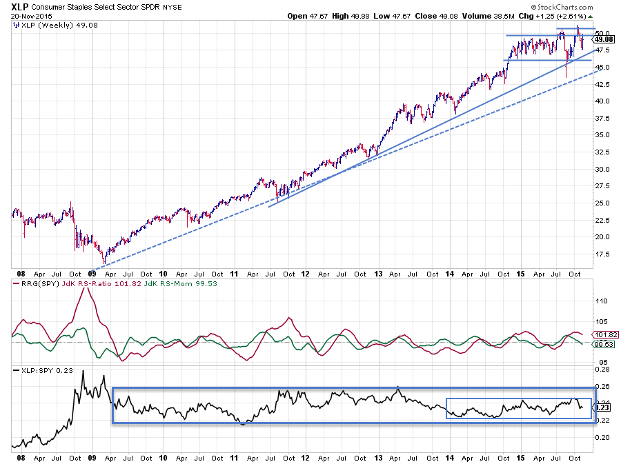
The price chart of XLP is still working its way higher in the uptrend that started out of the early 2009 bottom, characterized by the general rhythm of higher highs followed by higher lows although the "power" of the trend is weakening since the beginning of 2015 when subsequent highs stopped pushing as far beyond previous highs as they used to.
The relative picture is quite different from the price. Despite the nice up-sloping move in price, relative strength has been moving in a broad range during this whole period. Some periods of over- and under-performance trends can be seen in the pane holding the RRG-lines but never a really strong or really long trend came into place. Sector rotation in staples remained close to the benchmark since mid-2009 shown by an RS-Ratio line not moving far away from the 100-level.
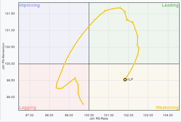 The, isolated, move of XLP on the RRG-chart vs SPY shows this behaviour in rotational format.
Over the past few months, a range seems to be taking shape on the price chart as well with resistance around the $ 50 area likely to cap upward potential. On the other hand, horizontal support around $ 46 in combination with the rising support line (solid) are expected to provide protection on the downside
With this range in relative strength still intact and also a range emerging on the price chart, a continuation of the rotational pattern towards the lagging quadrant, i.e. underperformance against SPY, is likely.
Utilities - XLU
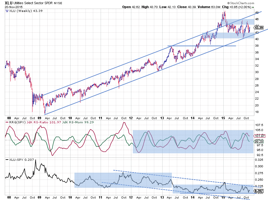
In a way, XLU is fairly similar to what we see in XLP. The steady uptrend in price since 2009, the leveling off of that trend in 2015, causing a trading range to show up on the weekly bar chart, containing price movements probably in a range between $ 40 and $ 46.
Reading from the raw RS-line a slowly lagging performance versus SPY can be seen since October 2011 which basically consists of two ranges. The big difference between the relative moves in XLP and XLU is the width of the swings and, therefore, the amount of alpha that can potentially be gained from those swings. Compare the peaks and troughs in the RS-Ratio line in the XLU chart above with those in the XLP chart previously. On XLU, the RS-Ratio line hits levels around 105 and 95 regularly while on the XLP chart the typical extremes are around 102 and 98.
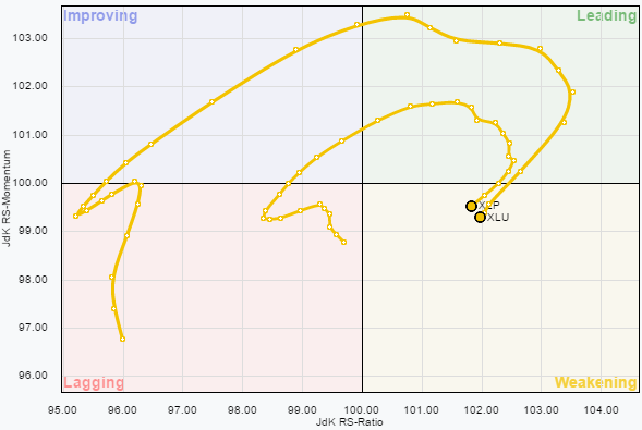 This relationship is even better seen when you click to the live version of the Relative Rotation Graph on the right and drag the slider through time. Pretty much all the time the XLU rotation takes place outside of XLP, meaning more pronounced relative trends.
Given the current setup, a similar expectation goes for XLU, i.e. an under-performance versus SPY in coming weeks and a rotational pattern towards the lagging quadrant.
Financials - XLF
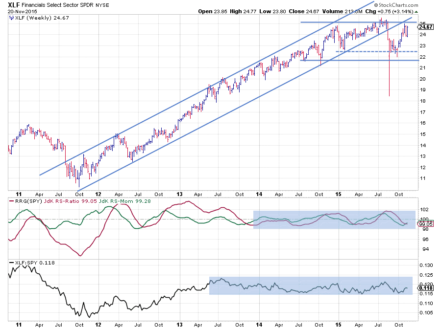
The financials sector is always important to keep an eye on, if only because it makes up such a big chunk of the broader market.
The uptrend in price for XLF really started late 2011 and carried the sector to highs around $ 25 a few months ago. Shortly after touching that $ 25 high XLF broke the rising support line which had kept it going up over the past 3-4 years. After setting a new support level around $ 22, XLF started to move sideways between roughly $ 22 and $ 25. A break on either side of that range will be a signal for a further move in the direction of the breakout.
The relative chart started moving sideways after a solid relative uptrend from late 2011 well into 2013. During that two-year period, financials were leading the market higher and then handed over to other sectors. Owning XLF since mid-2013 basically means owning "the market".
Looking at the current setting on the relative charts, it looks as if the market is trying to set a new relative low against the lower boundary of the range, this suggests a continuation higher for the move that started mid-October. On the weekly Relative Rotation Graph, this move translated into a trail that started to gain on the RS-Momentum scale quickly after the sector rotated into the lagging quadrant. It's a bit of an aggressive call, but building on the assumption of a relative trading range being in play it makes sense (at least IMHO :) On the daily version of the RRG, XLF already rotated into the leading quadrant.
Developments on the price chart of XLF can make or break this view. At the moment, the sector is pushing against the upper boundary near $ 25. A quick glance at the longer-term chart reveals that it is actually a zone between $ 25 - $ 26. If that resistance zone will prove to be too strong to break at the moment, a continuation within the boundaries of both trading ranges (price and relative) is likely. Clearly a break beyond this barrier will unlock (a lot of) new upside potential, which will definitely also impact the direction of the market in general.
Julius de Kempenaer | RRG Research
RRG, Relative Rotation Graphs, JdK RS-Ratio and JdK RS_Momentum are registered TradeMarks by RRG Research


